Once we have our theme worked out, we must get our materials ready. I suggest doing this before you start to build your WordPress website. Flying by the seat of your pants is NOT the best way to organize your material, as well as write it, design it and get it into the site.
I start with the information I want to have on the site. I know I want an About Page, and a Portfolio of course. A Contact Page is a good idea, and a Blog is a given. That is one of the best reasons to use WordPress for your website framework; the built in blog. The ease of use and maintenance is the other best reason.
Are there other pages I may want to add? How about a Projects Page to show some of the different photographic projects and self assignments I am working on?
An Investment Page for consumer shooters, a Schedule Page and Calendar may also be cool if you need them.
Now you have to figure out where they go – and this is the Navigation part of your site.
There is a limited amount of real estate for your navigation, whether you are using a horizontal method of navigation or a vertical, you want to avoid ‘wrapping’ of lines if you possibly can.
“About Don Giannatti Photography” is too darn long: We can use “About” and still have the ability to have the long name when we do the SEO (Search Engine Optimization) for the page.
With most WordPress themes, you have the ability to have drop down navigation, and that saves a lot of space. Having all of your navigation on that one global bar makes no sense, and it is NOT what people are looking for. Studies show that horizontal navigation with drop down menus are very comfortable to visitors of your site. Hey, you wanna re-invent the web, go right ahead – me – I want to make sure that people who visit my site are happy and engaged with my content.
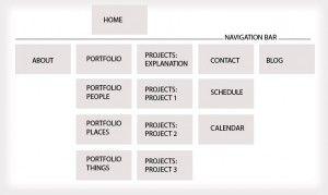
Here is a typical web navigation schema. I do these in Photoshop, but there are other tools you can use.
It shows a navigation that is very simple: Home – About – Portfolio – Projects – Contact – Blog. Below each of those simple navigation points are the additional pages of the site. We call them ‘child pages’ because the flow from the main page.
Looking closely we see that there are some additional notations on the main navigation pages.
Notice that the Portfolio navigation tab is the one that is showing… so what happens when we click on the word “Portfolio” instead of going to one of the drop downs? This is a consideration – you have offered a button and now someone feels that they should click on it… what happens?
We have two options: One is to make it without a link, so it forces the user to choose one below – NOT a good option. The other is to have a “Portfolio” on that page.
I think that a portfolio that is the best 25 or 45 images that are contained within the other three categories makes the most sense, and it is becoming the de-facto way of showing our work.
So we break out our genres, while keeping the best work from each genre in our portfolio. How ‘back-in-the-day’ that is, and yet it remains the best way to show your work. In my opinion.
When we get to Projects, we find a Project Explanation page. I would want to at least inform my visitors on what the projects are, and how I chose them, and what they mean to me. Then in the drop down I can take them to the current projects I am working on.
(In my vision, projects are self-contained assignments, mostly self-assigned, that show a different side of what I do than the work shown in the portfolio. The work in the projects area is more narrative, story driven work. You may choose to do or do not. S’all good.)
Now that we have our navigation, we know exactly what content we need. That makes it so much easier to begin to create it.
For the above navigation I would need the following:
About: Bio, Quote, Photograph of me.
Portfolio: 24 photos sized and ready to go into the portfolio tool I had chosen.
Projects: Copy for the Main Project Page, a photograph to accompany the text, individual project info (paragraph) and a sample of each of the projects sized and ready to enter.
Contact: Copy for the contact information, a Google Map link to my studio, a photograph to make the page look good.
Schedule: Copy for the Schedule page, a photograph to accompany it, possibly a ‘schedule tool’ if I was taking appointments online.
Calendar: a Calendar plugin would work well here.
Blog: I would suggest at least two blog posts are there, and have at least 6 more ready to go within your blogging schedule. Getting behind can take the fun out and stomp it silly… trust me.
While you are writing your copy, you must also be getting your visuals ready. And you should know how big to make them so they fit, so instead of fighting with them, and redoing and redoing and redoing, you make them once, put them in a folder and grab them as you are populating a page.
I have built fairly complex WordPress sites in less than a day when I had all the content ready. And believe me when I tell you that there is some complexity you must work with in these modern themes. Adding the frustration of writing the copy as well as sizing the photographs and trying to remember what pages go where… crazy.
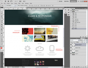
I suggest taking a screen shot of the theme you are going to use and take it into Photoshop. If you can grab the images by right clicking, then that is an alternate way that is also effective. (Some images are embedded in such a way that they are not ‘right-clickable’ so in that case, the Photoshop method would be a good alternative.
We are using the “Hero” theme available at ThemeTrust: Use the link provided on the sidebar of this page. ThemeTrust is one of my favorite theme builders and the link is an affiliate link.
We need a good portfolio tool, and WordPress comes with a Gallery tool that will make the thumbs and larger image views. It is not bad, but there are other ways of showing the work that you may prefer.
Use your “Save for Web and Devices” tool when saving out your images, but do not make them less than 60%. WP will crunch them up a bit more, so if you are too low in your quality, it can be very bad on your image. Saving the images with SFWAD will make the file smaller (less weight) and load faster on your site.
SlideShowPro.net makes a very good product for showing portfolios. You can show one portfolio per page on your site, or let SlideShowPro do all the heavy lifting. They have a simple means for hooking your SlideShowPro portfolio into your page(s).
GalleryPro.me is another solution that gives you control over your galleries and portfolio from a single dashboard. (Disclosure: I am a partner in GalleryPro.)
There are also many different plugins to show galleries in your WordPress.
25 Most Downloaded Free WordPress Image Gallery Plugins.
The Best WordPress Slideshow and Gallery Plug-ins
Putting the Plugins in your site is easy, and you can try them out with only a few clicks. If you do not like them, delete them from your Plugin panel.
Knowing what you want to do, and how you are going to get there will make your WordPress website a much easier project. Get the heavy lifting done first, then concentrate on working with your theme, learning its quirks and making it all yours.
Next time:
Important Plugins, Widgets and more.
———————
I was recently on creativeLIVE and have received some rave reviews of the workshop. If you are interested in taking a look at the workshop, you can find it on creativeLIVE’s web site here. I think it is a tremendous value and if you are unable to attend any of my workshops, this may give you a ton of information you will want to have to push your photography to the next level.




Thanks for giving out another lesson. I’ve been using CS3 to build my websites and I need to learn comparing to WordPress. Once I learn WordPress, it’s so much easier and there are many available Plugins to make everything easier. I’ll look forward to your next post. Thanks again!