I recently completed a job for Tera at Sassimi, a boutique fashion designer in Seattle. And while she is small for now, she wants to grow her business. I think she will do well. Oh, and you can visit her site here at Sassimi.com.
(For those looking for Project 52, please visit the project52.org page for all the info.)
The assignment:
Shoot the collection for a web gallery/catalog to catch the eyes of retailers who may be interested in carrying her lines.
Challenge:
– The robes to be sent look better on medium height women, not the tall fashion models we are used to hiring for this kind of gig.
– The colors are very pastel and we must be able to show the texture of the material.
– The material was a hybrid Terry Cloth (not the easiest texture to light).
– We needed to keep the background as unobtrusive as possible and render the colors well.
Not a terribly difficult set of parameters, but there are small challenges that must be met.
We started by figuring out how many shots would need to be finished, and the different angles/configurations that would be possible within her budget. I then figured the time that would be needed to do the job, and scheduled a date that would allow me to shoot, process and do any reshoots within a reasonable time.
Models were contacted and we booked two that fit the wardrobe and would be available on the dates we needed.
The wardrobe was received and we found that terry cloth and the hybrid terry/bamboo material didn’t handle being wrapped and shipped without being totally wrinkled. I used an industrial steamer to take all the wrinkles out, and we had to iron a few spots to get the look smooth and natural. The wardrobe was hung on a studio wardrobe stand and we began to catalog the shots.
I made notations on which would be worn by which model, and the wardrobe was divided into the two groups.
One of the things that Tera wanted was to make sure the texture was visible. It was a big part of the wardrobe’s features and it needed to be front and center. I had thought of using a big softbox, but at when I tested it, the light was too soft and it didn’t delineate the texture as well as I had expected. The material was more fine in texture and way softer than expected.
I chose a large umbrella instead. The 60″ satin white gave me soft light with a bit more direction than the softbox did. The wrap around feature of the large umbrella would also allow me to use some negative reflection on the opposite side of the light to create more contrast and texture.
Whenever I am doing a shoot with multiple items like this, I will do some tests to make sure the light, background and models look the way I, and the client, want them to look. I don’t want to do this when the models arrive as that is billable hours for them, and I want to make sure the clients money is well spent… not wasted on me trying to figure out what I want to do while the models are on the clock.
I knew the wardrobe was going to be easy to do, as they are all spa wear and wraps. So I staggered the models so I wouldn’t have one waiting around while I was working with the other. This also allowed the makeup time to be offset as well.
Efficiency is so important when doing a job like this… and this one was a small job at that.
I keep a shot list next to the camera station and we mark each outfit off as we shoot it. This way nothing is forgotten or mistakenly left out – triggering a reshoot. And if I miss the wardrobe shot, the reshoot is on my dime… and profit starts to dry up due to errors that are easily corrected by staying in control.
Here is the lighting scheme that I ended up using. As you can see, it is quite simple.
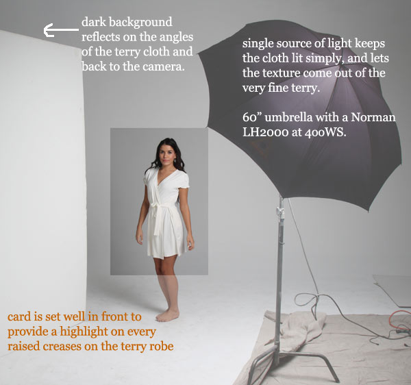
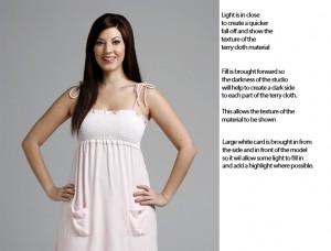
The large umbrella is in close for more contrast with the soft light. It is also set to do some wrap around to the shadow side of the face… but not too much as to kill the texture on the robes. The large fill is brought to the front of the model and works as a fill for the front of her, and a scrim to kill the light from bouncing all around the cove.
The shadow side of the robe is enhanced by the darkness reflecting back to the camera from the shadow side of the subject… even the Terry cloth can see some dark and reflect it back a little.
To say it again… the umbrella is big and close so the light is soft. The closeness also creates a faster fall off on the subject due to the Inverse Square Law, and the fill is controlled to be bright across the front of the model and the wardrobe, but dark to provide more contrast to the negative sides of the subject and the material.
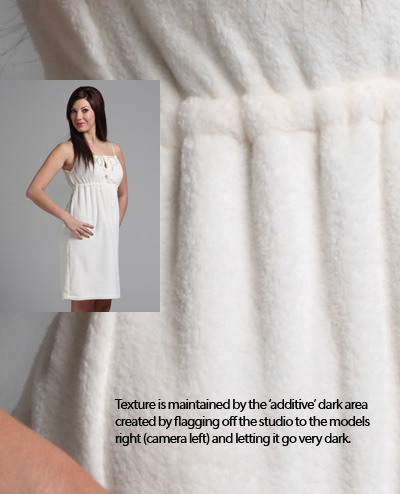
You can see the sculptural qualities of the light here on this closeup of the Terry cloth.
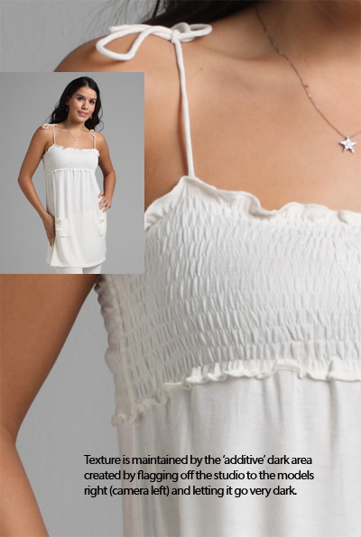
The tighter weave of the Terry/Bamboo was a bit more smooth, but the lighting handled it well. All in all, we had a nice, simple light with some complexities added by the negative fill.
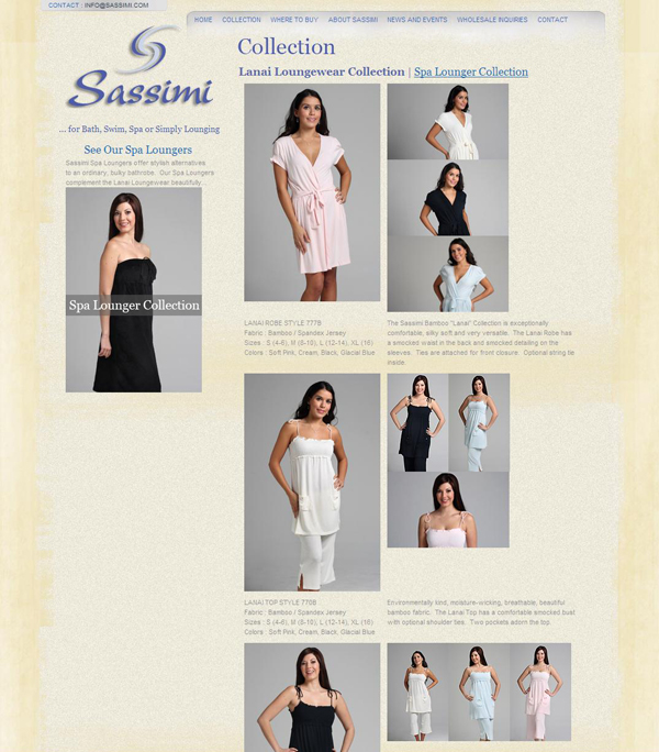
I was also the designer on this job. The website is quite simple, and very SEO friendly. A full CMS is included and Tera can keep her list of retailers up to date as well as changing out the images in the galleries. I keep monitoring the site for a few months after launch, and Sassimi is starting to appear on organic searches under our targeted keywords.
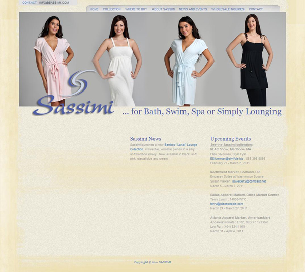
One of the important things to do on a shoot like this is to keep the light consistent. I was able to make the composite shot for the header quite easily as the backgrounds all matched perfectly. The consistency makes post go so much easier.
I will close out with some screen shots of the site with the images in place.
Thanks for following along. Stalk me on Twitter, and see the workshop pages at Learn to Light for more information on the workshops we offer.






Question: Do you build the testing into your shooting fee, or is it broken out as a line item?
Yes.
The testing is a normal part of what I do, and I would not want to do a shoot without first testing what needed to be tested.
That said, does every gig demand a test? No.
In this case, the terry cloth and bamboo material, along with the clients statement that she was not happy with the previous work as it didn’t show the texture, a test was called for. Test took about an hour.
This is very useful.
When you have to adjust your lighting based upon the texture of the clothes, the background gradients must change? What are your thoughts on that? Thanks for this post!
“When you have to adjust your lighting based upon the texture of the clothes, the background gradients must change?”
I do not see that as necessarily connected, and sounds more like a catalog concern (keeping matching backgrounds for consistency).
Changing the light for ‘texture’ may or may not have any bearing on the background. Send an example, please.
Thanks,
I just realized that the comment you made was for the Sassimi post. Sorry, I answered it as though it was from today’s post.
The background gradient is created first. Slight variations are not a problem, but in a catalog type shoot, care is taken to maintain that consistency.
In this set of shots, the variations of the light for the texture come from the opposite side of the main light. Changing that to black or white or adding a tighter fill has no bearing on the background. I usually make sure that the background is lit separately from the subject, so changes at the subject point are not seen at the background.
Hope that helps.