Photograph from a book on northern Arizona to be printed by Blurb.
Part two of the Jan Klier post on preparing your files for printing a book. We have a link at the bottom of the page where you can download the entire two part post as a PDF. Part One of this article is here.
I want to share a few things with you before we get on to Jan’s post.
First: I have some wallpapers for you. They have the October 2010 calendar on them and you are free to download whichever fits your screen. This one is 1024×768.
Other Sizes: 1280×1024 : 1440×900 : 1680×1050 : 1920×1200
I hope you enjoy them.
This is an interesting take on the creative process.
“Innovation, by definition, has no road map.” What a great take-away.
Stephen Shore is one of our most important fine art photographers. This short video is a great introduction to his work if you are not familiar with his work. If you already know his work, this will be a fun interview.
Doug Menuez is one of those photographers who seem to be in tune to a more subtle vibe. His work is wonderful, and his insights in to the future of photography are enlightening.
Alright:
Book news. I am on to chapter 4 this evening. I need to get some shooting done for this thing, and of course – what happens? I get busy as heck. I am shooting all day tomorrow, and both days over the weekend are devoted to shooting and writing. Next week finds me shooting two commercial jobs, launching a website, keeping two other clients on task and making a trip to Cincinnati for a workshop. Schedule:
Friday Evening : “Jump into Pro Photography”
Ohio Valley Camera Club, Friday at 7:00 p.m. at Red Door Studios
Workshop on Saturday and Sunday (two spots open)
Monday Evening: “Effective Portrait Lighting”
Midwest Photo Exchange, Columbus, OH
5:30 PM to 7:30 PM
Let’s get on to Part Two of Jan Klier’s article on Preparing Digital Files for Printing a Book
Take the jump here:
 |
 |
 |
Preparing Digital Files for Printing a Book by Jan Klier (Part Two)
CMYK Conversion
Now that we have an image with colors that can be reproduced, and we’re sure that the image will look ok on paper, it comes time to prepare the image for the designated press. Most big presses print with CMYK inks (also known as 4-ink process). There are also spot colors, but that is likely beyond what most of us will use.
Now most of our images are captured by the camera in AdobeRGB, which is the richest color space supported by most cameras and is adequate for their sensors. It’s not uncommon to import images at the even wider ProfotoRGB color space for editing, for similar reasons as you edit in 16 bit – avoiding unnecessary data loss during editing. This will also be a good time to point out, that you should always retain your original file in the original color space and bit depth for various uses. All press prep is always done on a separate copy for a specific deliverable, just as you usually export for website use, converting to sRGB and JPG at appropriate resolutions.
So most likely your image is still in one of the RGB color spaces at this point. Somewhere between now and the physical printer these colors have to be translated into the CMYK values the printer will use. You can either submit your file as RGB and leave it up to the printer to do it using some algorithms, or you can do it yourself and proof the result. Again, if you’re still reading, I assume you want to do it yourself.
There are a few things we need to know about CMYK – for the full and detailed explanation refer to a book like the one above – this is just the short version. Essentially in RGB every color has a single unique value in which you can describe it. But once you get to CMYK there are different ink combinations that result in the same final color. That leaves us some choices. Darker colors can be achieved either by mixing high amount of C, M, and Y inks, or simply by using small amounts of C, M, and Y for color and black ink (K) to darken the whole thing. The reason that matters is that on a press a high amount of ink doesn’t dry fast enough and results in poor print quality. While a full application of ink on an individual pixel would result in 400% ink (100% of C,M,Y, and K respectively) most presses max out at 300%, and depending on press and paper even less such as 280% or even 240%. So this is an important limitation to manage to get the right print quality yet accurate color reproduction. The second limitation we have to manage on a printer is dot gain – the amount a dot of ink will grow while drying. This impacts the amount of tonal gradation the printer can handle in an area at high quality. A default dot gain is 20%, but individual presses may vary.
If you want to see how your image is fairing on this front, go into Photoshop and make sure that the ‘Info’ window is open (part of the histogram). Then select the eye dropper tool and an appropriate sample size (5×5 or 11×11). In the right hand corner of the info window you will see the Greek Sum symbol and the eye dropper drop-down. Set it to ‘Total Ink’ and it will show the total ink used in percent based on the sample area of the eye dropper and the currently active CMYK profile. The shadow areas of your image will be the trouble spot, so sampling different areas will give you an idea where your image is.
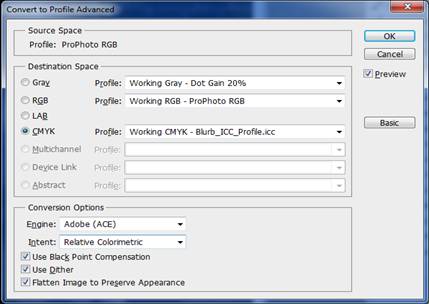
So now we’re getting to converting the image files. The key function for this is in Photoshop. By going to ‘Edit’ and ‘Convert To Profile’ you will get a dialog box that displays the current source space an profile as well as various conversion destination options:
Now it may be logical to pick the ICC profile you obtained from your printer as the destination space. Unfortunately that is not necessarily the right answer. These profiles describe the printer’s color capabilities, but may not have the correct parameters for CMYK conversion. To do that you may actually have to create a custom CMYK profile.
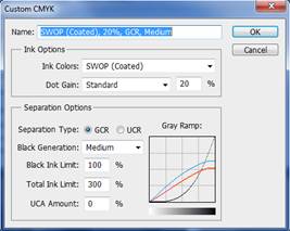
After a bit of research I determined that Blurb does all their printing on HP Indigo presses. And HP’s website had a document describing the proper CMYK parameters for it:
Dot Gain: 14
Medium GCR
Black Ink Limit: 100%
Total Ink Limit: 300%
So with these parameters in hand we can create a custom CMYK profile to use in the conversion process. To do this, you actually want to save it as a profile for later re-use. Go to ‘Edit’ and ‘Color Settings’. Then under ‘CMYK Working Space’, you select ‘Custom…’ which should take you to this dialog, which is where you can enter all these values for Dot Gain, GCR, and ink limits (PS: GCR is the method by which dark colors are generated with color inks vs. black ink).
After you give the profile a name and are back in ‘Color Settings’ and the ‘CMYK’ drop down, there is a ‘Save…’ option that allows you to save this setting as a file. Now in the ‘Edit’ / ‘Convert To Profile’ dialog this new custom profile should show up as a choice in the CMYK drop down. After selecting this, your file will now be in CMYK colors matching the capabilities of your designated printer. A sanity check with the eye dropper should confirm this.
An alternative to this conversion method is a manual adjustment of the tonal range of your image. That would involve a more straight forward conversion to CMYK and then tweaking individual channels an areas to manage the total ink in the shadows.
With the final image in hand, it’s a good idea to make one final check with the soft proof of the printer’s ICC profile to make sure everything looks good.
File Prep
Now with a properly converted CMYK file in hand, it’s time to put the image into your layout. InDesign (my preferred software for that) has a handy ‘pre-flight’ function that helps to make sure your images as laid out are ready for print. You should setup a custom pre-flight profile. The key things to check for are proper proportions and resolution. In the preflight profile you can specify the minimum print resolution for your image (e.g. 240dpi or 300dpi).
Particularly on a double truck in a larger book, it’s quite possible that the resolution of your image is insufficient without some adjustment. InDesign will help you spot those cases. If needed, Photoshop is great at up-ressing the image at high quality. This is also best done on the print copy, not the original, such as not to compromise your original data and because the up-ressed file can be quite large and awkward.
The other gotcha the pre-flight will detect: accidentally compromised image ratios resulting in something slightly askew (you probably would have noticed a major issue by just viewing it, but minor variations are harder to spot).
With all that in place, you’re ready to submit your files to your designated printer and hopefully will have a satisfactory, predictable, and repeatable result.
Happy publishing.
A big thanks to Jan for this article. You can download the entire article as a PDF here.
PREPARE-FILES-FOR-PRINTING: pdf
Follow me on Twitter if you like to stalk photographers who talk a lot about photography, and if you are interested in taking your game up a notch, check out the workshop info at Learn to Light.




Uhm… Did you forget to include the link to the PDF?
Nope. It is down at the bottom of the second article.
Intertube fairies had it hidden… heh.
I can swear that the link wasn’t visible before I added that comment – I even checked in Safari just in case NoScript and Adblock had removed it from Firefox. Weird.
Hey Don,
I just had a quick question. I read through both of these, and I’m not sure that there is a solution to my problem. How would you go about printing a color that falls out of the gamut of a CMYK printer?
I am trying to reproduce a vibrant, bright orange wedding dress, and it comes out a muddy brown/pink. Is the only solution tweaking the HUE/Luminescence and Saturation until you get a printable color?
Many thanks,
Kris
Hey Kris,
I think the first step is to figure out if there is a color that your printer can handle and that is representative of your visual intent in the image. If not, you may have to find another place to print this particular image. Either printer with broader range or that can offer spot color.
Once you know the target color, you have to shift the image towards it. There’s a good technique described in the book ‘Skin’ by Lee Varis. I use it regular during retouching: In short – put a hue/sat layer, select a color channel, fine tune the color selection by using the left picker to select the color to be shifted, and the right picker to select a neighboring color just outside the selection. Fine tune color selection, add a color sample in the specific area, then shift the HSB sliders until your color sample is on the printable target color. May require some practice. But I’ve recently used it to turn a deeply green anodized aluminum part into a very vibrant orange part after sampling the colors from a separate orange part. In that case I had to do it separately for the highlights and shadows using a luminosity mask. It can be done, though it may be quite a bit of work.
Hi Jan,
Thanks for your reply. I was worried that this is the only way. That would be a great solution, but I feel in this case, the Bride will want to see the orange of her wedding dress reproduced. I think I’ll have to find a hue that is quite close and printable, which isn’t looking good as I sit here in Photoshop. Wish me luck!
Well, hope it worked out Kris.
Maybe that’s something to add to the pre-shoot checklist. Tell the bride to only wear dress colors which are within printable gamut, or otherwise charge extra 🙂