The assignment was to shoot personal sports equipment (non-team sports). The photographers gave us some very nice shots, and the ways they came up with them really rock.
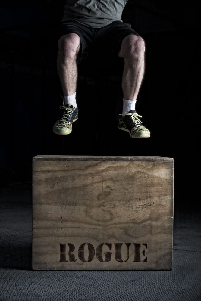
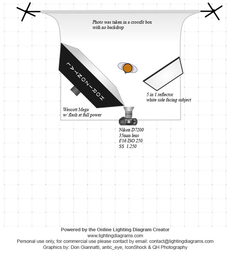
Rainie Mills gave us a workout box with an example of its use. The key element in her image was to create some modeling to the athlete, premier the box and keep the background flat in order to amplify the graphic nature of the composition.
The lighting example is actually reversed. the large softbox is to camera right, with the feathered fill on camera right. The large source, in close, provides a very smooth transition from highlight to shadow and we see that as ‘soft light’. Also notice the gradation on the box due to the close light placement… you can see the light falling off. (ISL)
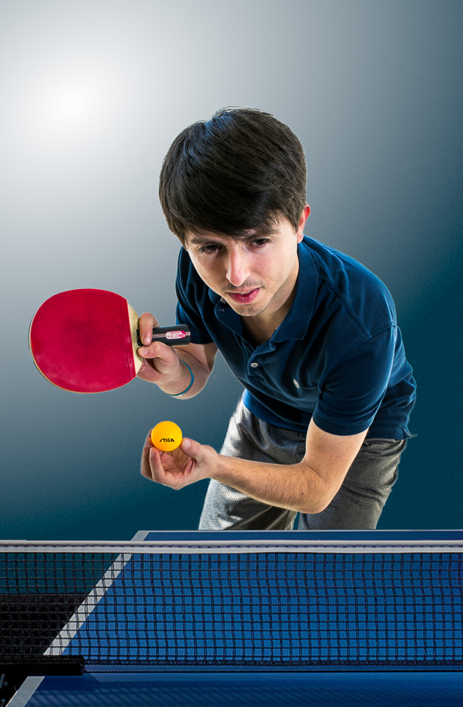
Albert Madrilejos chose to shoot a ping pong player just about to deliver a serve. A very simple lighting setup gave him some flexibility in how he wanted to portray the player.
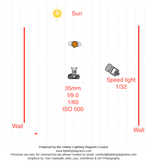
With the sun coming over the players right shoulder (camera left) Albert used a bare speedlight to add a main light to camera right. This light is not that much brighter than the ambient, so the shadows do not go too dark, nor does it give that ‘flash photo’ look. Carefully blending ambient / direct sun / flash is an art worth working on. Albert does a great job with it here.
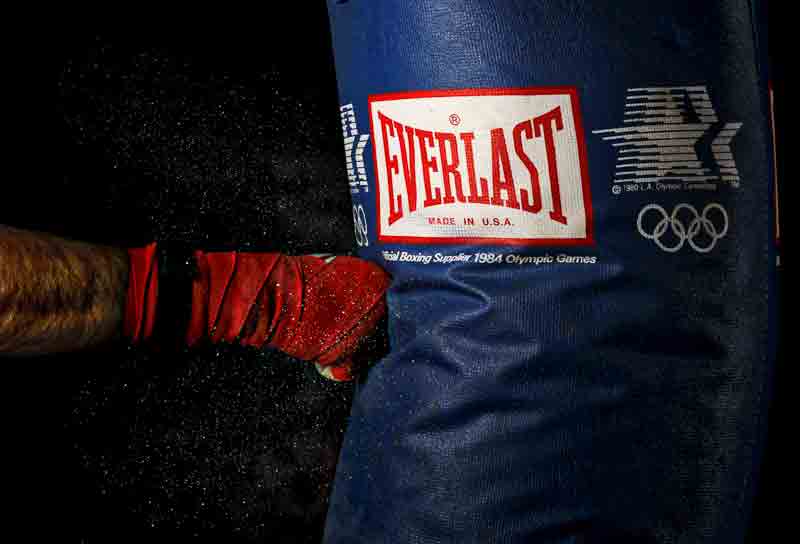
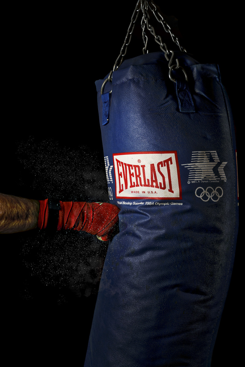
Michael Klinepier’s shot of a heavy bag being struck is both dynamic and graphic. Careful use of light and gesture turn what could have been a mundane photo into one with impact. Note the use of the ‘dust’ from the bag, and now the highlight on the bag leads us to the logo.
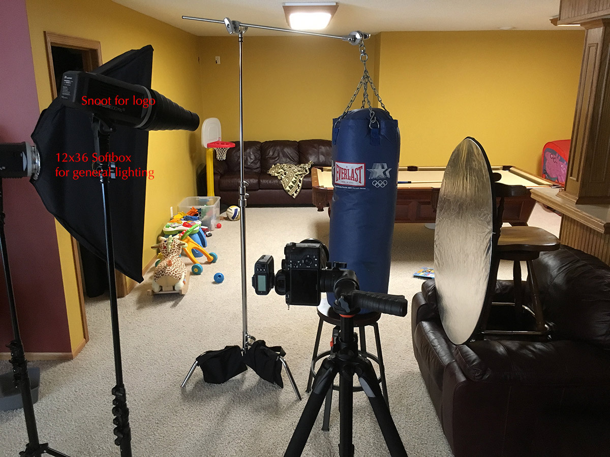
As you can see in the behind the scenes shot, the bag and arm are lit by a strip box to camera left. The addition of a very well placed snoot light gives us a bright highlight on the side of the bag, and opens up the logo to be brighter. To the left, a shiny reflector gives only a tiny reflection on the back of the bag… but bright enough to show us it is there. Since the exposure was so bright on the subject, the background went to darkness. Minor retouching was used to make the background fully black.
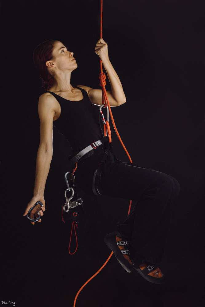
Richard Neuboeck wanted the bright orange of the ropes and climbing tools to stand out, so he designed a very low-key shoot with black and orange only. Allowing the model to fade into the black background was his goal to help the ropes stand out.
Of course, shooting someone dangling from a rope in the studio could be a tough assignment.
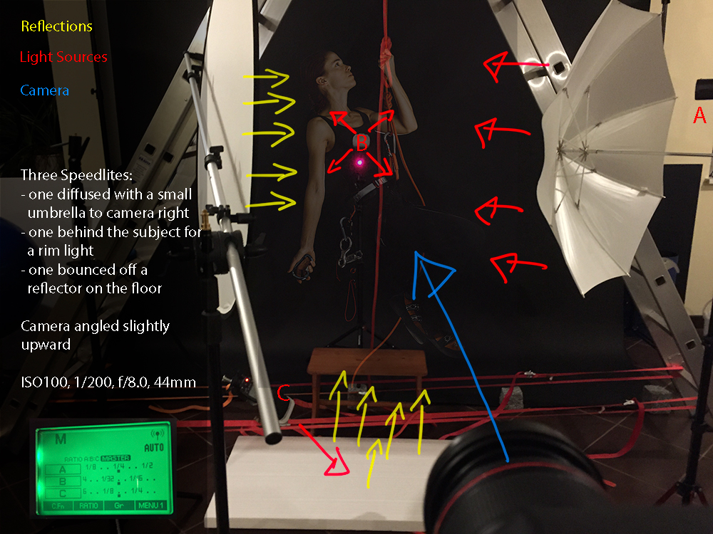
Richard chose a large, shoot thru umbrella for his main light. These sources scatter the light in a wide dispersion which was necessary for this shot. He hung the rope from a large ladder and added a fill to camera left to help keep the shadow side of the items brighter. He found he needed a bit more fill from the bottom as well, so that is the added fill from below.
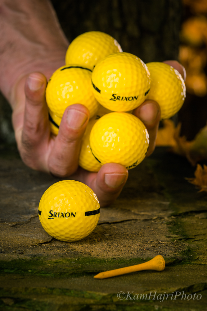
Khemais Hajri chose a handful of golf balls for his subject, and he worked to get the lighting to capture his vision of a shot with texture and dimension. This is a well-propped studio shot, and features some great lighting. Note the specular on the front-left side of the golf balls, and the bright kicker light on the back side of them. The balls are showing their texture, roundness and color very well.
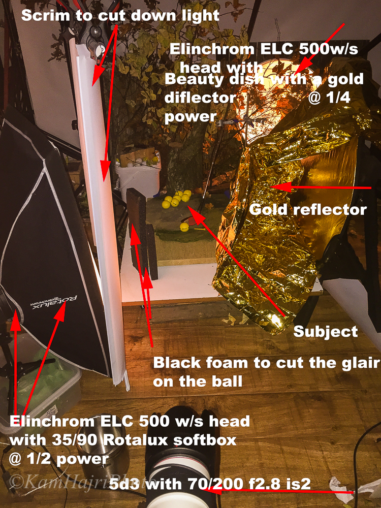
To get this light, Kam installed a large scrim with a softbox behind it. The scrim not only cut the light down (needed because it was still too bright at lowest setting) but also gave a wide, gradient light to the image. Note that the softbox is turned away from the scrim offering it more light toward camera and less away.
The addition of the small black foam boards helped cut the specular down on the golf balls and add a bit of contrast to them as well.
Plants and leaves were brought in to the set and an additional Elinchrom head was placed behind them. This light was modified with a beauty dish, and a gold reflector. and provided a very warm backlight to the set.
One last addition was the crumpled gold material to help add even more warmth. This material worked as a tiny fill light and can be seen on the shadow side of the fingers. Attention to detail is what makes studio still life work so much fun.
