UPDATE: OUR WINNER IS Rasheid Scarlett! Congratulations, Rasheid.
Well, here we launch into our first big contest. Shooting to layout is a very important part of shooting commercially. And there are some tricky issues if you are not familiar with doing it. It isn’t terribly difficult either, but you can make big problems for yourself and your client if you are not producing images to fit something already designed.
It can be exciting, boring and a mix of both, but it is a part of what we do.
(EDIT: There is a Flickr Forum post with some ongoing commentary and questions/answers here. Check it out if you have any questions.)
So here is our first contest. We have cool judges, cool prizes and a bit of a challenge.
We will get to the specifics after the jump.
First things: Workshop News:
Columbus is Sold Out, but you can still come and get a little Wizwow goodness Wednesday Evening, June 23, at MPEX store. Here is the link to the event.

I am taking on 4 private workshops for 1 or 2 photographers in the month of July. These very advanced workshops will be held at my studio in Phoenix, and will focus on studio lighting techniques, still life and fashion work. Priced to include model/mua fees. Our models will be agency girls and the work will be pushed hard to the edge for creativity. Portfolio submissions required, and pricing is for two full days. Morning shoot/Evening shoot and all day in studio. Post Production as well. If you are interested, please email me for more information.
I have a few openings at the workshop in Denver. This workshop will be the first time in that area, and there will be a ton of shooting/post-processing going on. If you are anywhere near the Denver area, you should take a moment to look at the Learn to Light Workshop page.
And the workshop in Flagstaff, Arizona will be extra special. The landscape there includes forest, incredible deserts, old Route 66, and the wonderful old town of Flagstaff. Weather should be manageable at about 85 degrees. This should really be a fun workshop. We leave Friday morning from Phoenix, and we return on Monday morning (missing that awful Sunday evening traffic on I10).
You can now sign up for the Going Pro NOW seminars. We are preparing a ton of great content for you all. My portion of the program will focus on marketing, web sites, portfolio preparation and functioning in an emerging business. Lots of tips, lots of real information. “Identifying Who You Want to Work For Can Invigorate Your Photography” is my most recent post at the blog there.
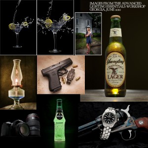 I have had a very busy, and terrifically exciting two weeks. We started out two weeks ago in Winder, GA at an advanced workshop. Matt Lovell offered his brand new studio in a small town a little outside of Atlanta, and we took over the entire shooting area. Focusing on still life, food and reflective surfaces. The students had a great time, and we got some fun images. Some of them were more than a bit surprised at what efforts go into shooting something ‘simple’ like a bottle of beer or a camera. Here are some images from that workshop… all by students.
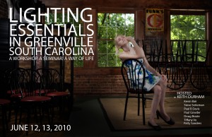
The following weekend found me right up the road in Greenville, South Carolina. Wow… did we have a blast. We took over the top floor of a restaurant and made images in and around that building. Downtown Greenville is simply beautiful, and we had some lovely models for the afternoons. I spent Monday morning meeting with photographers and looking at portfolios, then took the drive through the Smokey Mountains for some photography. I just love that area… wow.
I have an article at ProPhotoResource.com on choosing a background color (white/grays/black) and what I think about when doing that, so if you are a portraitist, you may enjoy that article. There are a bunch of good articles there, so spend some time and look around.
So let’s get on to that new contest.
(If you haven’t gotten your copy of Selina’s amazing audio series, you really should. Click above and save $100 courtesy of LE and Selina.)
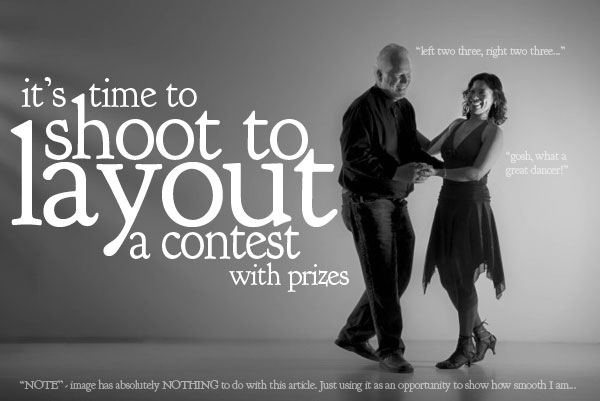
We had a lot of fun with this shot in Greenville, and I laid some type over it to show what it may look like as a spread in a magazine/brochure. Shooting to layout has a lot of challenges, not the least is the gutter area, and making sure that the type can work over the image. We discussed the image before we got going and were being very careful with the gutter.
So here is the deal: You can download the layout here:
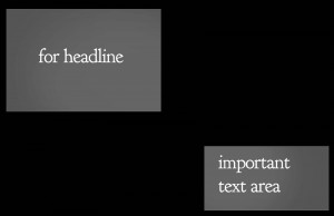 If you are having trouble getting the image above, download the ZIP file here.
It is a simple layout, without specifics. We will add the specifics when the image is chosen.
Here are some images shot to layout at the Atlanta (Winder) advanced workshop.
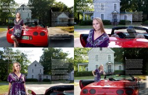
NOTE: the area where the layout calls for a headline, the gutter (middle) and the right area text. Making sure that the image is not too busy behind that text is important, and making sure that the gutter doesn’t go through our subject will be our first set of challenges.
Story:
This ‘story’ is to announce a new artist to the world. Whether it is a hip-hop singer, painter, musician or poet is up to you. The picture must relate to the subject somehow… a musician in his studio, a painter in her painting room… the setting must speak to the story. We are not looking for a studio photograph, but an environmental portrait.
Also note that the image is ‘landscape’, with the subject most likely on the right hand page. The image is to be in color, or muted color – not monochrome.
Our Prizes:
Midwest Photo Exchange will be giving a brand new LumoPro 160.
Steve, from Standbagger, will furnish the winner with a “Grab and Go” Standbagger.
Selina Maitreya will be giving a full copy of her audio course, “The View From Here”. It is an amazing program.
WordPress Themes for Photographers will provide your choice of website. We’ll even install it for you.
Mark asked for a workshop prize, and I deliver. A free “coupon” to a Lighting Essentials Workshop of your choice. Good for two years. (How’s that, Mark?)
Sorry, just like in the real world of photography, there is no second place. Winner take all.
Meet our Judges:
Coni Bourin, Graphic Designer: Glacier Design
Coni works with a wide variety of clients and uses photographers from the region for her work. Coni brings over 20 years of experience to design and illustration.
Ken Easley: Photographer www.keneasley.com
Ken Easley is a commercial photographer specializing in food and people photography for editorial, collateral and corporate clients all over the state and the region. Recognized as one of the best in the state, Ken is usually busy shooting in his 3 story studio in Central Phoenix.
Scott Condray: Visualville
Scott is a long time photographer and stock agency owner. Currently Scott teaches Photoshop and is a consultant for many photographers nationally.
Now the rules:
1. No nudity or “implied” nudity. Sexy and fun is good, but keep it pretty family friendly.
2. You must send the image to me by email. I will not return it, but I also will not keep it unless it is chosen to be a ‘featured’ image – one of 10 or so that will be featured as a submitted image. All others will be deleted.
3. You must title the image with your name: don-giannatti.jpg for instance. Please. No exceptions.
4. By entering the contest, you give Lighting Essentials and Don Giannatti permission to use the image on LE in relationship to the contest, winners, featured etc. No further rights are granted or implied.
5. The image should be sized to 11×17 at 200 DPI to keep the bandwidth low. JPEG’s only.
6. Images are due by August 1, 2010. No exceptions/extensions.
7. Have fun. Yeah, we made it a rule.
8. Send the image to me at don@steelid.com – You MUST use the Subject Line: LE CONTEST JUNE 2010.
9. Please no more than 2 entries per photographer.
10. Model released images only. You certify by sending image that you have the model release and documentation. Not sure that it needs to be done for this usage, but let’s keep to the safe side.
11. Do not try to bribe me with gifts of Corona, or promises of a 5DMKIII when it comes out. I am beyond reproach and cannot be bribed… well, there may be one exception.
Please read them and understand that sending attachments without the correct image naming or subject line may mean I don’t get them.
The judges decision is final. You will be able to see / hear the deliberations of the judges for the final images. Date and time will be posted near the end of the contest. Final judging will be done before mid August. Prizes will be sent directly to the winner by the vendors supplying them.
Thanks all… please let your friends know and if you want to follow me on twitter, here ya go. If you are considering a workshop this summer/fall, take a look at Learn to Light.
See you next time.



I assume this requires released subjects too with proof of release? Or not?
Don,
Are we able to submit more than one entry?
Thanks!
Bryan
St. Petersburg, FL
Good questions guys.
I am making changes on the contest rules now.
I think you should include a coupon for a Lighting Essentials Workshop as one of the prizes. 🙂
Good idea. Done.
😉
Wow. The stakes just went way up. Awesomeness.
Can it be a band or are you looking for only an individual?
I assume a dancer would be ok?
Hey Michelle… not looking for anything in particular. Whatever you want to use to make the shot is fine. It can be almost any kind of artist.
Thanks Don. Just wanted to double check as I already have some ideas in my head 🙂
Normally I don’t do contests, but this one sounds like fun. One problem: I can’t seem to get Safari to download the full-size template. If I control-click, I can download the 300×149 thumbnail. But if I just click on the thumbnail, the full-size image pops up in “slideshow” mode and can’t be clicked or control-clicked.
Am I missing something? A plain HTML link or a URL to the image file might help… thanks…
I will take care of that first thing in the morning.
I’d like to try… but I don’t know much about shooting for layouts. ie. I never heard the term ‘gutter’ before this post. Any resources you recommend (to read up on shooting for layouts) so I can use this as a learning experience?
Joe,
The gutter refers to the center of the magazine… where the pages fold.
I will add some instructions.
This sounds like it’ll be a lot of fun.
Out of curiosity, when shooting layout work, how often do you actually have an idea of what the print layout is going to be ahead of time?
It seems to me that, while it would be critical to keep these elements in mind when shooting, a lot of this stuff (where the text placement will actually be) would get finalized at the last minute.
-B
Good question, Brian.
Many times when shooting for magazines, you may be given only that it is double-truck (2 page spread) or a single page. The AD may indicate specific type placement, or not at all. Not carved in stone on that. I have had full blown layouts for magazines, ‘napkin’ sketches, AD participation with framing for headlines etc… and a few “shoot it and we’ll deal later” assignments. Many times it is simply the magazines way of operating that sets the standards.
When shooting advertising/brochures and such, it is often the case that the design has been set, and the image must be shot to placement.
It is a great process to understand, as it will definitely be a part of the commercial shooters knowledge base.
And, BTW, it may be a good idea to ask the AD when the assignment comes in.
Hi Don, I’ve been following your website for a couple years now and would like say how much it’s changed and keeps getting better all the time. Now that you’re throwing in the contest, I can really put to use the knowledge you’ve dropped. Lets see more!
This looks like fun! Just one question (maybe a dumb one, but I couldn’t find the answer)…should our submission include the “text” as well or are you just looking for the image? In other words, are we to write a “story” as well?
Hi.
Nope… just the image. We will adjust the text to reflect the intention of the image.
Don, can you tell me if the layout provided contains the exact demensions for the headline and text?
Thanks!
Yes… close enough that you should shoot with it in mind. However, it is only a layout, so if the shot is a little off, the headline can be adjusted. Would never sacrifice the shot in order to keep 90 pt type if the shot was cool enough that 72 may work fine…
gosh, I should’ve seen this contest sooner. I have something that might’ve worked nicely.
I was wondering about the words – I see they’re a template so that probly answers my question.
I would want to rearrange the words a bit on a few, silly me….. but we wouldn’t have had that control b/c it was added after – correct?
(I’m a lurking newbie over on flickr, starting to learn more about lighting.
this was a great idea for a contest, and love the variety that entered.
interesting, about thinking differently, planning for specifics. 😉