We were talking about style and vision in the last few posts. I thought I would take this point to show some photographers who I believe show a lot of vision and style. This is as nearly a random sampling of the photographers I love as possible. There are a lot of shooters in my ‘vision’ tab… these are only a few.
We see a lot of talk about ‘vision’ and ‘style’ and they are difficult to put into a specific, detailed set of parameters.
Style – noun (OnLine Dictionary)
1. The way in which something is said, done, expressed, or performed: a style of speech and writing.
2. The combination of distinctive features of literary or artistic expression, execution, or performance characterizing a particular person, group, school, or era.
3. Sort; type: a style of furniture – a type of photography.
4. A quality of imagination and individuality expressed in one’s actions and tastes: does things with style.
5.a. A comfortable and elegant mode of existence: living in style.
5.b. A mode of living: the style of the very rich. (Photographers… heh)
6.a. The fashion of the moment, especially of dress; vogue.
6.b. A particular fashion: the style of the 1920s. See Synonyms at fashion.
We have talked about style before on Lighting Essentials:
“Style: It’s Not What You Shoot. It’s How You Shoot It.”
“Salina Maitreya: 4 To Do’s for Photographers (Interview in Three Parts)”
“What Makes a Photograph ‘Great?'”
“”Breaking Out” as a Professional Photographer: Daron Shade”
So take a look at those articles when you get a chance.
Pretty good definition list, but what do we make of them. (5b is a given for photographers, so we won’t get into that one. My Bentley driver may have a few words later, but only after he fuels up the jet for the weekend MM shoot.)
Let’s see what we can attach to some of the photographers I have listed here. Spend some time at each photographer’s site. Note how the definitions above start to make sense as we view the images.
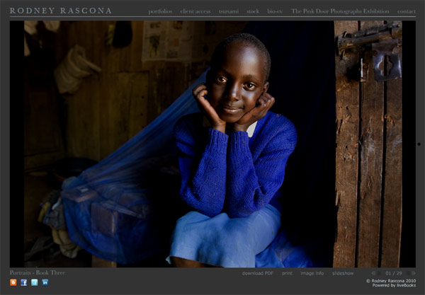
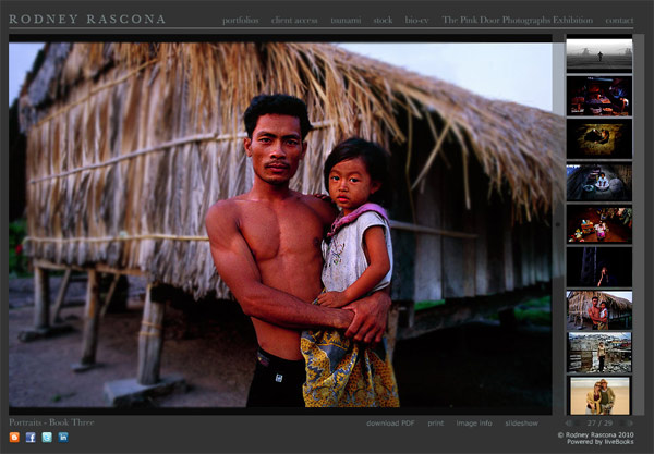
Rodney Rascona is a fellow Phoenician. His work has always been top of mind for me in this area. A talented photographer who has maintained a strong presence in the national advertising scene and still lives here in the desert. Rodney’s work ranges from portrait to automobile to travel… and he has a style that is so prevalent in his work.
Spend some time with Rodney’s work and note how he creates his style. Composition and light as well as presentation are consistent. A drama that is created by formal design and light with contrast to define. Colors are vibrant.
Across the genres of portraits, automobiles and even the photojournalist like shots of the tsunami, there is a consistency of vision.
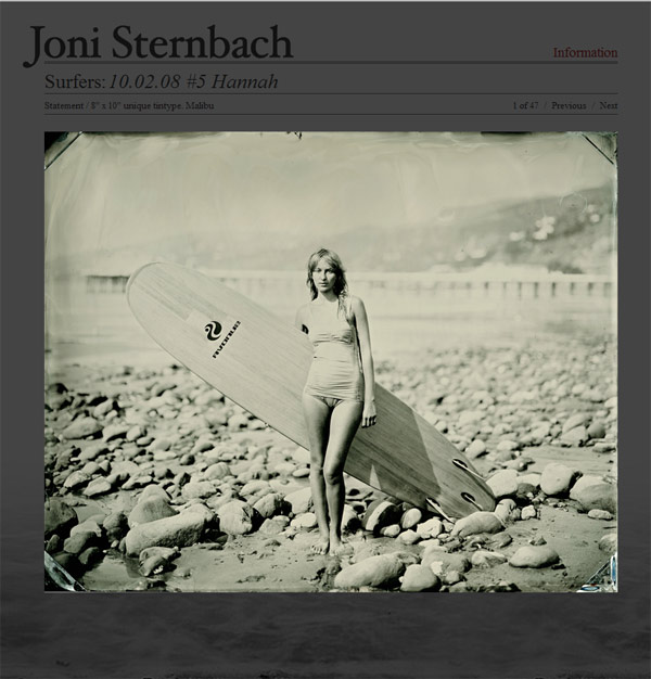
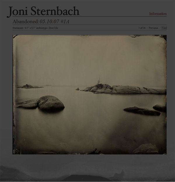
Joni Sternbach is a huge favorite of mine. Her work ranges from portraits to landscapes.
Sternbach chooses an older process for her prints, and uses large cameras for perspective control and limited Depth of Field. But it is beyond the choice of camera and process that makes her images take on a specific vision and style. Study how she approaches the “Surfland” images and compare that to the imagery in the “Salt Effect” series. Portraits of surfers and landscape work tied together by a vision and execution that show a single photographer’s style.
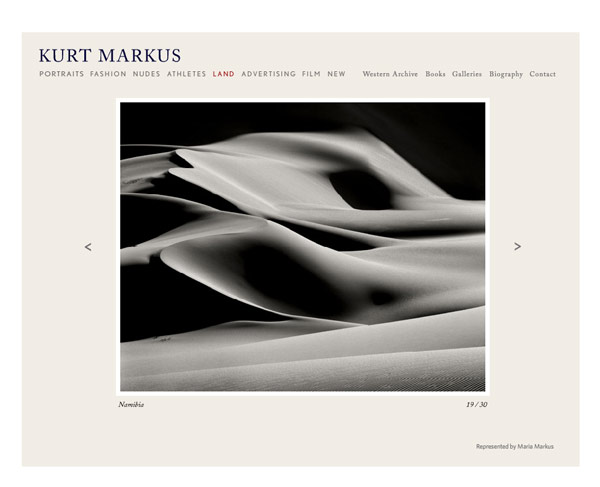
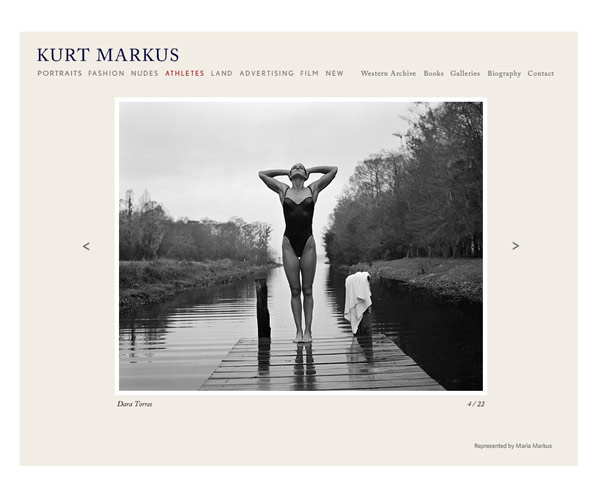
Kurt Markus shoots fashion, sports figures and landscapes… how’s that for variety. And yet the distinctive vision that Markus displays is across all genres.
A great example of it being not ‘what you shoot’ but ‘HOW you shoot what you shoot’, Markus’ clean style and intimate, natural approach to his images keep his vision consistent. Classical, almost historically iconic approaches to his subjects combine with a fresh, natural feeling seems to run through his work. Modern classicism? Maybe. See what you can find as you go through the images slowly and with deliberation.
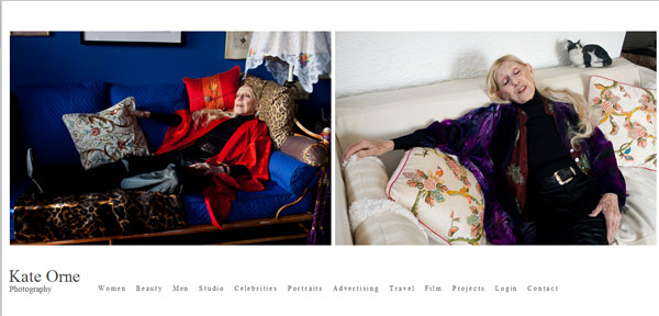
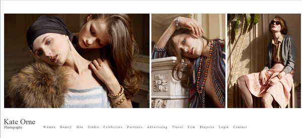
I love Kate Orne’s work. It is approachable, natural, elegant and totally free of conceit. It is an approach that lets the subjects be the subjects. No banks of lights and Photoshop magic, just honestly beautiful images.
Notice also how Orne’s style crosses over to her travel work and studio work. It is a vision that is hers, and the style is in the work itself. Beautifully photographed and simply presented imagery.
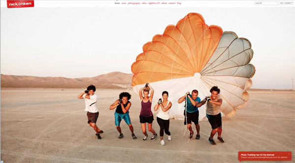
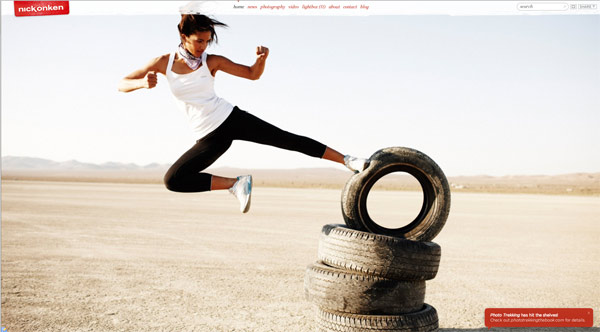
Nick Onken is a guy I go to often to just smile and take in great imagery. He keeps his work fresh and identifiable by keeping the style consistent. And that consistency has led to major campaigns and recognition from all over. His book “PhotoTrekking” was reviewed here on LE and is a fantastic addition to any photographer’s library.
Nick’s color palette, natural light approach, fun and witty composition and strong emphasis on Point of View gives some consitency. His attention to detail, in every instance, brings an excitement to the images and draws the viewer in. You will have a lot of fun looking through Nick’s work.
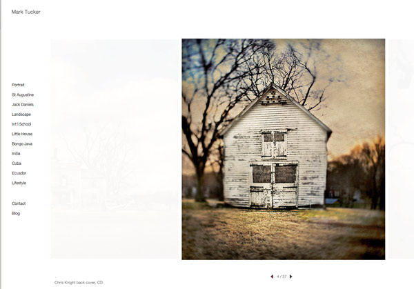
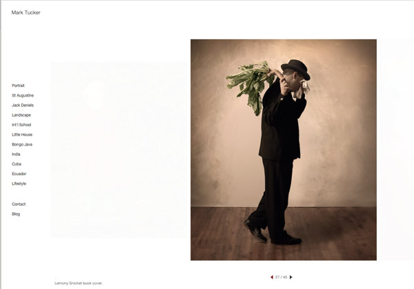
Damn, I am a big Mark Tucker fan. Such compelling work and with such conviction of style. Whatever Mark shoots, it is presented in what seems like the most perfect way. There is a pronounced absence of ‘over-the-top’ processing or faddish types of lighting. The work is consistent in color, composition and vision.
Mark’s work can be quirky and fun as well as serious. His use of old lenses, tilt-shift lenses and textures also makes the work accessible and seem like a blend of art and commercial… with an emphasis on personal style. As you go through his images, think of the choices he is making as he is designing the shots. What you see in Mark, and all the artists here, is a deliberate attention to detail. If it is in the shot, it was meant to be. The light is chosen to set the subjects off in a specific way… and that approach is taken across genres in his work.
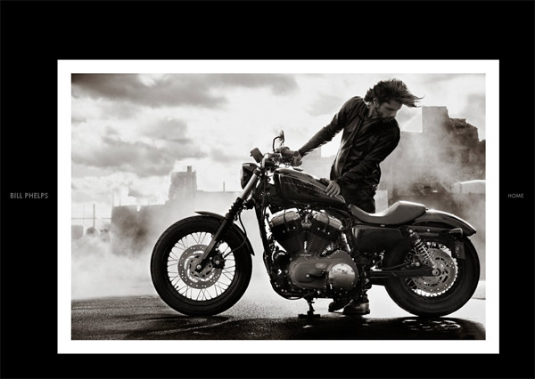
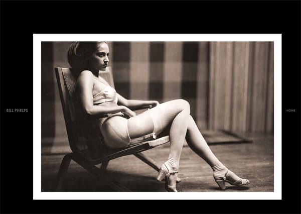
Last up is Bill Phelps, a fantastic shooter that I recently discovered. I am so in tune with this work. Personal, engaged and without the vestiges of over-commercialism, the work Phelps delivers is most definitely his. Not a lot of compromise shown in the vision… it is tightly held and demonstrated in every shot he shows.
I am captivated by his post-modern style and the way he uses the frame to isolate sections of the world, and presenting them as slices of reality. A reality that is charged through the use of black and white. The work has a film look to it, although I have no idea if it is film or digital… nor do I care. The careful use of light that is infused within all of his work is intriguing and elegant.
As you look through the images of these photographers ask yourself these 5 questions:
1. What is the thing that ties the work together for you?
2. If the work was presented within different post-processing would it still stand?
3. What is the compositional approach that the photographers use to bring their work cohesiveness?
4. How is light used to enhance or alter the reality in the work?
5. Quick, describe the photographer’s work, style if you will, in less than 8 words.
Of course not every single image will contain every element of a photographer’s style, but taken as a whole – a “body of work” – the images belong to each other. And to the photographer that created them.
A challenge:
Can you find the elements that tie your photographs together and show how they work to present a body of work? Are they cohesive enough to show you as a photographer with vision or just a photographer? And, hey, it is great to be a good photographer. Let’s step it up a bit and be a good photographer with style and vision.
It’s damned hard work. It is a gray area, a nebulous enigma entwined in the emotional ties we have with our work. It is the ability to grasp and let go at the same time. It may mean a slight tweek to what we are doing. It may mean a total disc wipe and on to a new chapter.
But whatever it is, it will be important for us in the long run to have developed a style. Doesn’t mean we are locked in to only one, but one is good to get started.
Thanks for tagging along and I hope I have your juices going on what style may be, how to look for it in the work of others, and your own. It is a journey that can have lots of pulling of hair and gnashing of teeth. Sometimes you feel isolated and fearful and sometimes joyous and victorious. All part of the next climb in the journey.
Please note the workshop schedule, and follow me on twitter if you are so inclined.



Very nice post and very inspirational examples.
I think above all it’s the consistency in their work that stands out.
But as we think about that, one interesting question is, is that consistency consciously created, or does it naturally appear with experience and mileage? What I mean, in this post you take a very analytical approach to style, which is easy to do as an observer and after the fact. But as each of them creates new images, I’m not sure that they give such conscious consideration, or whether their photographic eye and personality simply dials this in? I assume more the latter.
For example over time you can notice in your own images that you compose background features certain ways – yet I don’t really think about it when I hold the camera.
That said, if you follow Selina’s approach and market yourself, you have to spend at least some time analyzing and understanding what your style is, so that you can articulate it, and match the right target customer.
Of course changes in this can happen, either as the photographic eye wanders, or as one consciously tries to alter something in the style that isn’t working.
Okay, I’ve looked at all the example portfolios I can view (which, incidentally, is surprisingly few on an iPad) and I’m still having trouble integrating what the IT types would call the content layer and the presentation layer.
In another fine post on this subject you note that “your subject is not your style,” and I understand that. But if being selective about your content (i.e. subject) is NOT style, then why is it that being selective about your presentation (e.g. shooting with a tintype camera, or coaching your models to look as if they’ve OD’ed on barbiturates) IS style?
It seems as if there’s a decision space that runs from being over-selective (which looks formulaic and contrived) to not selective enough (which can make your work look as if it were shot by 20 different people) with “stylish” somewhere in the middle. But I’m still as baffled as ever as to how to find the sweet spot.
“In another fine post on this subject you note that “your subject is not your style,†and I understand that. But if being selective about your content (i.e. subject) is NOT style…”
Well. Let’s take people as a subject. The ‘style’ could run from snapshot awful to snapshot masterpieces. There are people shooters who pose every single flex on a person. And there are photographers who shoot loose and from the hip, with a much more organic, fluid look to the subjects. Some folks shoot fashion and some shoot senior photos. There are studio, white seamless shooters and environmental heavy shooters.
So the subject matter of ‘people’ simply is not a style. It can be incorporated into a style and become synergistic with it. But as it is, it is probably not a style.
“…then why is it that being selective about your presentation (e.g. shooting with a tintype camera, or coaching your models to look as if they’ve OD’ed on barbiturates) IS style?…”
Oh, no… nowhere would I ever suggest that the granular shooting of ‘heroin chic’ or choosing an old camera is a style. Those choices may be woven into the fabric of the style, but the work behind the camera (about 6 inches) goes way farther than simple gear choices.
Take Joni Sternbach. She chooses to shoot on large view cameras and make vintage process prints. And that is certainly part of her ‘style’ – but only a part. There is the isolation of the subject and the landscapes with wide, seemingly random subject matter… and yet with the power to pull you in to the shot. I think I could hand her a 5D and she would make similarly images, although the technical may change. The work would still be within Sternbach’s style, while presentation may change.
Kurt Markus shoots celebrities, fashion and sports figures with the same loose, finely focused look across all genres. He isn’t glitzy, studio, shiny skin for celebrities, and 6 point lights with desaturated post for sports folks… he stays true to the simple, graphic look that keeps figure/ground paramount. The ‘STYLE’ is HOW he shoots what he shoots. All those different genres… composition, approach to subjects, lighting, emotional impact and more are all similar… his style transcends the what and becomes the how. (And bu NOW I am not referring to what kind of camera and what kind of lights and where he puts the lights… that is technical how, not emotional how.
Give Kurt Markus a point and shoot, cell phone, view camera or Hasselblad and he will make the shots he makes. He wont be constricted by the gear, but will make the images he does within the constrictions of the gear he was given.
That is ‘style’.
“It seems as if there’s a decision space that runs from being over-selective (which looks formulaic and contrived) to not selective enough…”
I don’t think it is a decision to adopt, rather a decision to allow. I think that one has a natural selection process when they shoot. They know what they like, and the way they want to shoot it. It comes out in their work.
And then the angry ‘censorass’ monster comes out. “The Flickr people wont like this.” “It looks like that other guys work.” “I have seen too much of this work on the internet.” “My friends wont like it.”
And on and on. Instead of listening to the voices inside that will lead us to our style, we instead turn it around and run from the challenges and our own work due to a failure of confidence, an overthinking of the situation, and too much negativity brought on by a public that pushes hard for mediocrity and turns away from excellence. One sometimes must make a decision to be popular like B Spears or excellent like Pavarotti. Each is fine and both are neither good nor bad. But they do have a difference.
“But I’m still as baffled as ever as to how to find the sweet spot.”
Stop searching and shoot shoot shoot. Take the time to study the masters, then shoot some more. As you continue to shoot, you will start to find those images that mean something more to you.
Of course many shooters are not interested in a style, they only want to make pictures, are happy to copy the latest hot shooter (Dave Hill, anyone) or take photos of half nekkid wimmen. And while there are certainly styles involved, most of those shooters are happy to get the focus right and a halfway exposed image. Trying to ‘find’ a style can many times lead to simply copying the surface of what one thinks the style is. (I have an 8×10 view camera, and know how to make Salt Prints… but I bet my work would look a lot different than Sternbachs… don’t you?)
So don’t overthink the challenge of style, let down the guards and let it find you.
(Yeah… I know it sounds a little ‘woowoo’ but I am serious.)
Thanks for a thoughtful comment.
This style discussion has triggered a new project for me to discover my style in more precise terms.
I’m still rather early in my shooting career, and while I’ve managed to throw out a lot of genres / looks that I don’t resonate with, there is still a large range in what I shoot and how I shoot. My style isn’t readily apparent yet, and influenced by a variety of what I see out there in the ‘I wish I’d shoot something like this’.
So to be more organized, I figured I should apply the same rigor that goes into portfolio editing towards my inspiration. Rather than looking at hundreds and hundreds of inspirations (online, books, etc.) I will force myself to have a short list that is edited. I can have at most 50 fashion images that I will call influential inspiration. If I find a new one, I need to eliminate another one to stay within 50. As a way of staying focused on being able to identify the best of the best.
I did this earlier this morning, and was surprised how fast I dismissed images that I liked, but that didn’t quite stand up to this higher bar.
The next step is to more clearly articulate what it is about those images that puts them into this short list for me. What is it that makes these images work. Because that’s the essence of what photographic qualities describe my style. Having them more clearly articulated allows me to then make sure that I play with these very elements in my own work and refine it. It’s also a method of using inspiration yet distilling it down to elements and instead of the image as a whole.
So far I’ve then the first five of these images and spending 10-20min which each listed out all the things that work for me, that define the image for me. I ended up with up to 6 points on each. And interestingly enough, patterns are emerging. I was hoping that would happen, because that’s where the essence of my style is buried yet had to be articulated.
One of the things I found in many of these images were simple and graphic qualities, high contrast, yet very refined tonal gradients, and light that made visual sense.
It will take a bit longer to make it through my whole list of images this way. And then it will have to be an ongoing process as images rotate in/out. But I’ve already found it to be a helpful exercise.
This commonality of statements about lighting is something that I can now apply as I design / evaluate lighting for my own shoots.
Welcome to the ‘getting serious about it” side of photography.
I carry about 50 – 85 images in my iPhone in what I call a ‘swipe file’ – work of others that inspire you.
Time to update mine as well.