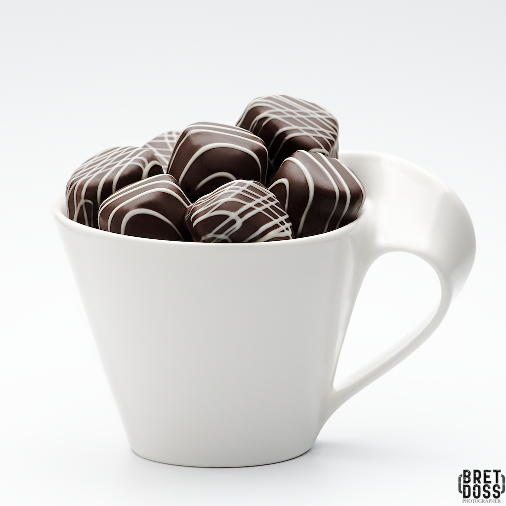
The P52 Assignment Brief: Chocolate.
“A square image that screams chocolate, with a bit of an editorial look if possible.”
That is the extent of the brief; the rest is up to me. It allows a lot of possibilities, of course, which is both wonderful and challenging. I needed to down-select from various ideas fairly quickly and begin moving forward on the assignment. Studio vs. location? Available light, studio lighting, or a mix? Include people? What type(s) of chocolate? I wanted to shoot some tabletop editorial/product for my portfolio, so that helped me narrow down the choices. I decided I wanted to create two images with very different styles: one a more graphic, light, airy, & high key and another more dark, rich, & luxurious. A few hours of set tests, prop choices, composition decisions, and I was ready to substitute the ‘real’ chocolates for the ‘stand ins’.”
Chocolate presents some unique challenges: in most cases it has a fairly delicate surface, prone to smudging, dings, & marks of all kinds. Careful handling is required to minimize these, but they are almost impossible to eliminate completely. A cool temperature on set helps prevent the chocolate from softening, which would make it even easier to damage in any sort of handling. I selected the chocolates based on the styling I wanted to achieve, and was careful to keep the “show pieces” set apart and handled them as little (and as carefully) as possible, while utilizing some ‘non-photogenic’ pieces as stand-ins when creating the set and lighting designs, making test images, etc.
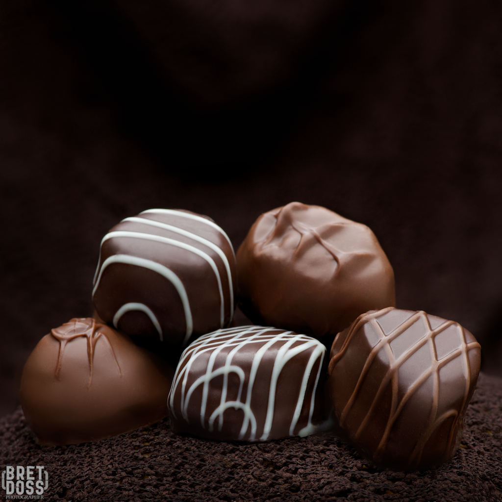
image © Bret Doss — all rights reserved
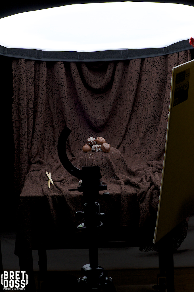
image © Bret Doss — all rights reserved
I ended up with a third image with an alternate perspective:
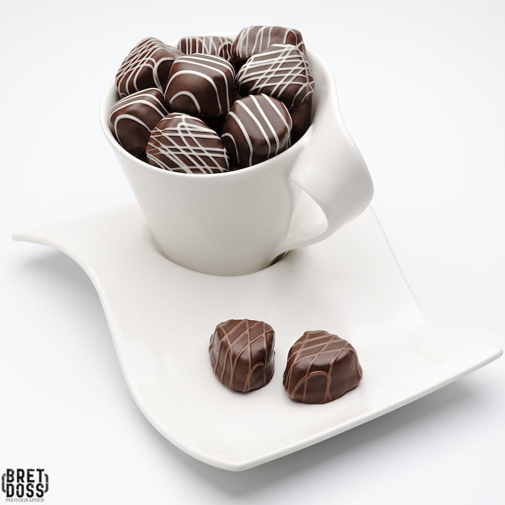 image © Bret Doss — all rights reserved
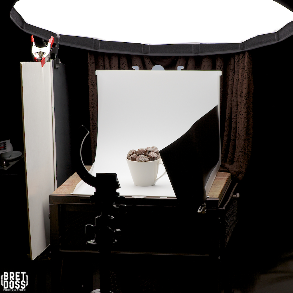 image © Bret Doss — all rights reserved
See www.BretDossPhotography.com for more of Bret’s work.

