Creating an “About Me” page can be quite a challenge for photographers. What should be included? How should it read? First person or third person voice? Should there be a client list or should it be separate. Well, let’s take a long look at a lot of those questions.
First of all, let’s take a look at the bare minimum to include:
1. who you are.
2. your expertise
3. how it(you) can fix a client’s problem
4. how they can contact you
Many sites are beginning to combine the contact information with the “About” page or Bio page. By combining the two sets of information, the site can do away with an unnecessary page or click, and make it even easier to contact the photographer without having to click away.
Did you know that the ‘About’ page is one of the most popular page on most sites? People love to read about other people, and get some idea of what it may be like to work with them. What does your ‘About’ page say about you and your business? Does it welcome the visitor in, and is that important for you?
Depending on different styles of photography, and the style of the site, the contact page must be reflect that unique style. Introduce yourself and introduce the unique style you have. Tell them a little about yourself. You can say a lot by saying a little. You can tell them a story, be bold, be humble, be yourself.
Brag. Crow. Blow Your Horn. It is important to let people know what you do and how well you do it. Don’t be over the top, but rather confident and certain about what sets you apart. If you have something that makes you special, let them know. It is vital to be clear when you set yourself off from the competition. Being witty and humorous can be a good thing. Being a jerk can be a problem. Be certain, really certain, that what you think is clever and funny is indeed that, and not dirty, snobby or condescending. Some people tell photographers to not tip off where they live so as to not chase away someone in another state or city. I am the opposite. Be upfront about everything. You can let them know you are only a few hours away by plane, and work the region, nation or internationally with ease. Never lie. No amount of overstatement can be worth it if your found out. That can be devastating.
There are so many different ways to present an “About Page”, and there are definitely more than I have presented here. Take a look at what we have, and think about how you will present yourself. The photographers below represent new shooters and established as well as a few in between. See how they do it, think about where you are and make your ‘About’ page as informative and reflective of you as possible. Social Media: The About page is a great place to include the social media that you are involved in. Skype, LinkedIn, Flickr, Twitter, Facebook, Plaxo, Posterous and more. Embed your recent ‘tweets’ or Facebook entries (unless you are very personal on those… I keep mine fairly close to business, art and photography).
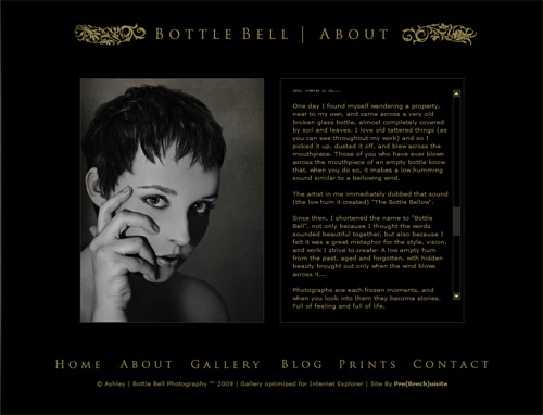
Ashley at Bottle Bell takes a very personal approach with the About Page.
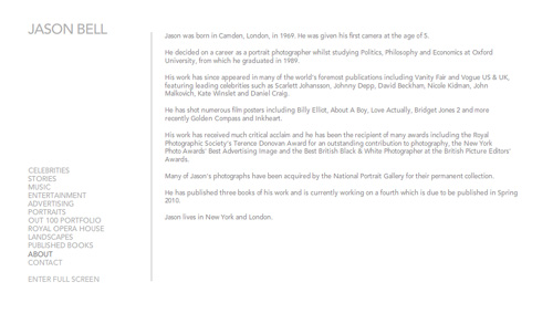
Jason Bell uses a third person approach. The information features some of the people he has photographed as well as accomplishments including published books.
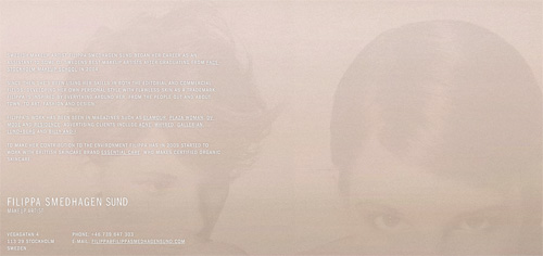
Makeup Artist Filippa Smedhagen Sund uses a third person approach with a little bio. She also adds links to clients she has worked with.
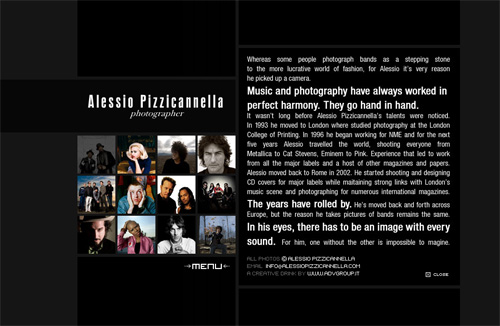
People photographer Alessio Pizzicannella takes a bio approach, also in third person. Interesting use of typography sets philosophy apart from bio.
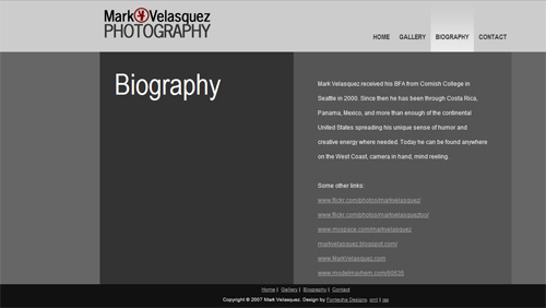
Mark Velasquez uses links to his other sites as a feature for his “Biography” page. Very simple approach.
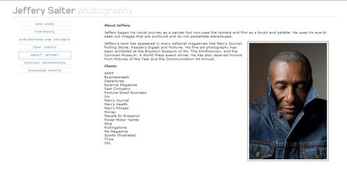
An impressive client list with a very simple declarative paragraph describing Jeffrey Salter’s approach to imaging is all he needs to make an impact. A playful portrait says something about his personality as well.
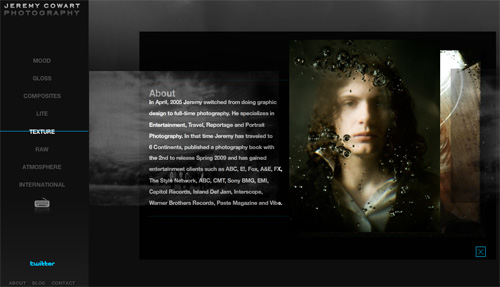
Jeremy Cowart uses a light bio, reinforces his specialties and lists a short, but very effective client list.
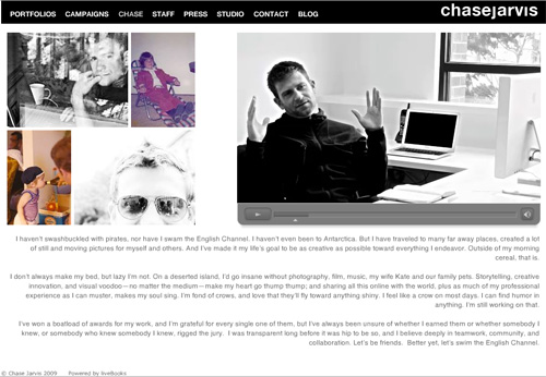
Chase Jarvis takes a humorous, personal approach to his About page simply titled “Chase”. Effective use of video gives the visitor a glimpse into what it may be like to work with him.
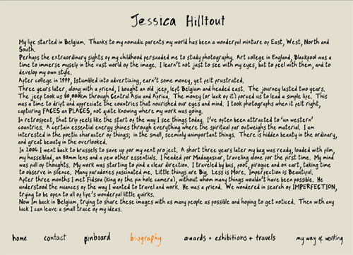
Jessica Hilltout keeps with her handmade look and does a Biography page that is first person, personal and fun to read.
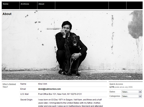
Khoi Vinh (Subtraction) is a designer with a very interesting About page. A personal and fun image set against a “resume” looking bio.
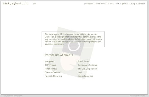
Rick Gayle uses a list of clients with statement of photographic philosophy. It is in keeping with his minimalist site style.
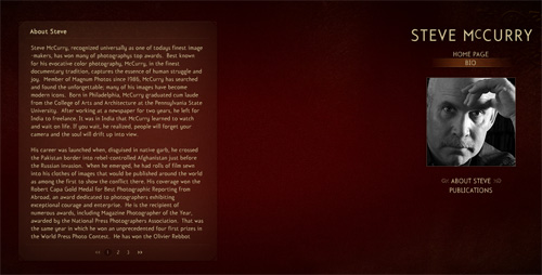
Steve McCurry takes a long, third party narrative to tell his biography. A mix of personal triumphs and client names make for a wonderful, interesting read.
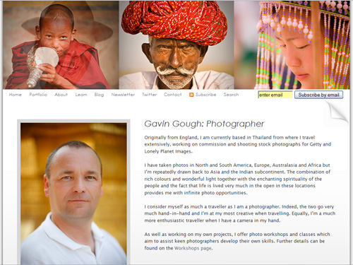
Travel photographer Gavin Gough uses a first person narrative and large photographs to introduce himself, and his work, to visitors.
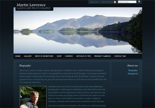
Taking a first person narrative, landscape photographer Martin Lawrence tells the visitor when and why he became a photographer.
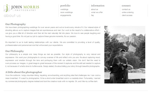
Wedding and Event Photographer, John Morris uses several paragraphs with headers to discuss his work, philosophy and personal bio.
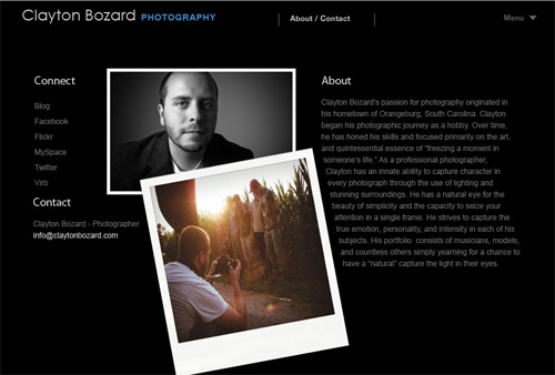
People Photographer Clayton Bozard uses a bio photo with a behind-the-scenes shot with a nice layout to go with his third person narrative. Short and sweet.
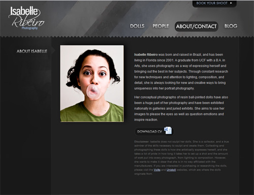
Isabelle Ribeiro photographs dolls and people. Her About Page features a downloaded resume, a third person bio, and a quirky portrait to give a little insight to her personality.
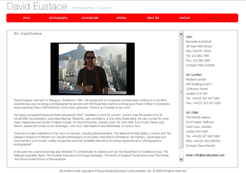
David Eustace uses a small bio page, with a simple portrait shot. Written in third person, the bio features shows and clients he works with.
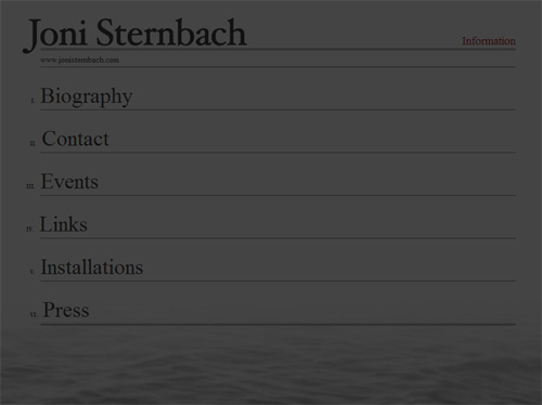
Fine Art Photographer, Joni Sternbach has a very comprehensive “About” area which is reached by a link titled “Information.”
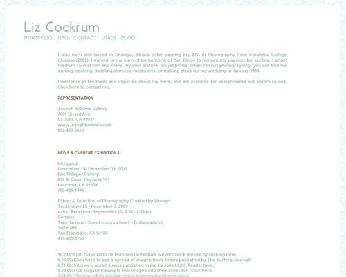
Also a Fine Art Photographer, Liz Cockrum presents a short bio, exhibition lists, representation and more on a very structured page.
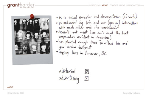
Portrait photographer Grant Harder takes a humorous approach to his About page. Note the fun and quirky image and creative typography.
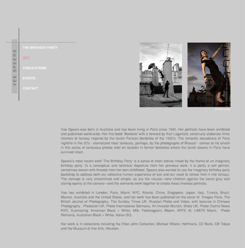
Vee Speers uses a behind-the-scenes image and the result of that shoot for her “Bio” page. Featuring a short bio and client list, the page is very clean.
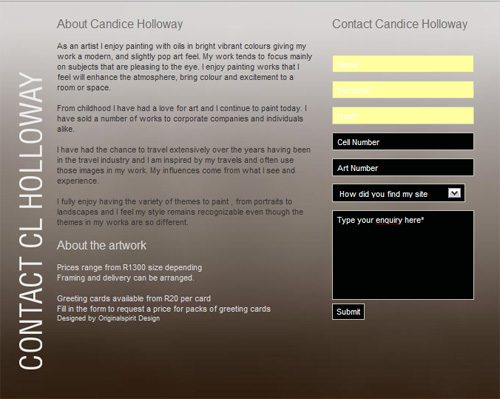
Candice Holloway takes a first person approach to explaining her art work.
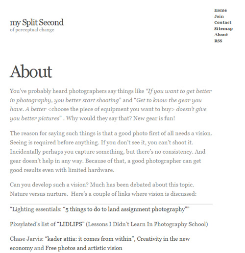
My Split Second takes a very personal, first person approach. Adding dynamic content makes the page fun to revisit.
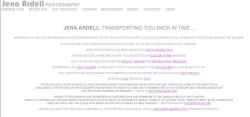
Jenna Ardell is a fine art photographer. She uses links and reviews to tell the visitor who she is. Links go to interviews she has done, galleries that show her work and clients.
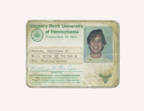
Choosing a design for a very different and interesting site, Matthew Mahon uses Photoshopped Driver’s Licenses and other ‘documents’ to intersperse his “bio” throughout the images.
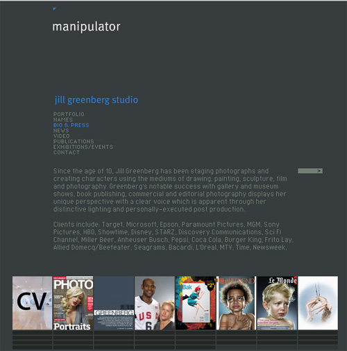
Jill Greenberg’s About Page has a small bio and tearsheets of print work and celebrities she has photographed.
As you can see, there are a lot of ways to present your “About” page. Here are some more resources for you:


This is a great article! My about me section sucks and I should probably hire somebody to write one for me. My “witty” doesn’t work as well as I want it to. Now I have some inspiration.
Thanks!
Good post Don. The about page is definitely one of the hardest parts of compiling a Web presence. I’m pretty sure mine needs a severe overhaul.
Great advice and excellent examples. I have some work to do on my lame “Bio” page. I have basic information about myself but nothing that tells a client why I am the photographer for them.
For a moment, I thought I was on Smashing Magazine. Great listings nonetheless. Thanks!
szlee… Heh.
Well, we don’t do a lot of lists here. This is the first with examples. I promise there won’t be that many. I just found so many different examples that I decided to show them all so photographers could get some ideas going.
Interesting post Don. I’m trying to work out what would be effective for the photographer just starting out who doesn’t have a client list to show or is still developing their own style. Perhaps when I develop my style and determine who I want my clients to be I can tailor my bio in that direction.
There are examples on the post of people not using client lists, or long bios. Keep it interesting. If you are doing social media, embed some of those. If you know some people who can write, have them put something together. Quote your parents… heh.
Seriously, the point is for the about page to introduce yourself and your work to people who don’t know you. Keep it simple at first (heh… mine is really simple) and be yourself. (Yeah, I know that sounds like what we have all been hearing for too long, but it is so true.)
Thanks for reading!
Great post, I should take some ques from this considering you refrenced a feature I ran on the graphic designer Craig Bower, it was a good article, but he isn’t behind pop-ology 😉 But I am taking something from this and adding a link to the about post 🙂
Great post and very good timing for me. I am having a new website built and have got to write a new About page.
John
Ok so this post finally convinced me to change my outdated bio to something I think says a bit more about me and my photography. What do you think Don? http://matthewdutile.com/index2.php#/text_4/
Well I like it. I would use a quantifier for the ‘images’ in the last sentence/first graph, and leave off the last line. Don’t make anyone scroll for a single line. Lookin’ great Matt!
What do you mean by a “quantifier?”
In your first paragraph it ends with “and particularly with images.” A quantifier would add to the statement of images like “and particularly with images of people and places that fill the senses.” Or “and particularly of fun, stylish images with the right blend of spices!”
Quantify images. That is the part you are selling and it is the part that seems singularly left out. Let me know what you think. Also sending by email.
Nice article. I’ve been struggling to create my “About Me” page on my website http:www.bukool.com. I just switch to being a wedding photographer.