Lighting Essentials LIVE: Tonight we discuss pricing strategies for emerging photographers. Log in to ask questions.
Thanks all for joining us this evening.
This post from a year ago has some good information.
Yeah… that’s right. We can actually create an impression of more power with our speedlights by carefully thinking about the images we make, and planning ahead. Photoshop gives us the edge. We will look into how this can be done after the jump.
Contest Information.
Our Winner is Rasheid Scarlett (#11 at the gallery).
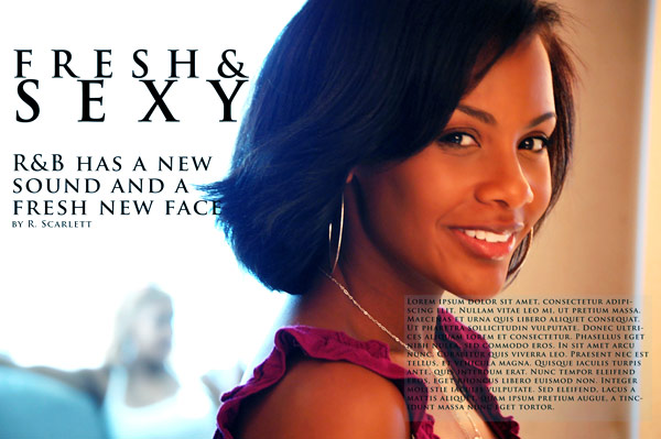
Congratulations to our winner, and thanks to all who entered. I am hoping Rasheid sees this post and sends me an email with contact information. We have a lot of goodies coming your way, Rasheid. And special thanks to our wonderful judges, Coni Bourin of Bourin Design, Ken Easley of Ken Easley Photography, and Scott Condray of Visualville. Thanks guys!
New Contest is based on this post and the technique applied here. It is a photo and Photoshop exercise that seemingly extends the reach of small strobes. I will have a contest page up by the end of the week, but you can certainly start to work on this idea now. Watch for a new Page here titled “Contests” and the prizes will be significant… including one of my semi-custom websites ready for you to fill up and get launched. We will even provide a years worth of hosting for you. More prizes will be listed as they become available. Deadline will be October 1, 2010.
As many of you know, I have been doing a LIVE broadcast twice a week for the past month. We try to make it at a time that makes sense for most of you. 6PM in Phoenix is the same as Pacific time (AZ doesn’t do DST) so that takes it to 9PM on the East Coast. I don’t want to run it any later, but I also recognize that it is a bit early for the folks on the West Coast. So we will continue with that, with the occasional changes in lineup that being busy could create… heh. I have not been recording them, as I am quite sure they are very valuable to those who attend and the exclusivity makes them even more valuable – and even more reason for you all to join us.
We discussed Blog Strategies last LIVE, and if you missed it, you missed something really fantastic. Great questions and input from our attendees and our special guest was John Ricard, NYC HipHop photographer. We also spoke at length about the changes, hits and misses, of shooting for the music industry. Here is the pre-discussion document with some good info on it.
This is a partial list of Photographers who have blogs that are written more for the clients and passionate photography fan than the amateur photographer. I think that serves photographers who are working toward getting more assignments well.
Will Steacy discusses the art of his art, as well as the things that catch his fancy. The blog features his art, and the musings of the artist as he creates.
Richard Renaldi discusses the world of photography with emphasis on large format work. He reviews shows and books and provides inspiration for the portrait work he loves. Not a how-to blog, but one of images and stories.
Jonathan Saunders (I Like to Tell Stories) the focus is on visual storytelling. A very popular blog for people who like using photographs to illustrate or define stories.
Kirk Tuck is the author of four books for photographers. His blog ranges from the practical uses of gear he loves, to dispatches of philosophy. The focus is on the thrill of photography, the nature of the business and what makes it all ‘tick’ for him.
Robert Wright, while not writing much these days, presented a wonderfully personal look into the New York editorial photography scene. His writing will make you think, and the focus is on the wonder of making images… and the difficulties of doing it for a living.
Jeff Singer shows work, discusses the business, and even chats a bit about gear in a fresh way that keeps him interesting to non-gear heads too.
Ben Huff discusses his work and how it is an integral part of his life. Lots to think about and lots to see.
John Loomis takes us through projects he is working on, shows new work and discusses recent assignments.
Now on to the discussion of using Photoshop to create a seemingly more powerful flash.
 |
 |
 |
First we will look at the technique in action in the field. Our light is not nearly strong enough to light our subject at a distance that would allow the composition that the photographer wanted. This can happen a lot when using speedlights, as they are not powerful enough to light at great distance. Adding modifiers can kill two stops of light and that makes the need to have them even closer to the subject all the more imperative.
We could have used bare flashes, but we wanted a much smaller, more interesting light. We chose a portable beauty dish for our light source for its full coverage and quick fall off.
NOTE: using a tripod makes this way easier, folks. And make sure it is a good tripod.
Here we are in Mexico. The shooter is Frank Tuttle, Columbus, OH, who was attending the workshop. We had arisen quite early to catch the dawn light and explore a structure that we saw out in the middle of a pretty barren desert area. Our model this morning was Megan – also a photographer attending the workshop – and she did a great job for us. It was our goal to shoot each of the attendees (including me – sheesh), so this one is Frank’s portrait of Megan.
Our light is a SpeedLightProKit Beauty Dish with a 430EX attached to Pocket Wizards. We had the power turned up full for this shot as the bright morning sun called for exposures in the f-14-f16 range within the sync range. Frank positioned Megan in the pose he wanted and I moved in to the point that would provide f-16 with this strobe and modifier.
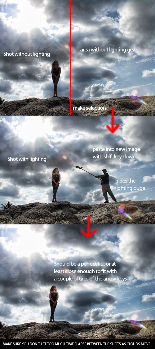
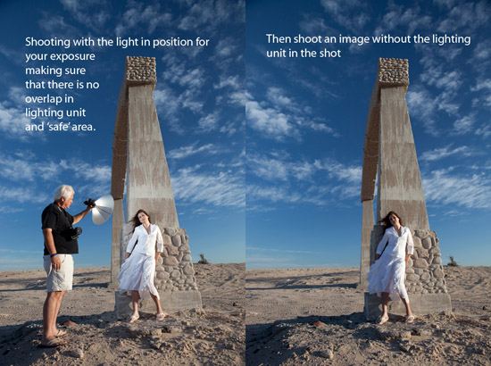
Frank made sure that the light in no way overlapped the area that would be retained in the finished work, and made his shots. Every three or four shots I would move out of the frame and he would shoot a frame without the light in it. The reason we did that with such frequency is that the clouds are moving behind her. If we had made a couple of dozen images without making our non-light shot, the clouds would have changed too much to match. Keep it quick, and make sure you keep your wits about you… There are issues beyond the shoot that are very important.
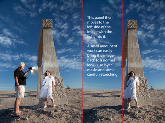
Shadows, clouds, vehicles in the background, light angle, camera angles…all must be diligently thought through as you shoot the photo. You cannot change the camera angle without making the non-light shot that would correspond. After you have processed the images, it is quite simple to select the non-light area and slide it over the lighted shot. If you hold the shift key down, the image should slide right into place.
Here is the finished shot by Frank Tuttle.
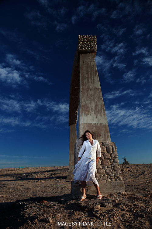
Careful blending and positioning will deliver the image as a perfectly lit photo, even though your light is not powerful enough to create it on its own.
Here is a setup shot I did of Bill Millios, a photographer from the Baltimore, MD. area. For this shot I used a different SpeedLight ProKit modifier, the ProKit small softbox. This is one of my favorite light modifiers for small strobes.
I wanted the statue to be a major force for the image, and to have Bill at the base of it. No interaction between Bill and the statue gives the portrait a kind of cinematic flavor.
This is the shot with the light unit in it, as well as the planned area for the replacement.
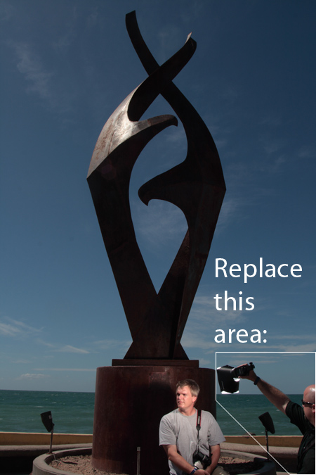
Frank Tuttle is holding the light and just after I made this exposure he stepped back and I made another image without him in it. Be very careful not to move the camera when doing this. It is really optimum to use a tripod for these shots.
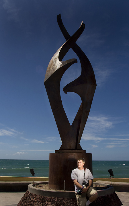
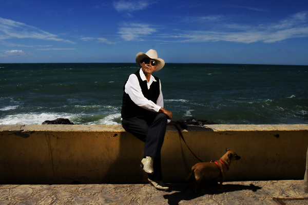
For this next shot of a gentleman we found on the boardwalk in Puerto Penasco, I had Bill come in close with the flash (same modifier as the previous image) and give the portrait a more powerful look. I liked the way the strobe lit his face with a nice soft light. But again, because we are dealing with a bright, bright day, there is no way that I could have shot this with the flash far enough away to keep it out of the shot.
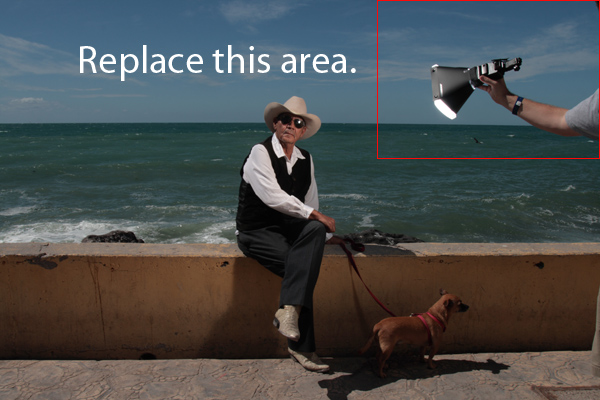
You can see how carefully keeping the light out of any difficult overlaps makes it easy to cut, drag and drop (holding the shift key down) and get it pretty close to exact, A tripod can make this nearly effortless.
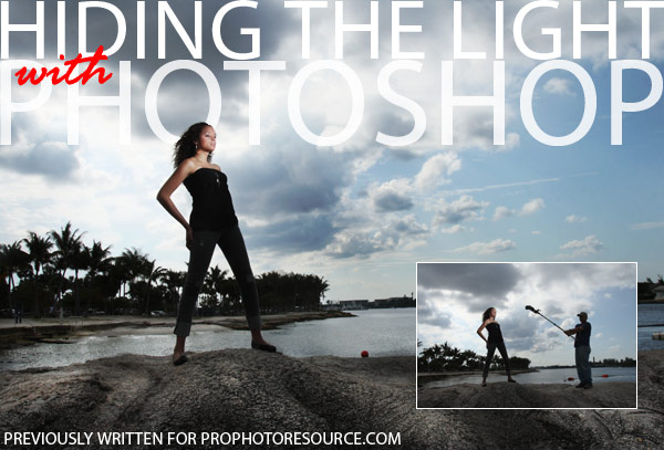
One last image from West Palm Beach. I really wanted this shot of Alexandria on the rocks. There was no way to do it with speedlights. I used this technique to get the shot I wanted.
I hope this little exercise gives you some ideas for creating images that you may have believed you couldn’t make without a ton of gear. If you enjoyed the article, let us know.
As always, visit the Learn to Light page for information on the workshops and follow along on Twitter if you are of the mind to tweet!



Re contest: Any chance of seeing maybe the top three or top five runners-up, in addition to the winner? I have to shoot to fit layouts all the time, so I’m interested in seeing various approaches to this.
http://dongiannatti.carbonmade.com/projects/2802928
sorry – thought I had it on the post. Adding now
Thanks. Several good entries, but now I can see why this one was the winner.
(If I had been the layout designer, my reaction still probably would have been, “Hey, get your subject’s decolletage out of my body type!”… but the designer isn’t ALWAYS right, especially when it’s just dummy copy!)
If you use the auto-align and Auto-Blend features in photoshop it will make this job much easier.
1. Take your two photos
a. Model + speedlight
b. Model without speedlight
2. Auto-Align your photos in photoshop to match them perfectly (even if not on a tripod)
3. get your eraser tool (or layer mask) and
a. erase the speedlight / lightstand / shadows (doesn’t have to be perfect)
b. erase the model (as she/he isn’t lit properly) but its ok to leave the shadow there as its the same.
4. Auto-Blend the two layers for seamless results.
Its ok to be sloppy with erasing the speedlight.
Photoshop usually takes the nice clean section from photo b, rather than trying to incorporate a half erased speedlight into the finished image.
Thanks Ranger 9. I see where you’re coming from about the placement of the text. I played around with a couple arrangements but this ‘felt’ best.
And thanks Don, Coni, Ken, and Scott! I really love this blog. Thanks for sharing all your wisdom!!