Hi, and welcome to Lighting Essentials, a place for photographers.
I do believe that is the first time I have used a welcome, and it had to be done. I guess. Stats show that I am getting new people all the time. Actually I was a bit surprised at all the people who are coming to the site. Thanks to all of you, and welcome, of course.
We are at the end of the workshop season and this weekend will find me in sunny south Florida. Anna Maria Island to be exact. It is the smallest little spit of land that completes the frame for Tampa Bay. At Bean’s Point there you can see the water from the Gulf of Mexico and Tampa Bay meet. It really is a pretty cool place.
We have our little band of intrepid image makers, two condos, models and delightful surroundings… all the makings for some remarkable photos. In addition, I have two professional photographers joining me for some additional insight for the students. Billy Kidd, a pro from Orlando and Chris Gerber, a pro from Minneapolis are joining us for the weekend. We will be discussing and doing photography for three days. I love that.
That is the end of 2009 for Lighting Essentials Workshops. I will spend the remainder of December working on two other projects, redesigning the workshop for next year, finishing the small book and some video. We hit it again next January with a Phoenix workshop, then San Diego and Seattle. Seattle has added two additional workshops for advanced shooters. Smaller in size and broader in scope than the regular workshops. More on this as I rebuild the workshop pages… watch for that. The new design is taking shape and I am about to get it in production.
I would like to thank the folks who took the workshop, worked as hard as they did, and sent me nice notes (and they will be on the new site, for sure…). To the models who spent long hours with us, thank you. I consider you all to be part of the LE Family.
A couple of posts that I think you should take the time to read:
Frank Ockenfels III is interviewed by APhotoEditor, as is Sam Jones. Rob also interviewed my friend, Selina Maitreya. You can find her audio interview with me here.
Speaking of Selina and her incredible MP3 Audio Program… did you know that as a reader of this site, you can save half the price of the program? Yep! Visit her site at “The View From Here” and order the series. Normally it is $199, but enter FOSLE at checkout and receive $100 off the price. I believe it may be the best hundred bucks you have ever spent in photography – especially if you are an emerging photographer looking to find a voice and get noticed.
Heather Morton continues to follow two entry-level photographers as they build their books and their business. This is a wonderful project, so if you visit, be sure to leave some comments for these two guys who are working so hard to give others a glimpse ‘behind the curtain’ so to speak.
And if you haven’t kept up with the Going Pro section here at LE, take a few minutes to bookmark the posts. There is something for everyone.
Well, let’s take a look at a few of the images taken at the Toronto Workshop.
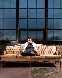
First up is this shot of Krista on the couch in Adam Belnap’s wonderful new studio outside of Toronto, CA. Brick walls, windows… check out those windows, and an environment around the building that makes it a shooter’s dream studio.
I am drawn to this image for a number of reasons. I love how they (the team that Ian was on) took the lines of the floor and the window and used them as a graphic element. The windows do not tilt inward and the line that is part of the flooring leads directly to the middle of the couch. Graphics! Found and used.
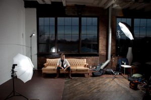
Lighting it proved to be a challenge… there’s a lot of reflective glass there. As I teach in the workshops, they built the lighting based on an agreement of what the shot was supposed to look like (in their minds) and how they were to achieve that look.
Starting with the key light from camera right they used a bounce umbrella to control the spill and to deliver a smooth wash of light over the subject. Careful placement and angle of the umbrella assured there would be no reflection in the window. This can be painstaking work or you can sometimes get lucky. I think they worked this for a while.
Adding a second, fill light from camera left was an interesting compromise between the tools they had at their disposal. They decided that the shoot thru umbrella provided the soft, center weighted light they wanted so it was added. Keeping it low enough to not be seen in the window, and high enough to not cause a ‘Halloween’ look was worked out.
Test shots showed they needed to add a kicker light to sparkle up the shot. A bare speedlight was added to camera left, slightly behind the model and to the side. The power was dialed to be a little less than the key and fill, but the angle let it give a nice highlight to the shadow side of her.
Here is Scott Martin’s image from the team shoot above:
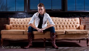
His horizontal approach and interesting pose brings a different look to the lighting setup above.
The dark brooding sky adds a nice, mystical touch to the image. The symmetry of the lines all leading to the subject and the poppy, glamour lighting make for a great shot.
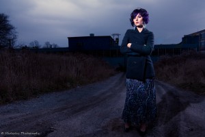
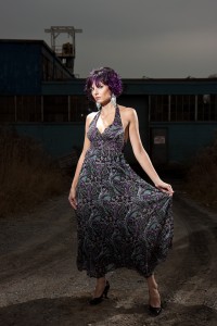
Next up is a shot by a group working with Aleksandra. It was getting to late afternoon and the clouds were really dark and menacing. They chose to shoot her on a dirt road that lead to an industrial building in the background. Again there is a group of three shooters.
Keeping the separation of all that dark clothing against that impenetrable dark background was one of the challenges. Posing Aleksandra was not. She was wonderful, as were all the models in Toronto. Amazing. Hien used three lights to keep the subject lit and also for some drama.
Using the road as a compositional element to lead into the subject (and then mysteriously fade behind her) the group set up their key light on a stand in front. Zooming out to form a pool of light on her face, they then positioned it to Hien’s camera position to make it slightly, ever so slightly, off axis to camera left. This light gave the front light for her face. The light was then manned by a human to keep the axis of the light on the axis of her nose to eliminate any cross shadows.
A second light was added to camera right, slightly behind the subject. It was also bare and above the models head, angled down. Set to the same exposure as the main light, it also had to be flagged to prevent flare. This light separated her from the background very well.
Adding the third light on a human boom (and as you can see in the photo below, a very handsome human boom – heh) set to the same exposure as the other three and aimed to slightly graze the subject and throw some light on the road behind her… this added depth to the image and kept it from being too flat.
This is the setup shot for the image above:
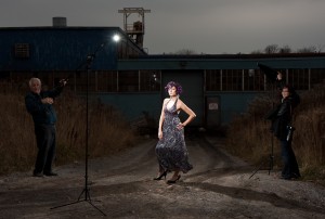
Photo of the setup by James Harmon.
James Harmon’s shot above uses the same basic lighting, but a change in lens, angle and the use of the camera right third light changes it up quite a bit. A little light spill across the front of her and the dramatic zoom effect of the key light add a bit of lighting drama to this image.
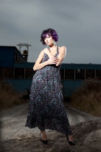
Karen Weiler took this shot (above) of Aleksandra with the same basic lighting. She changed up the side lights a bit, and moved the subject to dead center of the road. Adding little graphical elements like that can make a shot have purpose. She moved camera right side light to be a little less on the subject and to add just a little to the shoulders. She had the light aimed up, so it wouldn’t spill too far down the dress. Camera left’s side light was moved to more fully light the background. As in the shots above, the key light is handled to make sure the axis of light and her nose are straight on.
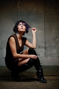
Sometimes a single light is all you need. Navy Nhum was working in a freight elevator and wanted a dramatic shot of Aleksandra. She chose a single umbrella in bounce position to ‘pour’ the light over the subject without spilling it all over the elevator.
The pose of the model, the surroundings and the patina of the old metal elevator all lent themselves to a dramatic shot. The choice of the bounce umbrella meant that the light could be controlled and not light up the elevator with a flat light. You can see how the natural gradient gets darker as it goes up the wall. The bounce umbrella’s black backing made the light flow where Navy wanted it to flow.
Here is the setup shot from Navy’s photograph:
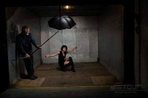
(Hmmm that damn handsome human boom does get around, ya know)
This shot of Heather, one of our models who is also a heck of a photographer, was done by Ian’s team.
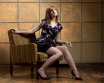
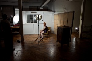
This group worked really hard on this set of images. They found a spot in the adjoining store room to Adam’s studio and set this up. The main (key) light is my wonderful SpeedLightProKit Beauty Dish. It was set first to give the light they wanted to use to create the overall shape to the image. Adding a shoot-thru umbrella for fill from camera left provided the basics to the lighting. These lights were adjusted to give a 2:1 ratio for the model.
They added a light for her hair and it was set on a stand and brought from behind the background, and from camera left. Getting that light to stay in that position was a challenge met by leaning chairs and gravity.
Testing the shot, they found that the image looked pretty good, but lacked some real pop. A fourth light was added to come through the semi-transparent background right behind her. This shot took on a new life with the addition of that last light.
Again, I love the symmetry of the shot, the graphical look of the piece and Heather’s ‘S’ curve against all that symmetry. Below is the setup shot for this image.
A few more images with brief descriptions.
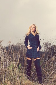
Navy shot this image with natural light from camera left and a single strobe for blending (matched) from camera left. A soft, cross process look to the presentation delivers a very romantic image of Hailey.
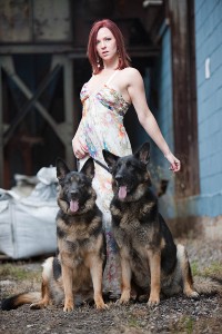
Karen shot this image of Krista with two canine admirers. She used a speedlight in a shoot thru umbrella for the main, keeping it a little above the ambient. Adding a second shoot-thru, dialed down to match the main, for a hair light added a nice, subtle separation to the subject.
One more image from Ian. This shot was done with two speedlights.
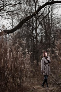
A speedlight from the camera right, and a speedlight from camera left, behind Krista presents an interesting shot in the woods. This split lighting creates nice drama for the environment.
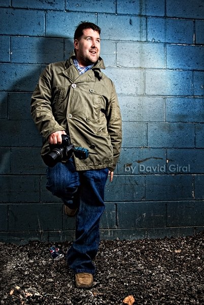
And thanks again to the amazing Adam Belnap, captured here by David Giral in a rare moment of repose.
I may add some more images to this post in the next 24 hours, so check back. I am expecting a bunch of images in soon from the Toronto shooters.
Thanks for a terrific workshop, Torontonians. I look forward to returning next year. I am working on my schedule for next year this week, so the signup starts soon for the first half of next year.
See you soon on LE, folks. And thanks for reading. If you would share this with friends I would appreciate it. You can use the social icons on the top right of the page to send it to twitter or del.icio.us or whatever.



Wow, the quality of work that comes from your LE Workshops is just tremendous!
Wow Don.. just wow. I always seem to come away from your site knowing more than before. I have said it many times but the amount of information you give away for FREE is just amazing. I know young and starting photographers like myself really appreciate it.
I can’t believe I missed this workshop. I didn’t even know about it until a few days after. I’ll hopefully catch you in 2010.
I’ll be back Alan. September, 2010.
Thanks for the feedback on a couple of my groups setups and for including one of my pictures. I loved the workshop!!! I will be keeping my eye on your dates for next year. I’d love a second session once I have more experience under my belt.
I’m completely blushing. Don, thanks for featuring *four* of my photos (six if you count the setup shots). That’s a real boost to the confidence. For the record, the “team” Don mentions alongside my photos included Scott Martin and Tom Legrady. The lighting setups were a collaborative effort. The light through the semi-transparent painted window behind the picture of Heather was Scott’s idea, which completely made the setup.
very good work! nice, greetings from Poland!
Alan
I highly recommend Don’s workshop. You need two days to absorb some ideas, try them out the next day, and get some feedback. As well, it was much more participatory than other lighting workshops I’ve been to. And working with models was an important component for me, it sn’t something I’ve done, and was nervous about getting started with. You know, don’t have any photos to show, how do you get a codel to give you a shot. I made dozens of mistakes, so I won’t make those, any more, and still wound up with some great shots … http://tomlegrady.smugmug.com. Thanks for the account, Don.
One thing I’m wishing is the workshop included some Photoshop/Lightroom component. With models you’re generally going for a glamour / fashion look, which is not quite the same as my usual workflow. The material I’m finding online is mostly about how to turn a photo of an attractive woman into one of an artificial mannequin. While I don’t mind removing a scar or blackhead or even a freckle that’s too intrusive, I don’t want to turn the person into some fantasy object.
There isn’t actually time in the two-day workshop, maybe it could be an optional third day … gives you a chance to look at the images together, process images you took, with all your mistakes, rather than something the teacher provides.
I attended the Nashville workshop, and Don spent time with us after the class to show us photoshop tips and to go over some of our pictures. I enjoyed his class so much that I plan on attending a class in 2010.
Set up one: “A bare speedlight was added to camera right…” camera left surely, going by the set up. Correct me if i’m wrong.
Yes, of course.
Bad typing.
Fixed now – thanks for the heads up.
Appreciated.
— don