This post looks at creating an ad from a very simple layout. The client, Dimensional Software in Palo Alto, CA, needed to have an ad produced in nearly no time. An opening in a magazine came up last minute and a fax was sent to me with a sketch of the ad that we had talked about.
We will take a look at how the shot was done, and how making the layout a part of the planning and thinking process.
A reminder to check out the recent posts below for links to some great interviews, lighting information and ideas to give you a lot to do with your photography. The tag cloud on the right, below the banners, also is a great way to find out what is on the site. You can spend all day here, LOL.
Also, you may have noticed the banner on the right side. Midwest Photo Exchange has teamed up with Lighting Essentials to provide a page of hand-picked (by me) lighting gear. From pack/head kits and mono lights, to stands, booms and reflectors, this is a page with some best-of-breed equipment chosen for durability and value. And my readers save 10%. Just click the link to see what is offered.
So, let’s get on with it and see how the ad was created in a very short time.
My client, Gerrie, and I discussed the look and feel of this ad. We had no time to do it but decided we would get it out the door by the end of day. She notified the magazine and we went at it. A discussion of what the featured item was supposed to portray followed. I wanted to know everything about the TapRecorder and why it was an important thing for a volleyball coach to have.
Gerrie explained that this device and software eliminated the hand-written notes, stickies and such, that coaches were using. Gerrie, also a coach, knew the pain and what it would take to eliminate the pain… so we began the design process.
We wanted to feature the software, and we wanted to show visually how the software and device would contrast the messy paperwork of doing it by hand. By placing the hands with the device over a mess, we could show the contrast it was hoped.
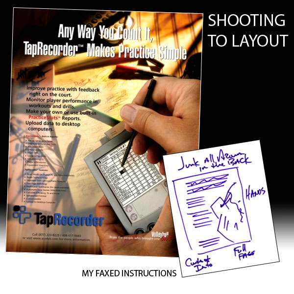
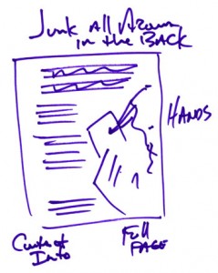
Gerrie and I worked with fax and ended up with a quick, ‘napkin’ layout. This is used to keep us both on the same page, not necessarily a heavily designed layout. I work with both, this is a sketch for position.
While there are much tighter layouts out there, these kinds of sketches are done a lot. And they convey a lot of information to the photographer. For instance, we know that there will be headline type at the top of the ad, and that there will be body copy on the side opposite the hands. Copy and type can be a real challenge… color of background, ‘overly busy’ background, or light-to-dark contrast that makes it hard for copy to read.
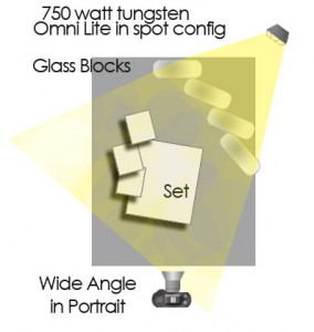
I began setting up the shot on a small table. Placing the camera at an angle to the board that creates a foreground/background. Choosing the wide angle lens, a Canon 21-35L at approximately 24MM gave me a nice sweeping feel. I try to get an idea of the lens choice and angle and then build to that when doing product and still life. It is just how I work most of the time.
The lighting needed to look like it was natural and real. I took a softbox first and was disappointed with that light… seemed to boring and uninteresting. My second thought was to grab four of five glass blocks and put an Omni behind it in ‘spot’ configuration. Ahh, now I had light coming from the back and some dramatic shadows driven toward the camera. This gave me a much more interesting background.
I took the props and started to build the layout, keeping in my mind where the type was going to go, and where the hands would be. I knew there may be some challenges as the client wanted it to be very cluttered and have type over it. But I had my idea for that already in place so I went ahead and created a pretty dense mess of stickies, charts, and all the rest of the background. We wanted it to look messy and show the contrast, so sometimes you go overboard to drive the point home.
Taking a few exposures at auto white balance showed a pretty warm color from the tungsten Omni. I changed the color balance on the camera to Tungsten and took a few. I was shooting in RAW, so I could have done it in the processing, but I wanted to see what it looked like on the camera. I decided to shoot at both color temps which would be quicker. The shutter speed was long at about 1/4 second.
Building the set was time consuming and I spent a little over an hour working the light and the props till I had them where I wanted them. At that point I took the shots.
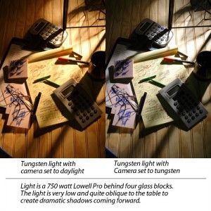
You can see the difference in the color here. For me, the warm is too warm and the cool is too cool.
Now I had my background. And I moved to the shots of the hands. Should I shoot them with the background or separately? If I was to shoot them with the background, I would have to light them separately and work the shot to have a drag shutter with the hands in strobe… that could be very time consuming and even a little motion from the hands could create a shadow around them.
Separately – it was a no-brainer decision.
I began looking for some hands. I called a few models I knew and timing wasn’t gonna work. I had to have the shot done by noonish to get it ready for the magazine for end of day delivery. I checked with the people in businesses near me. Scars, bad hands/nails… sheesh.
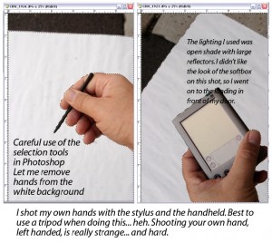
I did it myself. Moving to shooting on a softbox I did a few shots but the light was very hard to do with one handed shooting. I couldn’t get the fill to come in tight enough cause it was my hand… argh. So I decided on natural light. It would look more ‘natural’ anyway.
I took a white board and two fill cards outside, I set up in the northlight of the studio and set the fill cards in close. Shooting the left hand with the device was fairly easy. I held it out in my left hand and tripped the shutter with my right. The camera was of course on a tripod. However, shooting my right hand with the stylus proved, well, challenging. I was twisted like a pretzel to get it right. I had to take several of those to get it right.
Placing the white board behind the hands meant an easy cut in Photoshop. You can see what I did in the shot below:
Notice how the wide, broad light of the north sky makes a wonderful highlight on the device. Also notice how I turned the angle to get the top right and right side dark in the left hand shot. That is because the right hand would be placed over it. It would not look natural at all if the highlight continued under the right hand. The right hand would naturally cast a shadow, so I had to take that in mind with these shots.
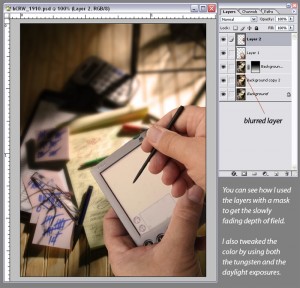
Quickly using the magic lasso tool, I grabbed the hands from both shots and moved them to their own layers. I used a feather of 2 to keep the edges a bit more natural. At this point, I retouched the hands and cleaned up the device.
The shot above shows the beginnings of the ad as it starts coming together. I used two layers, one soft and one sharp, and a layer mask with a gradient to create the DOF fall off. This further moved the hands into a position of ‘subject.’ I also blended some of the warm background image into some of the cooler image. I think it created a more interesting and rich background, and makes the hands and the device all that more interesting.
The hands fit perfectly, so all I had to do then was get a jpeg screen shot from their device and add it to the shot. Using the transform tools I was able to take the screenshot and carefully place it on the device. I lowered the opacity to about 80% and that let a little of the sheen of the original shot come through and looks more like it is a device screen. A moderate amount of Photoshop blending at the edges and we had it.
Next, I had to add a logo (so that I could keep it transparent) and also the lightened area for the type. Placing the logo on its own layer means that I can move it if necessary. The lightened background area was created by the marquee tool, with a feather of 75. Choose the area I wanted and fill it with white. I then lowered the opacity to a place that felt good and gave it a try. I tweaked it a couple of times to get what I wanted.
Next was to make a copy of the Photoshop file as a flattened Tiff and get it into the page layout program. I was using Quark at this time. I use InDesign now. I still have Quark for some legacy clients, but all my new work is on InDesign. Placing the Tiff in the background, I placed the headlines and copy into the document and sent it for review.
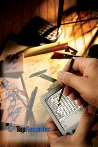
Here is the final background. You can see what we did to the image to get it ready for the text.
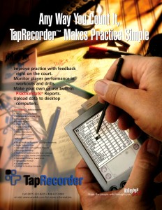
Here is the final ad as it ran in the Volleyball magazines.
Thanks for coming by. We will have another post on shooting to layout soon. That layout is far more detailed and presents a different set of challenges. Please remember to visit my sponsors BorrowLenses.com, Mighty Imaging, SmugMugPro and MPEX and see you next time.
If you are considering a new website, please take a look at our WordPress Themes for Photographers.



Shows me how much I have got to learn….you now can always fall back your hand modeling if things go south..
Yeah… the world needs another model… heh. Thanks Yarg.
I don’t know if you know this about me Don, but I was a leading hand model in Bosie Idaho for many years. Only left that sweet gig to come out to Phoenix to fuflll my dream of being a calf model. You should have called me.
Great article. Unbelievable how quickly you put together such a professional looking ad.
Oh… now the inside of my eyes are burning… burning I tell you.
Thanks Jimmy…
I would have done this much differently.
(Pregnant pause to deceive listener into thinking it’s criticism of Don’s work)
Not that my way would have been usable at all. (Safe money on NOT) LOL
Great job Don.
I’m almost there. (HA!!)