BEVERAGE WORKSHOP ASSIGNMENT EIGHT
BRING IT ALL TOGETHER WITH UNIQUE SHAPES AND COLOR

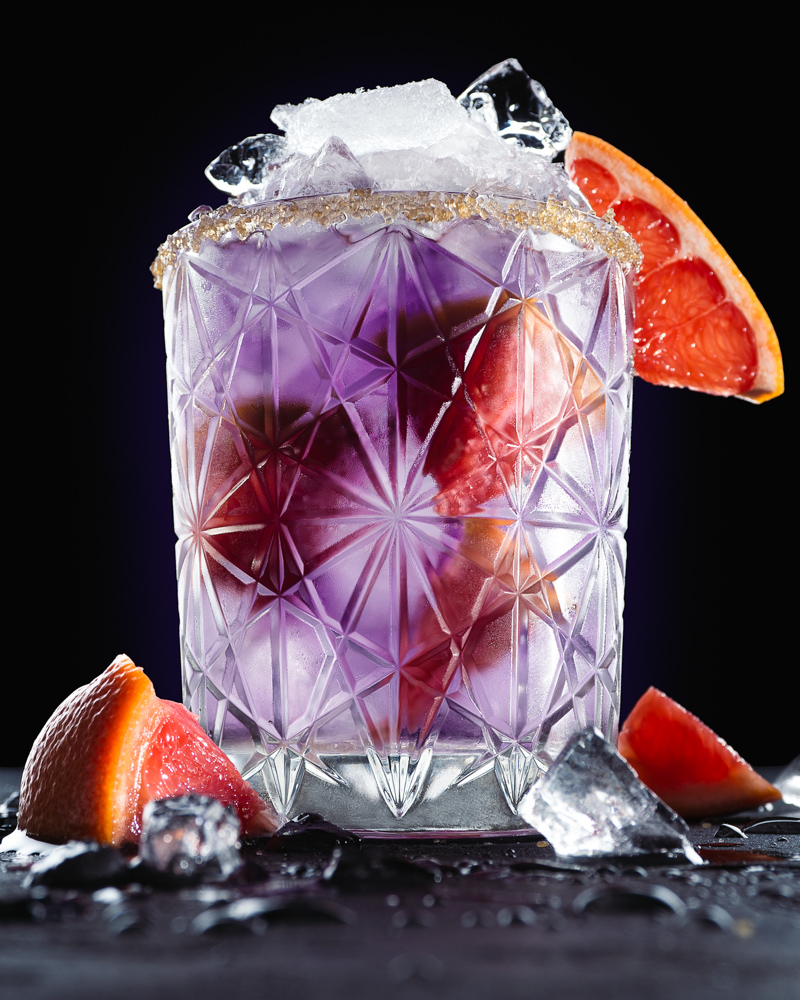
PHOTO BY LIGIA CUEVAS JOHNSON
Here we are at the end of the workshop. I hope you have all enjoyed your time spent here and have learned a thing or three about shooing stemware, adult beverages, and table top photography in general.
Now we bring it all together. Everything you have learned to make a colorful, interesting, and ultimately engaging photograph.
We do that with light.
We do that with composition.
We do that with camera angle.
We do it with POV.
We do it with color, shape, and dimension.
We do it with a strong concept, excellent technique, and our own style.
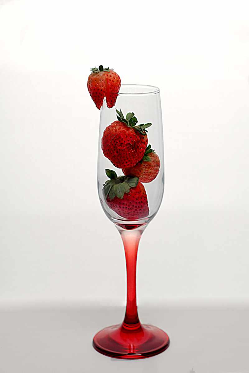
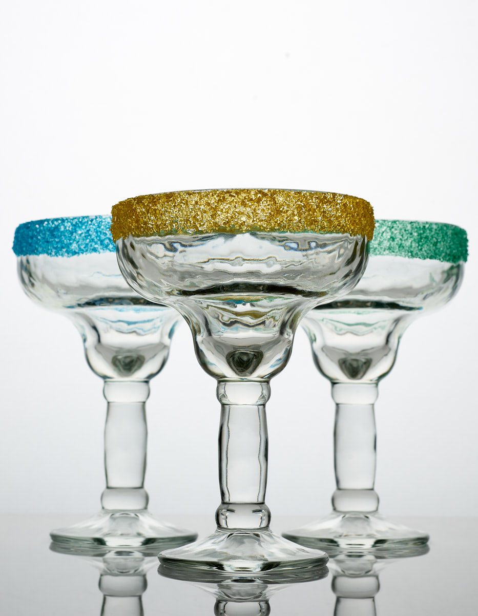
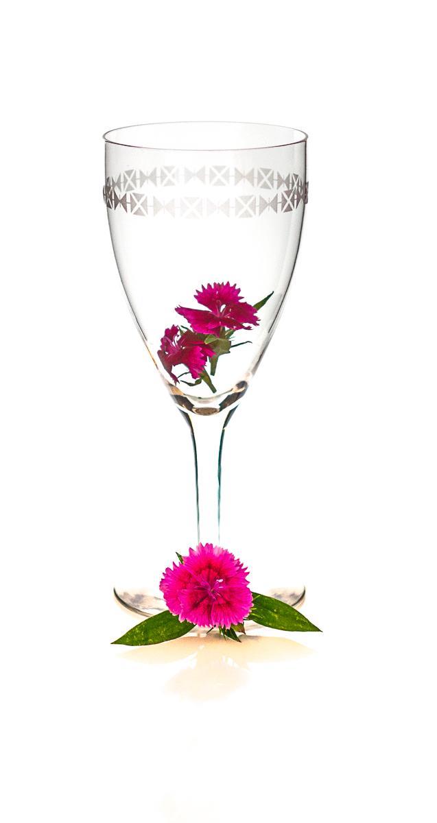
I suggest that you get some inexpensive stemware from the Dollar store(s) in your area. Or find an old, antique glass or clear mug. A selection could be cool, as well, several different shapes could be used to show context.
Food color or Easter Egg dyes can be blended into lovely hues to define the glass.
Use everything at your hand, everything you have learned, to make a shot that will make us gasp.
Photoshop can be utilized to add color, textures, and more. This is YOUR photograph.
BEVERAGE WEBINARS
THIS LINK SATURDAY MORNING
9 AM PACIFIC, 10 AM MTN
Upload two images into the Facebook Album with the review date on it.
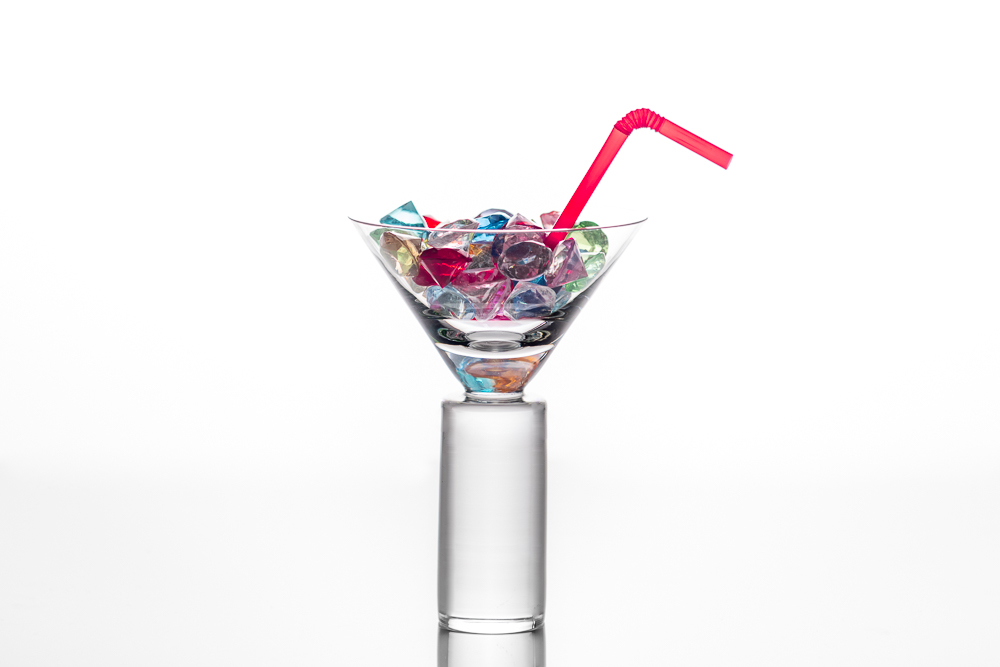
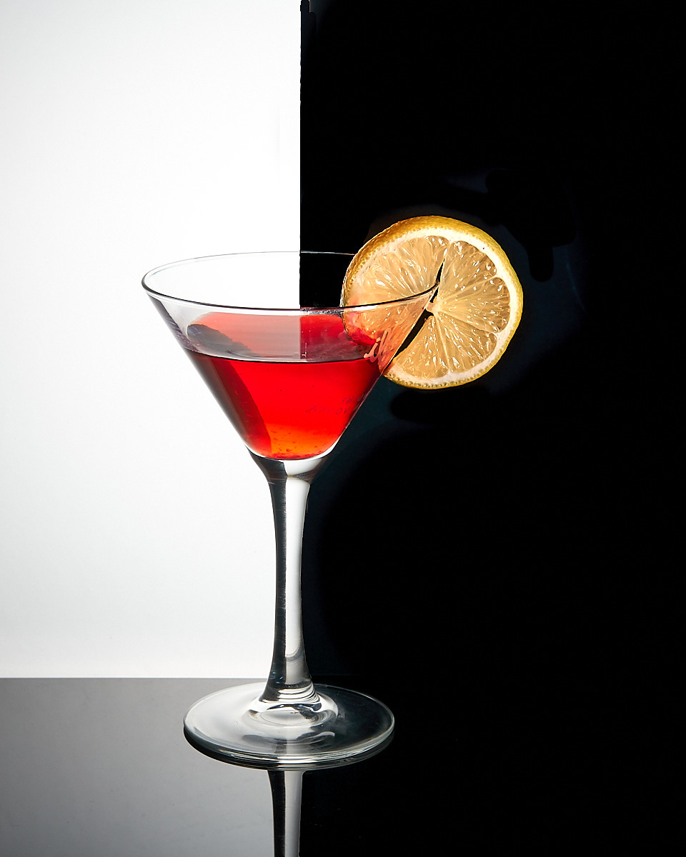
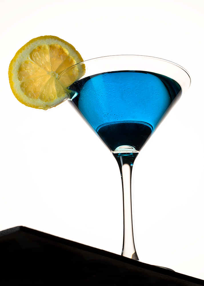
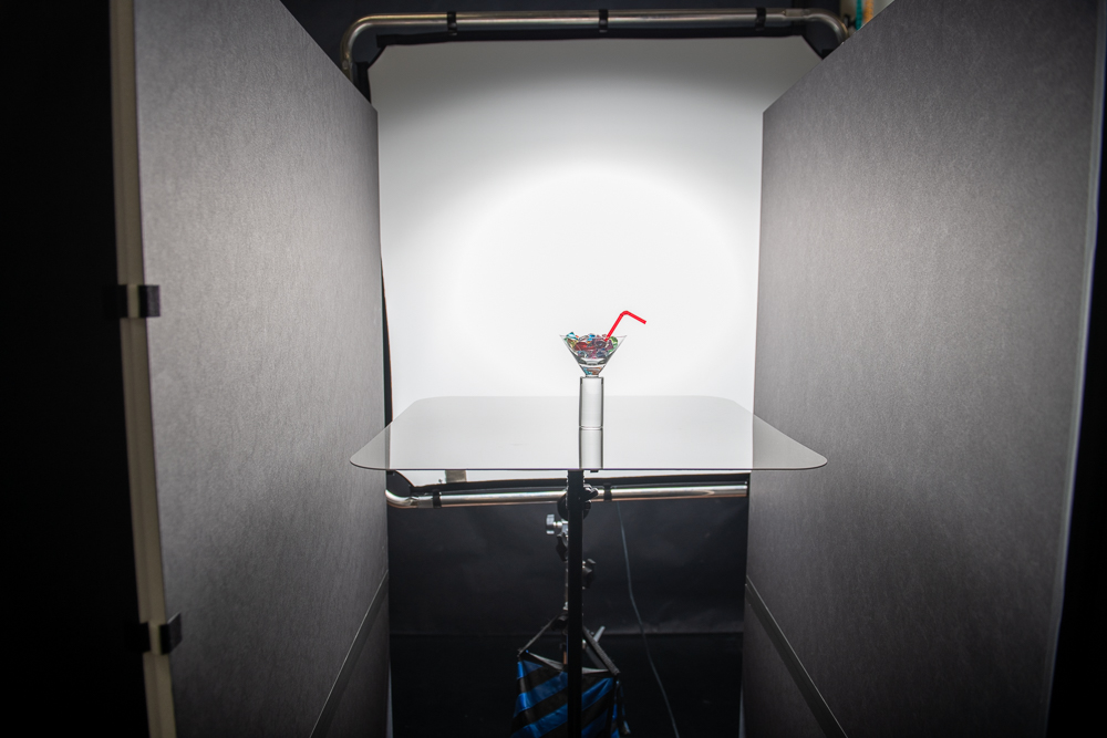
This delightful shot by Cliff Ferguson shows us how a simple lighting scheme can present a killer image. Using two soft reflector boards instead of bright white ones or pure black ones, he got a large, soft dark edge that doesn’t go too dark. The lovely colored items in the glass seem to be delicate and bright.
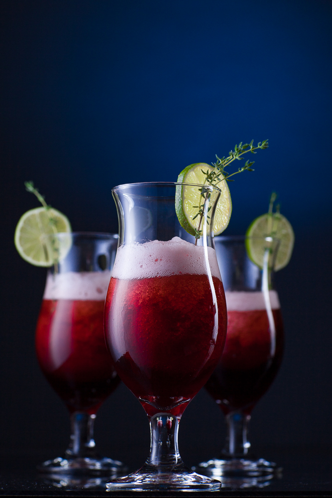
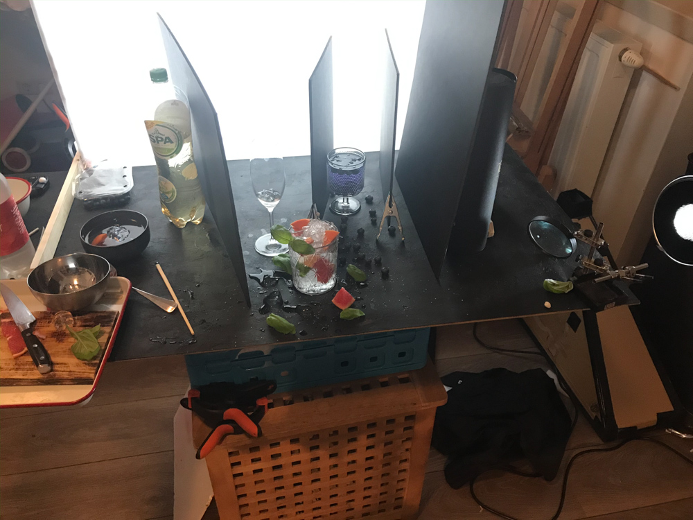
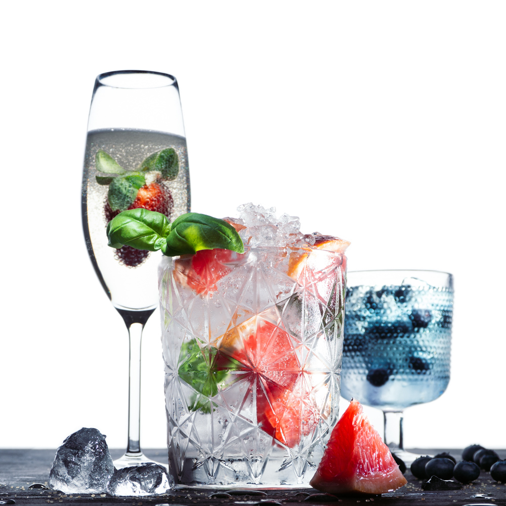
Timo Van Aanholt shows us a very complex setup within a bright-field lighting base. Note how the dark boards on both sides of the blueberry glass help it stand out from the background. the center dark card (taken out in Photoshop) also adds a dark edge to the tall strawberry glass. The resulting light on the forward glass produces a gradient look across the etched glass. Notice the POV that Timo worked with. It is a very low camera angle that results in a very low horizon.
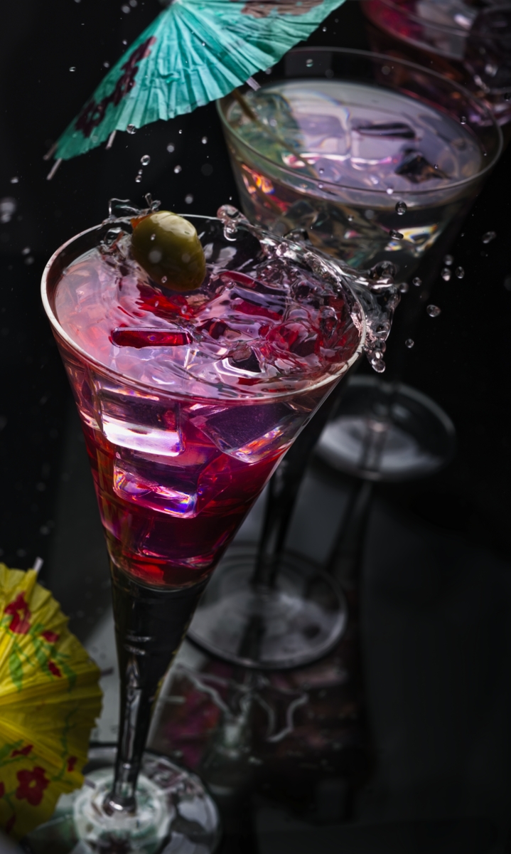
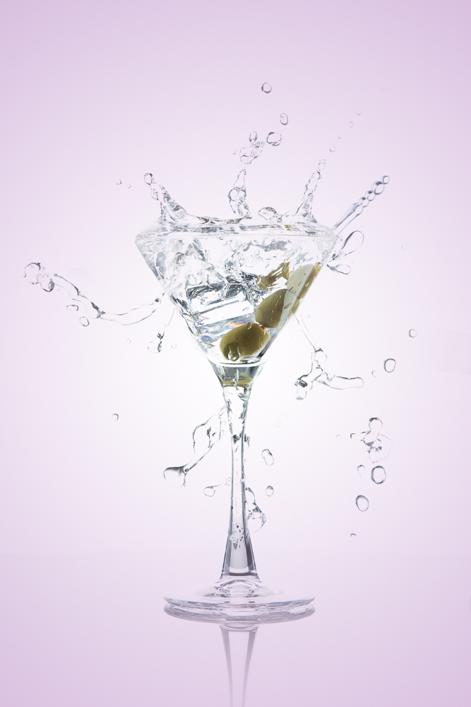
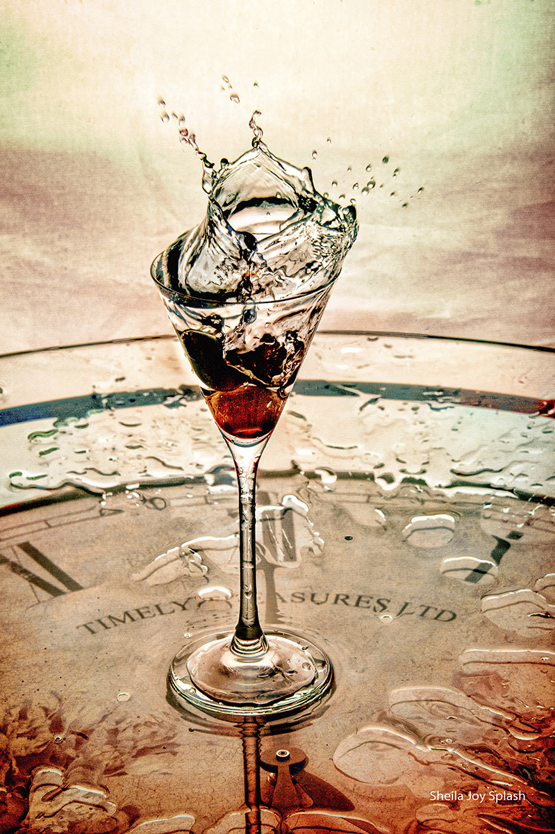
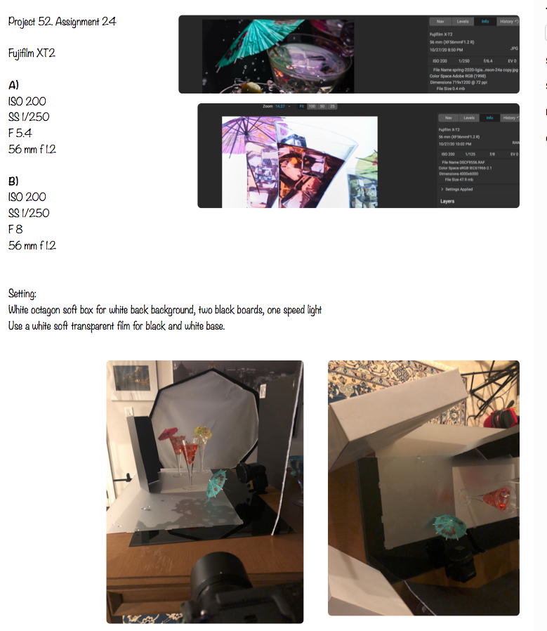
A beautifully crafted shot by Ligia Cuevas Johnson shows how powerful the highlight on the top of a beverage can add to the texture of the entire photograph. Le has a few little tricks up her sleeve by using what is effective dark field lighting from a different angle. The addition of the splash drops adds another level of fun to the image.
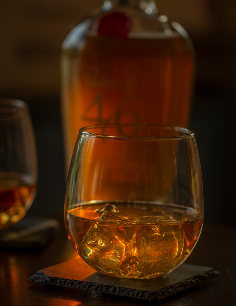
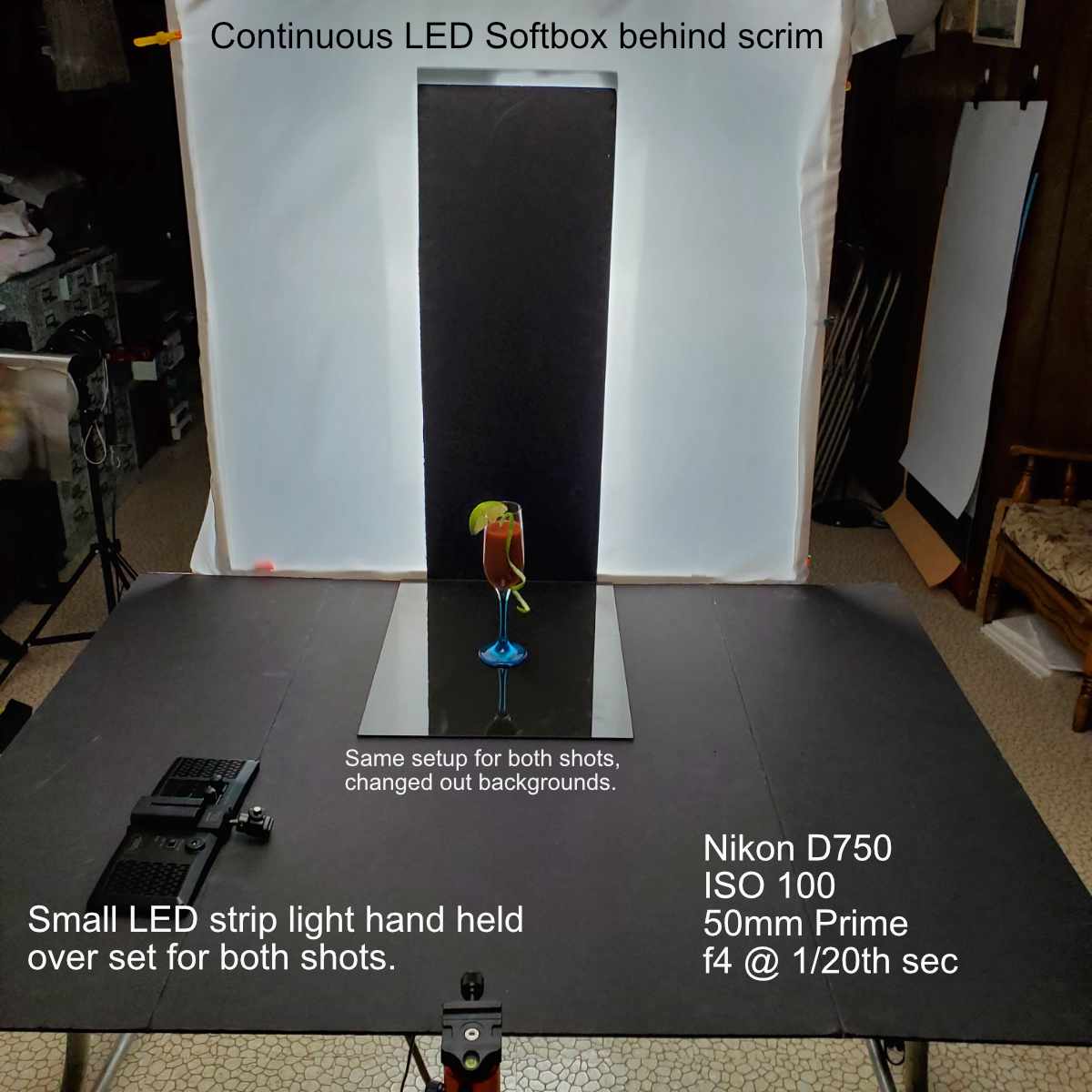
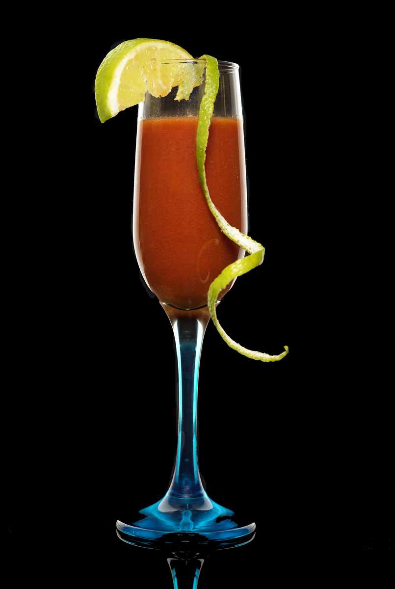
Loen Gietzen is using continuous light to create his image. A basic dark field lighting setup gets a boost from a hand-held LED light. Essentially, the light is used to add a touch of backlight as well as to light the peel that flows down the side of the drink. In addition, the handheld light opens up the color of the tomato juice without forcing light through it. If that could be done anyway.
Creating a Gradient
5 Tips for Better Beverage Shots
REMEMBER:
The images are to be put in an album on the Facebook Group Page. The album will be available starting after the current review is completed.
Make sure you upload the photograph and the behind-the-scenes photograph.

