The assignment was to focus on textures and patterns for backgrounds or surfaces.
These photographers created images that blended texture / subjects together to make images that are compelling and draw the viewer in.
Let’s take a look at the images.
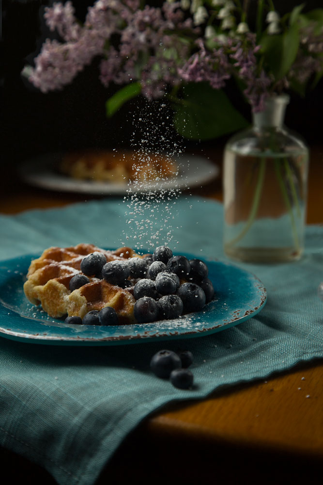
Barbara Schweighauser created a beautiful still life, complete with compelling light and a moody presentation.
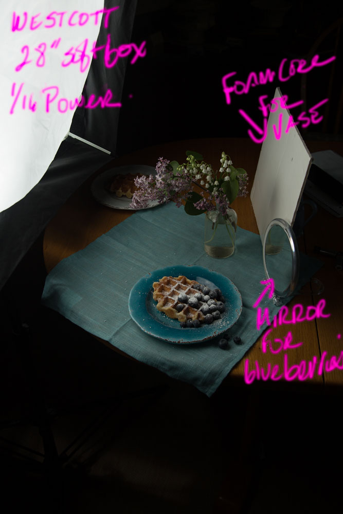
Barbara used a large light source in very close but at low power for a soft presentation. Barbara determined that the light needed a bit of a kick from the right side. Adding a fill card gave the ambient a bit more shadow detail, and the mirror gave a small, crisp edge to the side.
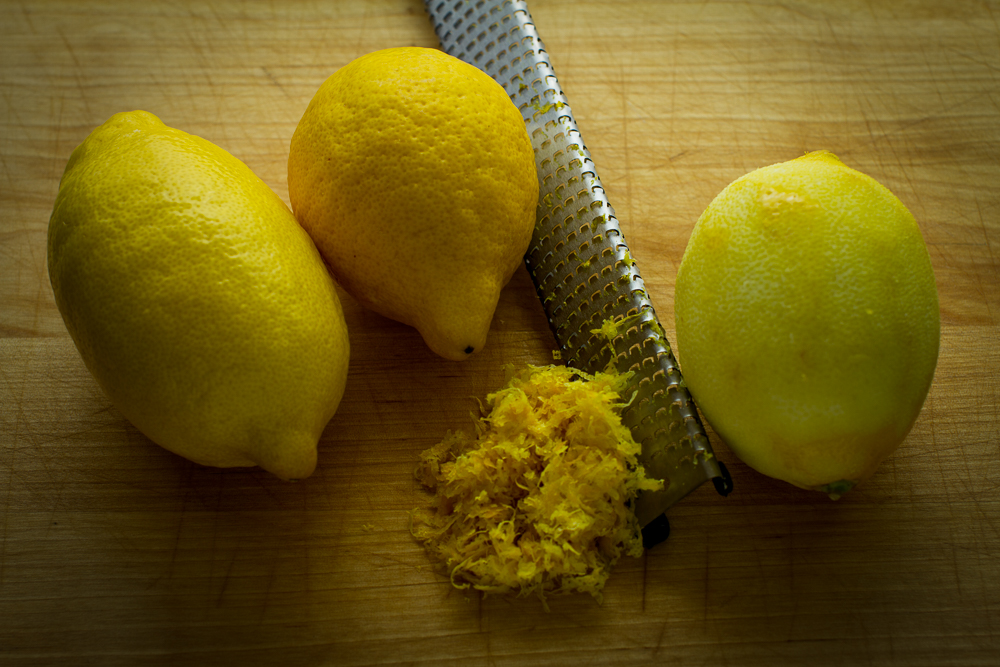
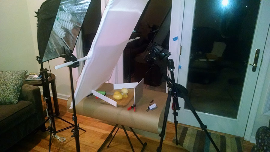
Greg Pastuzyn chose a shot of lemons, with lots of added textures on both the surface and the props.
Using a scrim with a softbox behind gave the textures dimension. A fill card up front balanced the shadows out. You will notice that Greg uses a scrim for the main light, and a continuous light behind the scrim. Continuous light is a very inexpensive source for doing still life work. Since the subject is rarely dancing around, longer shutter speeds can be used. Consider a set of inexpensive continuous lighting for making still life imagery.
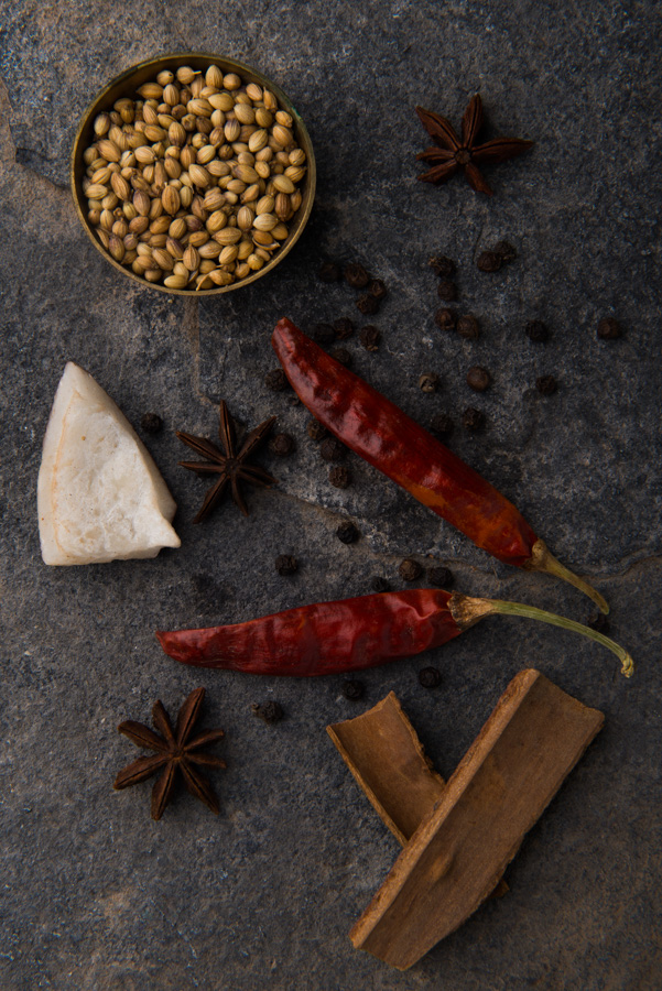
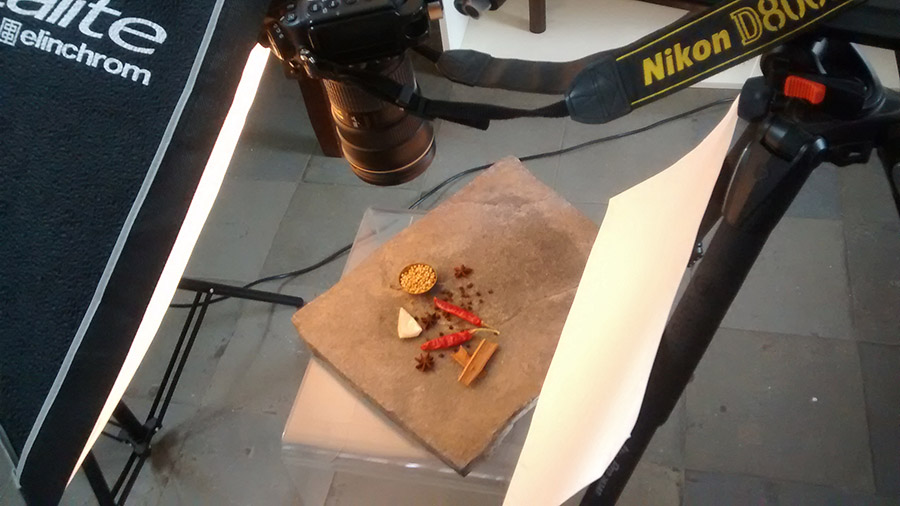
Lavanya Reddy wanted a deep-toned image with detail in the subject matter and background.
A large softbox in close, with a fill card for shadow detail gave soft highlights down each side of the items. A fill card opens up the shadows to bring the ambient contrast down. But even with the lowered contrast from the fill, the texture is brought out and we can almost feel the slate and peppers.
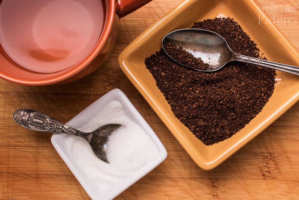
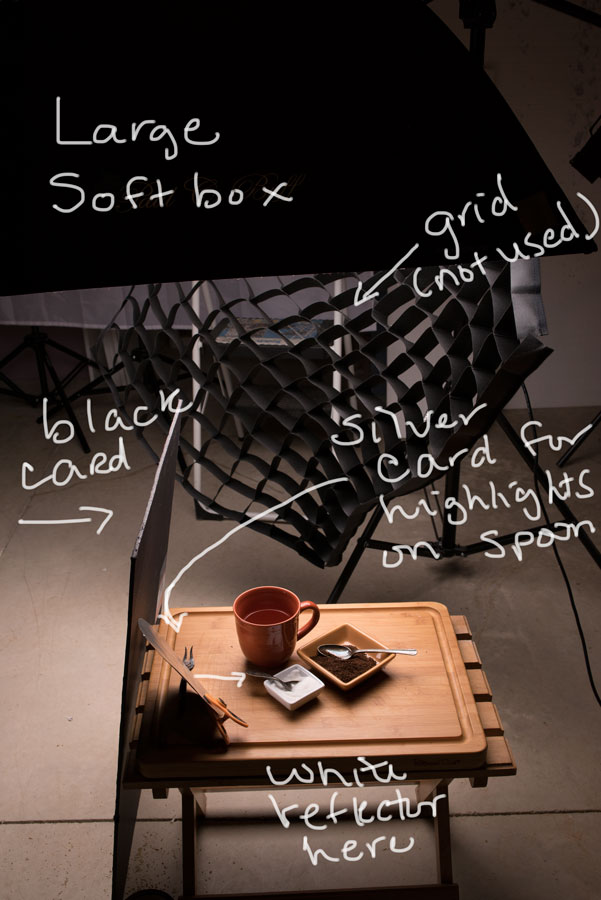
Lily Dale chose a lot of different textures to reveal in her subject and a used cutting board for her background. From the liquid smooth coffee already brewed, to the coffee grounds the textures of everything allows the viewer to get a sense of what the ingredients must feel like.
Lily chose a soft box above the set, and removed the grid. She then added a white card for fill on the front, and a black card to give a negative fill (add contrast) to the left side of the image. This helps the sugar be seen down to the granular level.
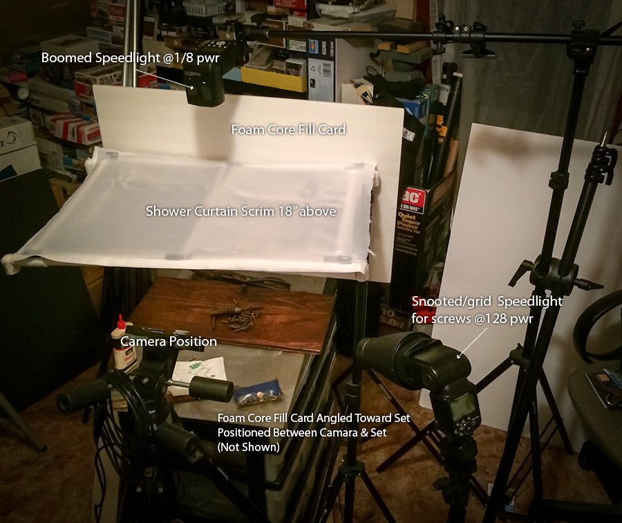
Phil Kirshmeier’s image of fasteners and an old tool shows some great texture.
Phil uses a DIY scrim to give the ambient exposure and clean highlight on the tool, while his speedlight with a grid and snoot on it gives some great texture to the screws in the foreground. Building a nice scrim for still life is neither expensive nor difficult. I think you can see from Phil’s shot that it can be made with very simple materials.
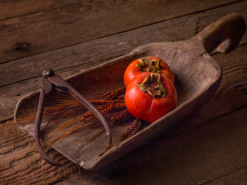
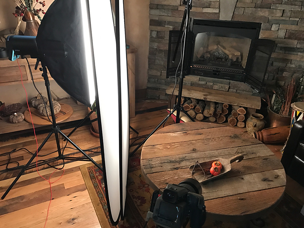
Liz Carmel used a very soft side light to present the differences between the smooth tomatoes and the rough-hewn wood.
Placing the softbox behind two large scrims gives a distinctly soft lighting with a lovely soft specular highlight on the efficient tomatoes. As you can see, the scrims are very high, and by doing that the light actually wraps around the subject and creates a very soft edge to the shadow. And the shadow is far less contrasty than it would be if the light was smaller and not as tall.
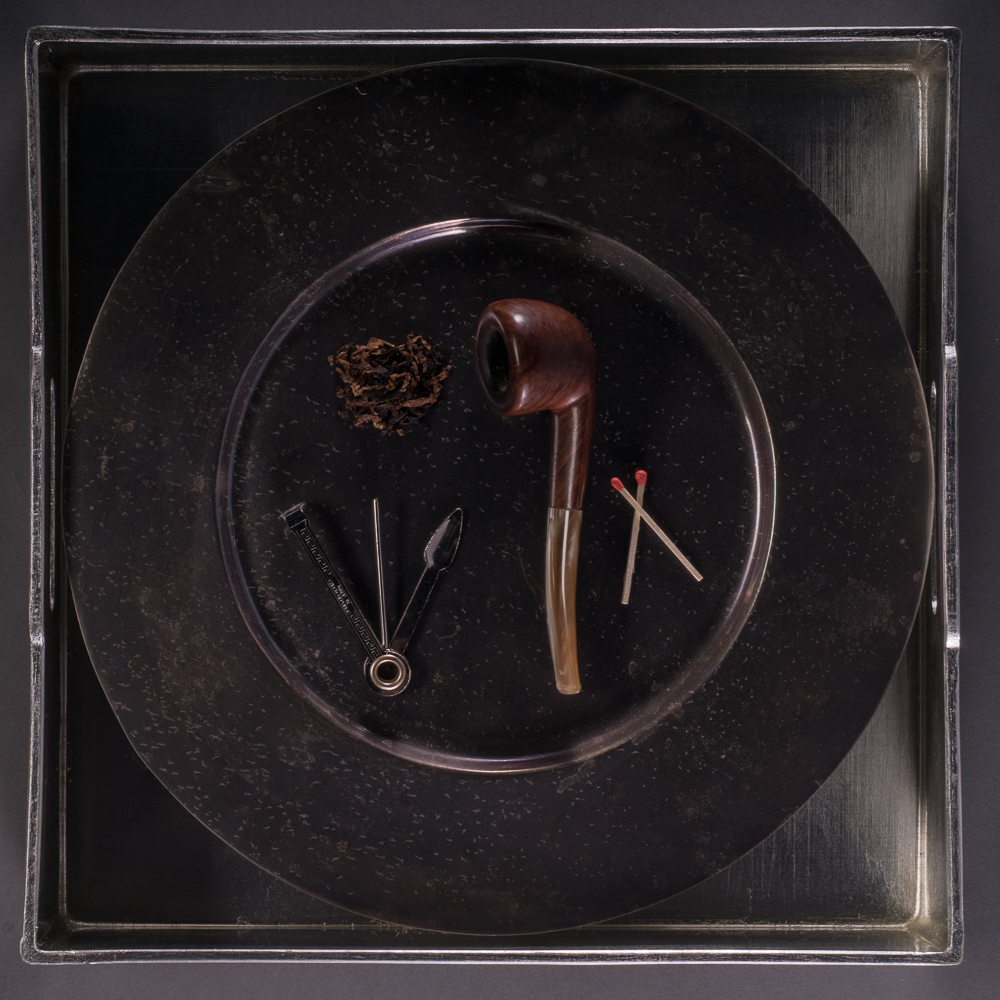
Ivan Singer’s still life give the subjects several highlights to draw the viewer in. Many times the creation of multiple highlights will make the viewer stop and check out the textures.
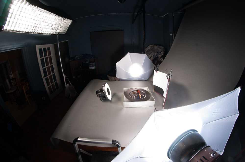
As you can see from the lighting shot that he used four different lights to create the different highlights that ring the plate. The multiple highlights create a very interesting image. Whenever there are multiple highlights it creates a visually different image from what we normally see.
Have you wanted to take a look at the Project 52 workshop without committing for a year?
Well here is your chance. An 8 Week Project 52 Pro Membership is ready for you to get into - NOW. And it is the full deal. All of the resources, assignments, reviews, webinars and more are there for you to work with. This is NOT a truncated offer, but a full opportunity for you to take advantage of the most unique photographic workshop on the internet.
Real-world assignments, with art direction, layouts, brand ID info and more. This is shooting just like a commercial photographer in any city shoots. And it is an introduction to a lot of different genres, styles, challenges, and subject matter.

