We haven’t done a lot of Photoshop tutorials on LE, but I plan on doing more. The amount of requests I have been getting tell me that there is a lot of interest. And we will be responding.
This tutorial shows you a simple way to add a texture to an image. As with almost anything dealing with Photoshop, there are a lot of ways to get to the same end. This way is mine and it works very well for me. I hope you enjoy the tutorial and have some creative ideas in mind.
Before we get going, here are a few websites where you can get some great textures.
DesignFeed
100+ Textures for Design
And here is a great collection of texture tutorials.
And here is a great list of Photoshop Beauty Tutorials courtesy Smashing Magazine.
 There are a lot more out there, try Deviant Art for one, and even Flickr has a couple of forums where textures of larger size are offered free. Look around for some cool ones you like.
This week will find us in Omaha (June 6, 7, 2009), and then we will be heading to Missoula and Chicago for workshops. If you are interested in taking a workshop, consider the Lighting Essentials workshops for a fantastic weekend experience.
Check out our previous posts:
An Interview with Kirk Tuck, an Austin based commercial photographer.
Shooting an Ad from a Sketchy Layout.
Mixing Ambient with Strobe: Seeking Balance.

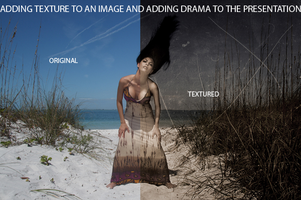
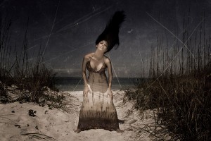
The photograph of Vanessa on the beach was shot during the Anna Maria Island workshop this winter. We were at the tip of the island, and it was mid-day. I liked that little passage of sand and grass so I placed Vanessa in the middle. Lighting was added with a 430EX on 1/2 power on a pole over my camera and just out of the frame. The strobe and the white sand helped open up the shadows a bit. I had Vanessa throw her hair for a dramatic gesture. Working with a wide angle lens, the sense of “place” was brought into the portrait. I knew when I shot this image that I wanted a textured, desaturated look to the final print.
Now let’s take a look at how I added texture to the image above.
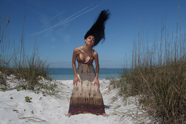
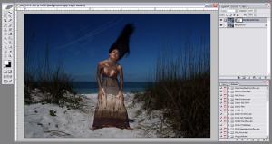
First we have the original file of Vanessa on the beach, straight out of the camera.
It is not a bad shot, but it isn’t the shot I saw in my head when I was shooting. Digital is flat, and that needed to be corrected. I wanted the surreal look of her pose and gesture to be heightened by the presentation with texture and a desaturated, muted color look. I knew that I was going to do some post processing on the image and add some texture to give the shot some context. I knew what the shot was going to look like before I started shooting it.
First I duped the layer and set the blend mode to softlight. This enriches the color and adds some saturation, but it also makes Vanessa too dark. (Drag the background to the new layer icon at the bottom of the layers pallet. Blend mode is found at the top of the layers pallet.)
Wanting to get Vanessa the subject back to a more natural exposures, I added a layer mask to the top layer, and painted her back with a black brush at 30%. It took some time, but with careful work, it reveals the lighter color below. I worked the image until I got it the way I wanted it. You could choose to use other tools to bring her back, this masking is the one I use. I am slow and deliberate. If I reveal too much, I can undo my work with a white brush.
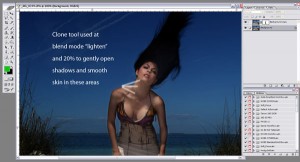
At this point I did the editing on the face and body. Using a clone brush with blending mode set to lighten and the healing brush, I was able to clear the face of anomalies and open the shadow a little bit. I wanted the face to look great without destroying the cool look that the sun had added. Shadows are important for this shot. You can do this on a layer above the shot for a non-destructive working method, but I sometimes skip this part when going for a texture look. This was minor work and didn’t take long. We will be doing a Photoshop tutorial on face retouching soon.
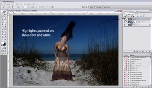
Thinking that the skin still looked a little flat to me, I added a new layer above, filled it with 50% gray and set the Blend Mode to “Soft Light”. With a soft white brush set to an opacity of 8% I gently lightened the arms and shoulder areas, and opened up the shadow area. Be very careful and work slowly to build the look you want. I normally use between 6 and 8% and build the highlights up gently.
I then created a new composited layer to keep working (control / alt / shift / e). This lets me go back to the highlight layer and make adjustments and replace the composite layer if needed. You may not need to do this, and can continue with the layers as is. It is something I chose to do at this point.
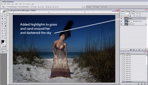
I added some highlights to the reeds, clouds, sand and other small areas with the white brush. Changing the color to black we added some darkness to the sky. Remember to keep that opacity low and use a large and soft brush. Work slowly and diligently. It is better to add the highlights with several passes than with one big gesture.
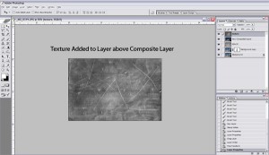
Open a texture that you like. You have some choices to make at this point. You can leave it as full color or change it to black and white. You can work with it any way you like, and you should experiment with the different ways to use the color in your textures. For this shot, I am using it as a monochrome image. After you have the texture where you want it, drag it over to your image, adding it to the top layer of the file.
Size the texture layer down to fit or do what you need to do to make sure it covers the entire image. When you have it ready, double click it to apply the resize and move to the next step. You could resize it before bringing it to your image file, it is up to you.
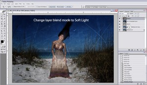
Set the Blend Mode of this layer to Softlight. This blends the texture into the image. It is not looking all that good to me at that point, seeming rather harsh and over the top. We can control that with our next move.
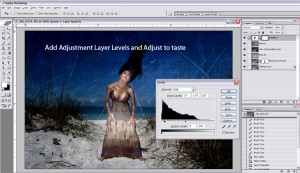
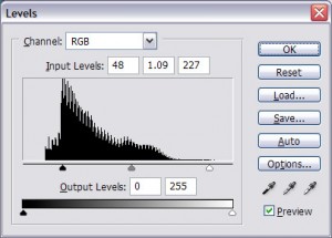
We then add an Adjustment Layer / Levels and adjust it to taste. I like to keep the midtones depressed a bit and lower the highlight adjustment as well. I want the texture, but I don’t want it to be too overwhelming. Flattening the dynamic range seems to work well for my work.
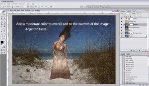
At this point I add a color layer. I used a very faint orange/yellow color and then lowered the opacity down to about 30%. Try different colors and opacity settings to find what looks good to you. I shifted the layer down for effect. You should experiment with the layer placement of the color. Don’t be locked in to where it is placed in the layers, try different places for a different look.
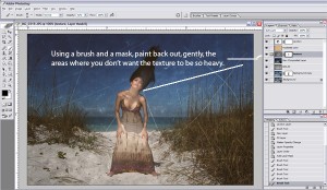
I added another mask to the texture layer and with a black, soft brush, painted the texture back to reveal non-texture in those areas that seemed to much for me. I also lowered the opacity of the texture layer down to about 60%. This reduces the amount of texture and makes it seem more a part of the image.
I readjusted the adjustment layer Levels at that point. You may or may not choose to do this, but I did. Many times I will readjust at this point after adding the color and doing the reveal. Slight tweaks, but important as well.
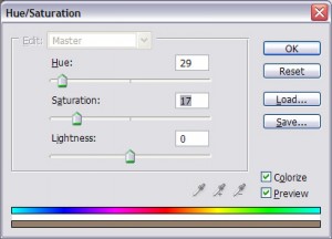
Adding a Hue and Layer Adjustment Layer, I created a sepia look to drain some of the color from the image. I wanted a more subtle hue to the image. On Hue and Saturation, check ‘colorize’ and adjust the sliders to get the sepia look you like. You can desaturate a little here if you want.
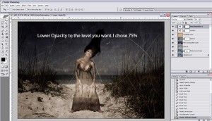
The image looks like Now it is time to lower the opacity of the sepia layer until the image looks like you want it to. I dropped mine to about 55% for this look. I added another layer filled with 50% gray and with a soft brush added a bit more highlight / shadow. This is optional, but it is something I like to do… just tweak it up a little.
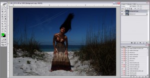
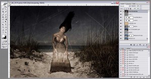
Here is the final Photoshop file. You can see the layers and how it was assembled.
And this is the final image.
Hope you enjoyed the Texture tutorial. See you next time on Lighting Essentials.



great tutorial… thanks enjoyed it.
Quite informative tutorial. Thanks for sharing.
Regards,
image masking
Great tutorial as usual.
Interesting to see that you left the same amount of texture on the subject as the rest of the image.
Would you ever reduce the texture on the main subject/model to give the image a bit more pop?
Hi Richard,
I did in fact lower the texture on her face a small amount. However there are times when I will take the texture off the skin areas to allow the subject to have more of a presence. It can sometimes just come down to that single image and how it looks. This image is one of the few images where I let texture be so much a part of the subject.