I am an old school film guy. It’s true.
It’s also true that I have embraced and love digital. Seems to me that photography gained a whole new set of tools with the addition of digital.
Of course, many folks treat everything they do as some sort of ‘team’ affiliation with nothing but disdain for the ‘other’ team.
Never sure what to say when someone starts down the “I only shoot film cause digital sucks” path or the “digital rocks and film sucks” road. I try to understand why anyone would want to limit themselves and remove choices, but I can’t.
So I usually think to myself… “well, that’s kinda stupid”.
Sorry.
One of the things that got me interested in photography was the fine black and white print. Sure, color was fun and all… but black and white just seemed to speak to me. The monochrome image would translate shape and design and texture and line and… well, so many more things. They would be translated into my brain as a abstract reality.
People aren’t grey. Skies are not black or grey or white. Where the color was lost, much more was revealed. The B&W portraits by Watson and Elgort, Avedon and Penn, Mapplethorpe and Ritts transfigured the ‘real’ world into something that seemed to transcend the reality.
At least to me.
A color shot of Cindy Crawford nude on the beach (NSFW) would surly have been nice, but when Ritts shoots her with the sand on the skin and the light playing shadows… well… it is MORE than Crawford on the beach.
Much more.
What that means to each of us is different of course.
Some people would prefer their photography to be in color. And I do indeed shoot a lot of color.
But if for some reason I had to choose either black and white or color to shoot for the rest of my life, I would choose black and white.
Hands down.
Thank goodness I do not have to choose, as I love to shoot in color. I love choices. It lets me exercise that other creative muscle; decision.
When shooting in black and white, many decisions must be made.
In film day, we had all kinds of choices that forced us to make decisions. What film, what ISO, grain, non-grain, format and more.
Then we had to process the film.
D76 or Microdol? What dilutions would be best? Do we push or pull based on exposure, placement of highlights and shadow detail?
The decision process based on the knowledge of different mediums and processing choices.
With digital… not so much… but still with choices and decisions.
Where do we “place” the exposure to keep the skin alive? What about colors and separation and density and how will the sky work? With digital, there may not be any need for color filters to help us darken the sky (red) or lighten the trees (green) or make a darker sky, but not black (yellow). But to make a good black and white photograph, you should at least KNOW how those things work.
So you can work those magic sliders with more finesse and understanding.
And that’s fine.
I still shoot some film, and still get to have those wonderful choices and make those decisions. I recommend learning to shoot film and picking up a nice medium format camera and a lens or two. It can be almost Zen like standing in the dark shaking stainless steel containers with pieces of film cooking inside.
Heh.
My approach to black and white was always more personal than color. I touched my black and white. I made ALL the choices. And I had to live with choices that were made poorly.
Yeah… it happens.
In portraiture, my first concern was skin tone. I wanted the skin to glow, and the eyes to be bright and accessible. I wanted the values to show the modeling of the light, and the contrast of the tones that shaped the face.
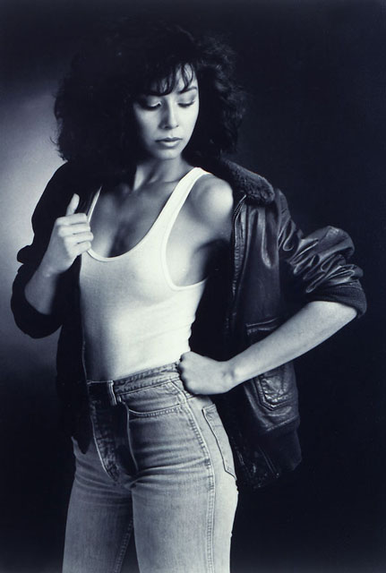
Katherine. 1981
This shot was from a series I did of models wearing white T-Shirts and a leather bomber jacket that I had in the studio. These shots were all done on Tri-X shot at ISO 200 and processed in D76. Lighting was a large 4×5 home built softbox to camera right, a large fill card to camera left and a small head about 6″ from the black background to give the spray light behind her. (Scanned from a print.)
I wanted the images to be kinda stark and a bit dramatic, and all lit the same. I loved the vulnerability of the white t-shirt with the very powerful bomber jacket. The models were directed slightly and each was asked to bring some of their personal persona into the making of the image.
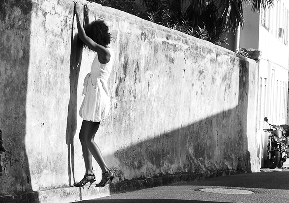
Triketa in Bermuda: 2009
A digital conversion, I nonetheless knew I was going to make it a black and white. I loved the texture and the light and shadows and the design that put her in the point of the light that made her stand out.
In the color shot, the motorcycle pulls the eye due to the color blast in that spot, while in the black and white shot it is but an accent that helps anchor the image area.
Little things about this shot intrigue me. Her shadow on the wall, the texture in the shadows, that little specular line that defines her calf, and the highlight that keeps her heel from being lost in the shadow.
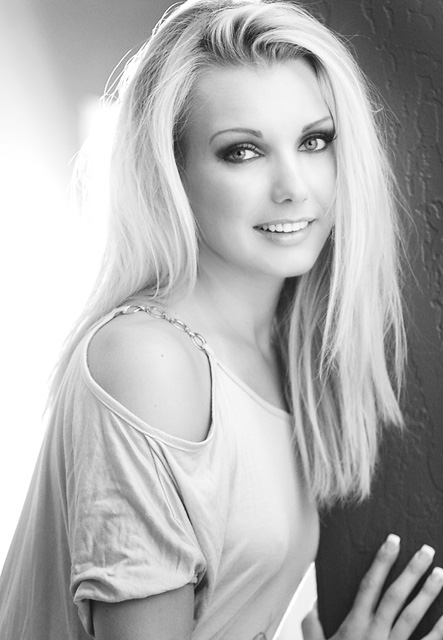
Samantha, Phoenix: 2008
Shot with the modeling lights of my old Normans, and some hot lights in the hallway behind her, this portrait started as a black and white. I changed the preview on the camera to black and white and pushed the ISO way up. On this little old Canon Rebel, that meant noise. Noise looks kinda like grain, and I wanted some grain in this shot.
Seeing it on the back of the camera in black and white let me see the tonality of the lighting across her face. Sure, it was shot in RAW, so all the color is in the file.
But it looks kinda terrible in color. It just does. I didn’t shoot it or light it for ‘color’ – I shot it for black and white.
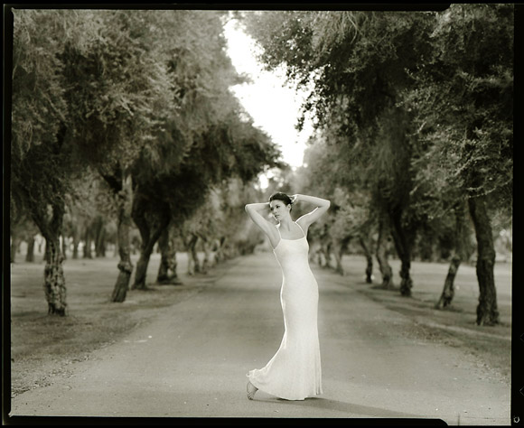
Cheyenne, Phoenix: 2008
I wanted to shoot this in 4×5. When she showed me the dress, I KNEW I wanted to shoot it on large format, black and white. I cannot explain that part of my process. I can’t. It is just something that I have always done.
I look at a shot and start to make choices and decisions. Format/film/color/black and white/processing.
And these days I usually end up shooting in digital… but I make those decisions anyway.
Shot on a Toyo 4×5 camera, Nikkor 210MM lens wide open at f5.6. No tilts or swings, and no Photoshop other than scanning and contrast. Film is T-Max 100 developed in D76 normally.
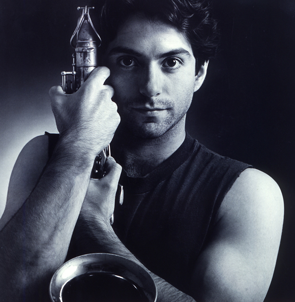
Alex: 1982
Bronica 6×6, 150MM lens, Tri-X processed in Microdol.
4×5 foot softbox to camera right, spray light against black background. Large fill to camera left, at a distance to create very little fill, but a smooth tone on his shadowed arm and the saxophone.
One of my favorite portraits from that point in my career, this simply lit portrait was a stylistic mainstay for me. I like the modeling of the light, the contrast on skin and the way the light helps create drama.
I do not think this image would be as strong in color.
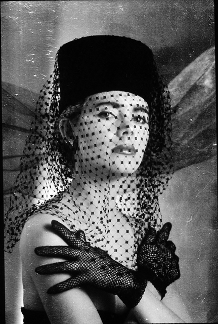
Pat, Phoenix: 1987
Shot on Polaroid Instant Black and White Slide Film, this shot of Pat has always been a favorite.
This slide had no glass on it and was displaced in a box. I did not know that it was rattling around in the box for several moves, and the emulsion got, well, scratched. And damaged.
I like it even better now.
Shot with a Nikon F3, 105MM f2.5 wide open and two Fresnel hot lights; one to camera right and one on the background behind her. Fill cards liberally sprinkled to fill in the shadow detail.
The slide is now protected, but I fear the emulsion is soon to be leaving the base. It is a mess.
Thank goodness for scanners.
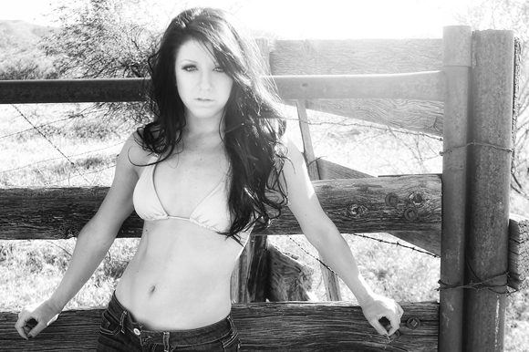
Briana, Superior, Arizona: 2012
Flare, natural light, over-exposed background… all the stuff I love.
Shot on a Canon digital, in color, I knew that I wanted to see what it would do in black and white… and I was right. It works so well in B&W, and lets Briana be more of a presence. There are a few shots from this series that MUST be in color. And there are a few that I knew would work better in monochrome.
I do that a lot. I make choices and decisions about images and their presentation even as I am shooting. I start to see in monochrome and make exposure decisions based on what I KNOW I am going to do with the image.
Black and white portraiture is one of my most favorite things to do in photography. I need to do more of it.
I will.
———————
I have been asked back to creativeLIVE to do a workshop on Table Top Product Photography. You can see more at their site. Dates are June 21, 22, 23, 24, 2012. Register for free and watch all weekend!
I was recently on creativeLIVE and have received some rave reviews of the workshop. If you are interested in taking a look at the workshop, you can find it on creativeLIVE’s web site here. I think it is a tremendous value and if you are unable to attend any of my workshops, this may give you a ton of information you will want to have to push your photography to the next level.




You’re a wiz, and this is wow – so you live up to your nickname, Don! Oh, and I like your photo of Katherine lots lots more than naked Cindy (which would be considered ‘art’, not ‘porn’, so around here in good ol’ Europe, it’s pretty much SFW).
Were you happy with that Bronica? I’d love to get one (cannot afford a Contax, and even Hassies are a bit too expensive at the moment)…
Thanks!
Yeah – I loved that Bronica… the poor man’s Hasselblad. Had a curtain shutter and it made a big bunch o noise.
Wonderful lenses.
I now have a Bronica G1 and a passel of lenses. Also a great camera. Look for them as being very strong workhorses and they have incredible glass.