BEVERAGE WORKSHOP ASSIGNMENT FIVE
A SIX-PACK OF BOTTLES (BEER, WINE, SODA)
Shooting packaging and bottles in packaging is a big part of a commercial photographer’s arsenal. Packaging alone can be 10-20% of our business, and if you are specializing in beverages it can be as much as 60%. Bottles are packaging.
A “six-pack” is a distinct challenge. One you must be aware of as you build your portfolio.
We have a few examples for you, but most of them are pretty – well – boring.
I don’t want you to make a boring photograph of a six-pack of cream soda or Budweiser.
Think concept.
Think the Hierarchy of Impact. What is the Hierarchy of Impact?
I’m glad you asked.
What can you do to create more impact?
- Location
- POV: What are you wanting to show?
- The angle of the product to the camera. Shoot up, shoot down… create drama.
- Lighting. Oh, yes…. lighting!
- Post Processing can play a huge part.
- Color
- Composition
- Talent (people)
And of course, there are thousands of things you can do to make the image more impactful, more interesting, more eye-catching.
And make no mistake, this is a very difficult assignment. A mundane object like a six-pack of beverage is something we see everywhere all the time. And now we are being asked to do something totally different.
We need to make something very interesting out of something not very interesting. (It could be worse… heh. In Project 52 they have to make a great shot of a utility plug.)
So thinking caps on, sketch pads at the ready.
Put all you got into this one.
BEVERAGE WEBINARS
THIS LINK SATURDAY MORNING
9 AM PACIFIC, 10 AM MTN
Upload two images into the Facebook Album with the review date on it.

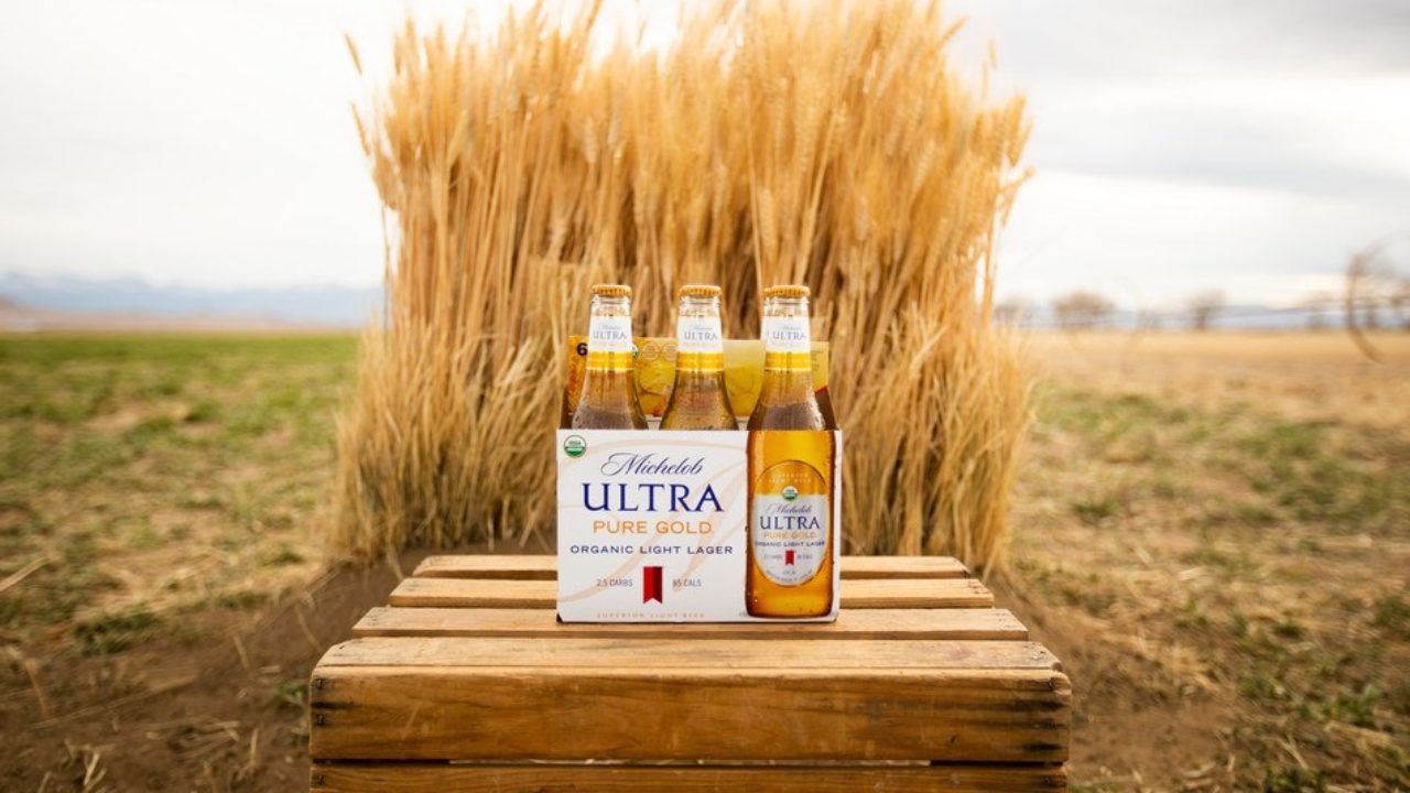
A very interesting approach to the product shot. It is about the golden wheat, and the beer is shown in a location to boost that idea. I think it could be much more interesting than this, but it is not a terrible shot at all. What would you do to make it better? Perhaps a bit more contrast? How about some lighting and gradient approaches to add more interest?
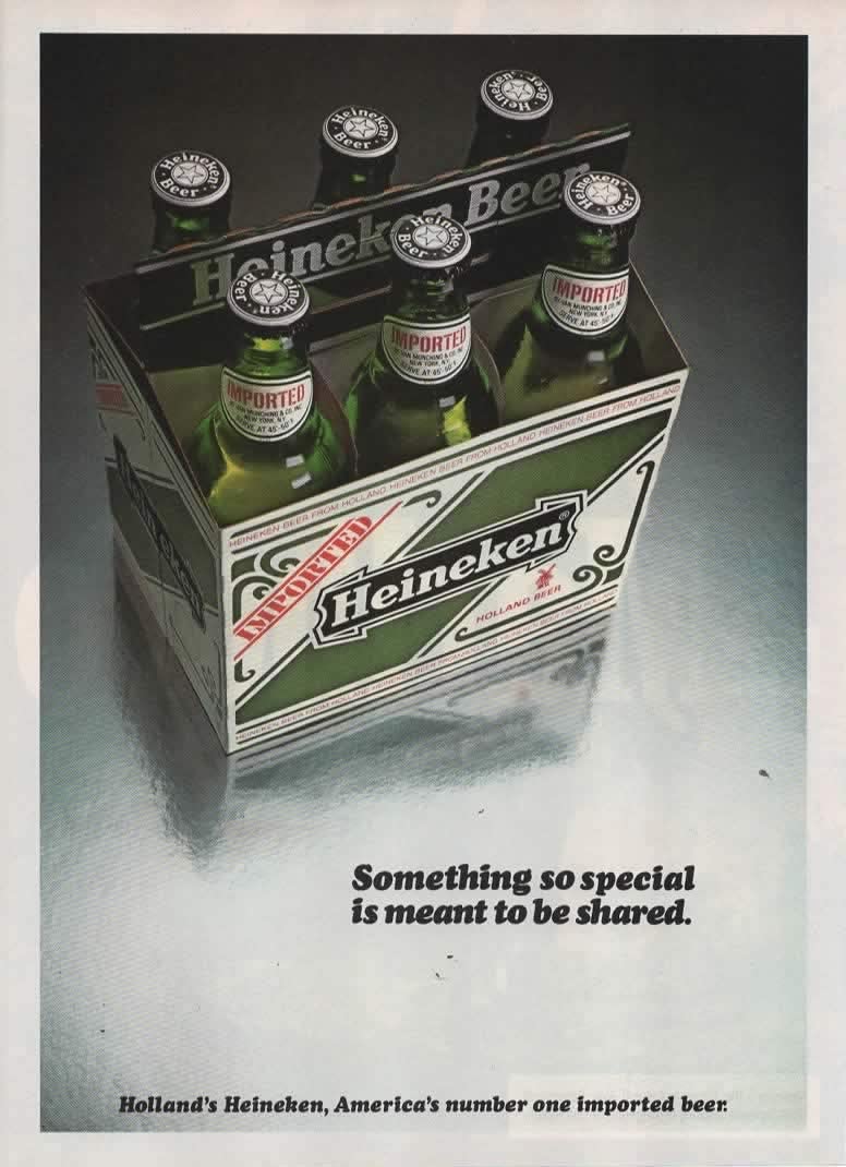
Notice how the photographer used a high POV for a bit of a different view of the beer. I am not thrilled with this shot, the lighting could be much better. We need some backlight here. The container looks terrible where the bottles are, and that could be fixed with light and some post-processing.


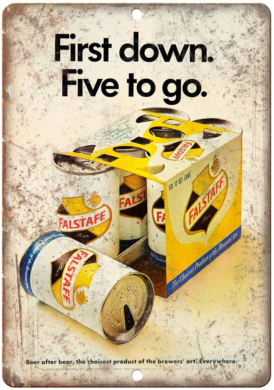
What a clever shot of a six-pack of old-time beer. The concept is great. An open can with a countdown reminding the viewer that there are six in the box. The addition of the texture reminds us that it is a bit older. While I do not think it is an amazing photograph, it is indeed a well crafted idea and very attention getting.
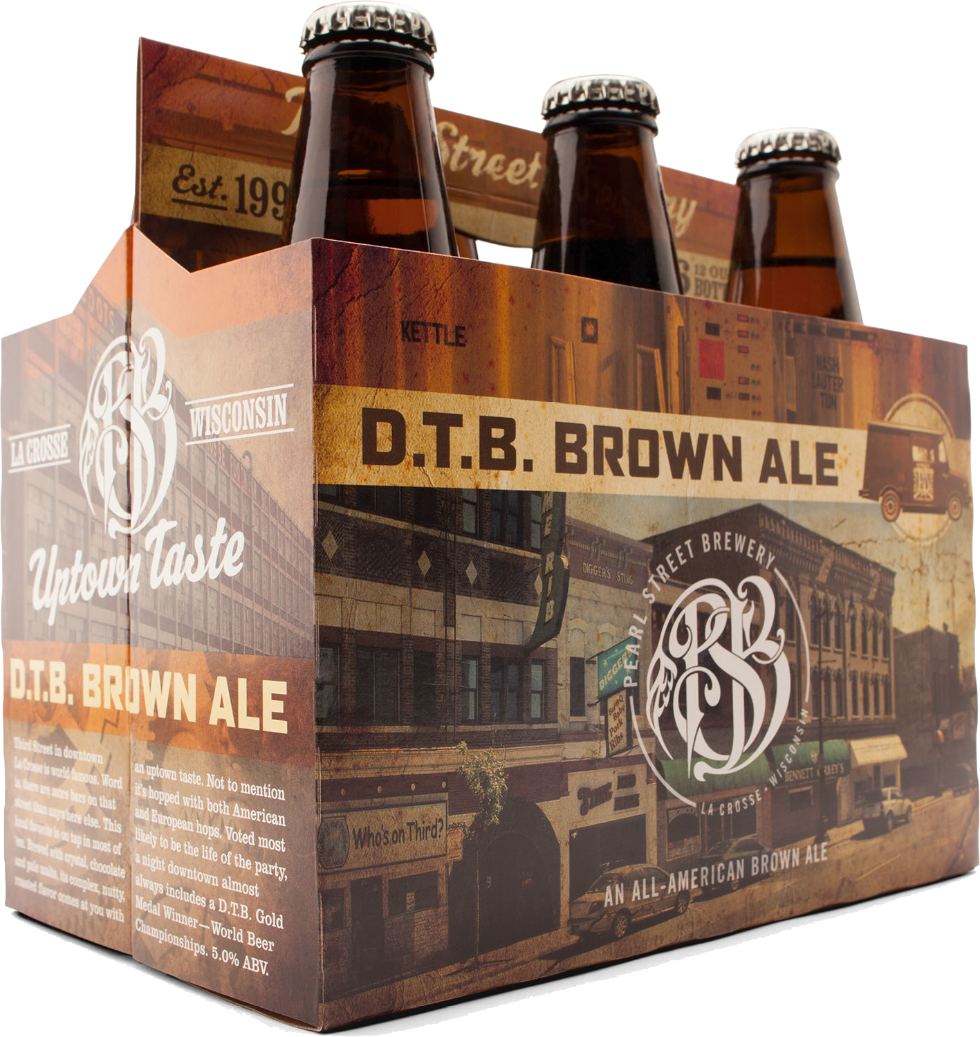
In this image, the packaging overpowers the bottles. Notice how the photographer drops the POV down to a lower view in order to feature the packaging art. A nice gradient to the light on the front of the package, and the highlights are wonderful up at the top of the bottles. Adding a bright reflection to the end panel does give a nice feeling and some dimension to the box. Terribly dropped out of the background.

PHOTOGRAPHING PACKAGING
RETOUCHING WITH FREQUENCY SEPARATION
REMEMBER:
The images are to be put in an album on the Facebook Group Page. The album will be available starting after the current review is completed.
Make sure you upload the photograph and the behind-the-scenes photograph.

