BEVERAGE WORKSHOP ASSIGNMENT FIVE
BLACK BOTTLES
OK…
It may not be practical for you to spray paint a bottle. Weather, temperatures, availability of a place to paint can all make spray painting a wine or liquor bottle all but impossible.
So choose any black bottle. Wine, beer, spray bottle. If you can find a couple of tall black glasses, they will work as well.
Black ON Black.
Be sure to read this entire brief.
This is a dark image overall, we just want to see the black bottle on the dark background.
Edge lighting can help pop it out. Subtle use of fill cards and shiny reflectors may also help sculpt the subject.
CAVEATS:
- At least one black bottle… that is the subject.
- Dark to black surfaces and backgrounds
- Props (only two) are fine, see the list of acceptable props below.
- POV: Oblique, standard (45 degrees) or flat-lay
- Create lines of interest with edges and reflections
PROPS:
- Wine glass(es): clear if a liquid is in it, opaque if not.
- A small flower. Delicate, not overpowering to the subject.
- Cherry or Strawberry (make sure they are PERFECT in every way)
The idea of this shot is to create something very beautiful given strict directions and a set of parameters for the image.
Think close-ups, think design, think negative space, think relationships between subjects… This one is wide open for interpretation although it has a very small set of subject possibilities.
BEVERAGE WEBINARS
THIS LINK SATURDAY MORNING
9 AM PACIFIC, 10 AM MTN
Upload two images into the Facebook Album with the review date on it.

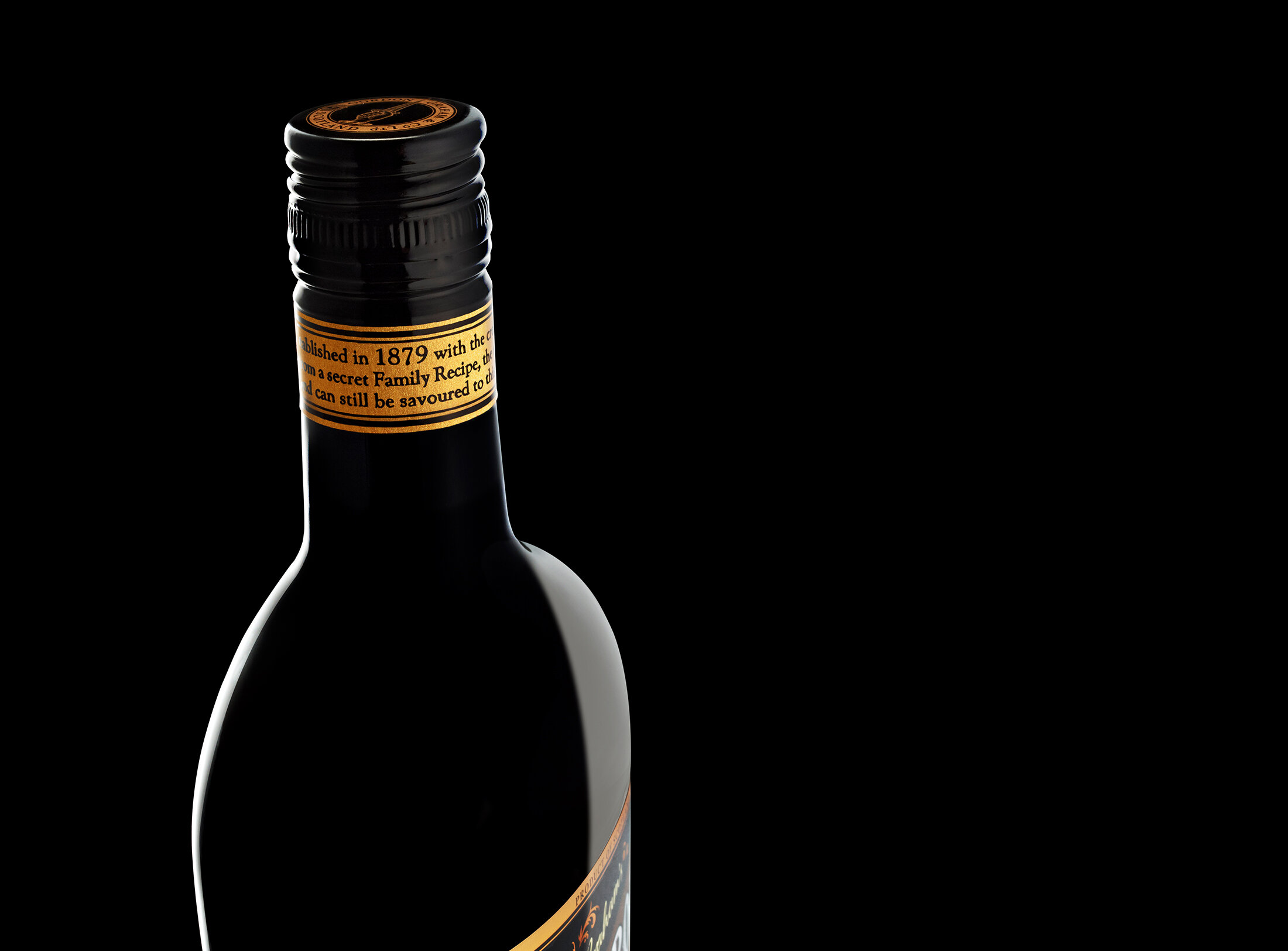
A beautiful ad: note the use of negative space, edges, light, and color. This very delicate approach to the lighting would be fun to do. Use small cards, shiny cards, and maybe even mirrors to finesse the image you see in your head.
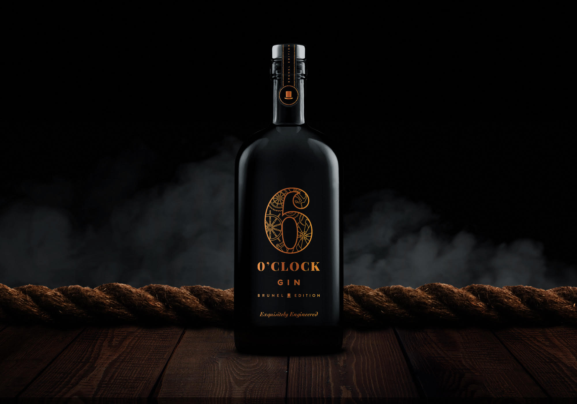
Note the use of color and texture in this simple ad for this black Gin bottle. Notice how the photographer uses the smoke behind the bottle. It provides a lighter background for the dark bottle to stand above. This is a beautifully crafted visual. Study it.


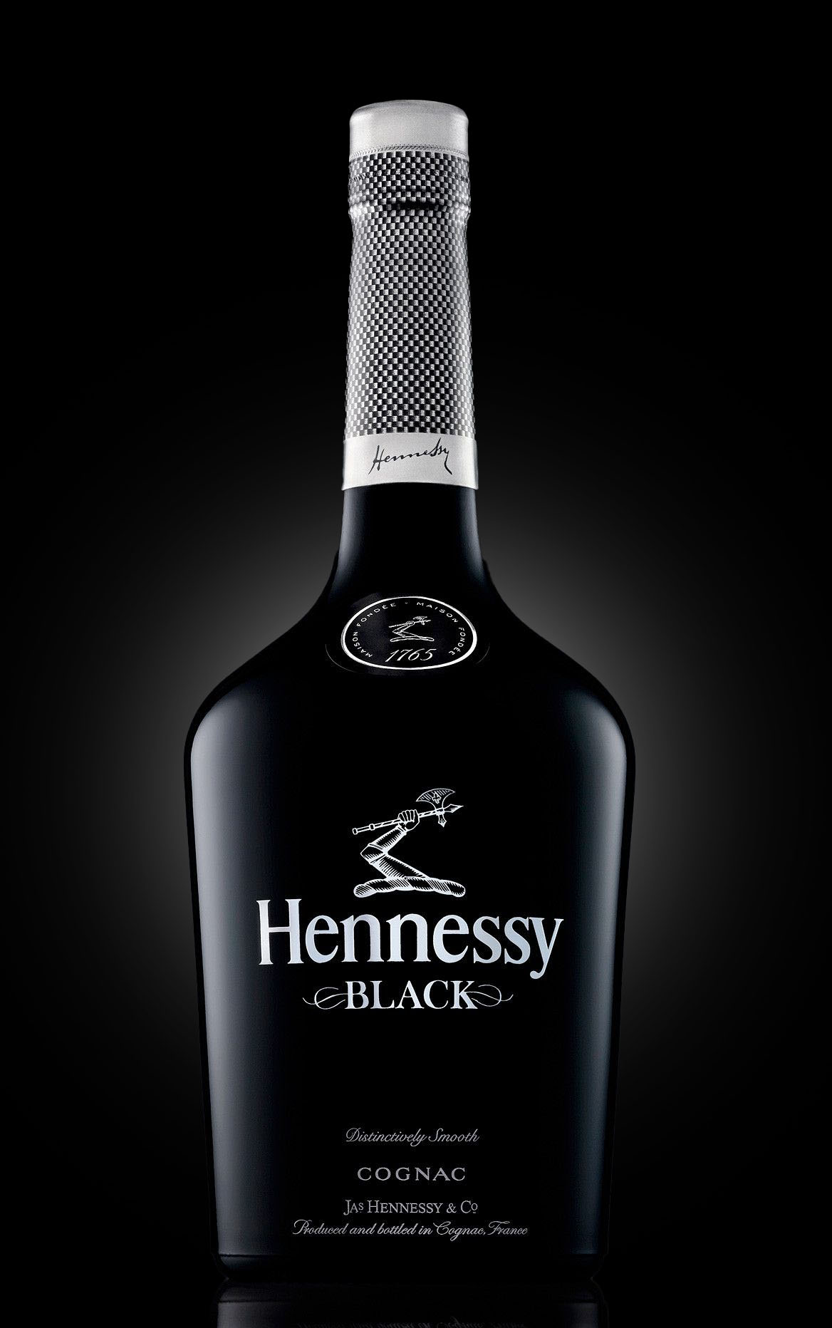
Super simple at the first glance, the image is well crafted. Note the gentle lighting on both sides of the bottle, BUT also notice that they are not the same size. This is a way to give the bottle some dimension that may be lost if they were matching. Also notice the incredibly beautiful light on the label and the detail in the top cover.
VIDEO ONE: LIGHT PLACEMENT EXERCISE
LIGHTING DARK AND OPAQUE BOTTLES
BEGINNING TO END EDGES
BLACK ON BLACK
REMEMBER:
The images are to be put in an album on the Facebook Group Page. The album will be available starting after the current review is completed.
Make sure you upload the photograph and the behind-the-scenes photograph.

