My client called and needed a job turned around right away. Her client needed their entire menu shot for some collateral and web materials and the previous shooter had not been able to do what they needed.
The images had to be attractive enough for menu use, arty enough for the web and collateral and still stay within budget. Well, yeah… there’s always that budget thing. The twist was that we had to do two shots of each dish… one for the menu and one for a more ‘artistic’ collateral piece.
Because of the nature of the food, it was best to do it at one of their locations and luckily enough it was near where I live. I took an afternoon and scouted the store. I wanted to check surfaces since they insisted on using their table surfaces for the shoot. In this case there were several tables that were nearly pristine.
There was also a huge window near a corner of the restaurant that faced east. This window was under a walking area that was covered. At 9 pm the light would stop flowing into the restaurant and we would have soft window light for most of the day.
I decided that we would do the two setups at the restaurant. One for the ‘menu’ type shots and one for the more ‘artsy’ shots as they were described to me.
Gear:
Norman Pack
2 heads
Boom
3 stands
Small softbox
Assorted reflectors
Assorted mirrors
Small sheets of shiny white paper (for cutting into small reflectors)
Gaffer’s tape
Camera Bag
Lighting Bag
Tripod
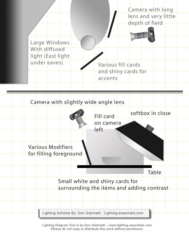
We began by setting up the small softbox on the boom and positioning it above and slightly behind the table where the food would be setup. I made sure it was close enough to the kitchen area so we could be quick in getting those shots styled. (You can see a diagram of the light setups farther down the page.
I added a medium sized white fill card to the immediate left of the shot. I let the right side go without any fill so there would be some direction to the light. Even if it was a small amount of fall off, it would let the ingredients have a dimension to them as well as keeping the bowl with a slightly darker side.
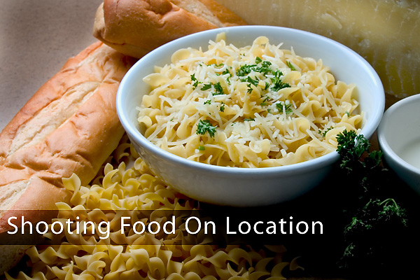
Below is a shot we did for the “menu” part of the shoot. It is a dish with some of the ingredients surrounding it for a still life look.
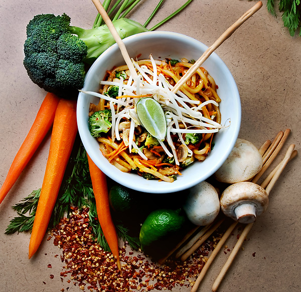
The softbox gives a soft, slightly back light. In front of the set I placed a small white reflector to keep the shadows at bay. It is about 10 inches in front of the set and below camera. Without that reflector, the shadows would be extremely contrasty toward the front.
By keeping the light on a boom, it was also easy for two people to style the images. We had to do the whole menu in one and a half days, so there wasn’t a lot of time.
We placed the bowl in position and then brought the ingredients all around it. I had a staging area for the ingredients and would have the manager get the things needed for each dish ready before it came out. We then were able to move that small amount of things on to the set. I styled it with a classical approach of ‘hero’ and supporters.
Even though I had a tripod for the shoot, I ended up shooting hand held. It was very important to end up with the bowls at about the same perspective and size and that meant moving quickly. After the first couple of shots, I put the tripod away.
For the more artistic of the shots we moved the set over to a table by the window. The tables here had rounded ends, so that gave me some added tonality. Below is the same dish in the second location.
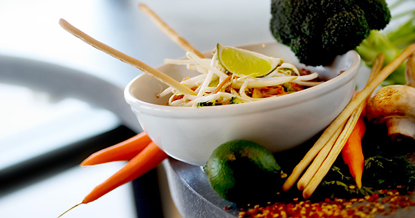
Here I used an 80-200MM L lens at wide open (and long) to shorten the depth of field and make the image more ‘fresh.’ I was using the ambient light from the window and the shutter speed was a little low for my taste. I broke out the tripod for these shots. I had enough room to move the camera around quickly on the tripod so it worked out pretty well. We eventually did some considerable work in post on these… adding text and such.
Coming from a low angle I could get some back light and sculpt the food. I also tilted the horizon and and added fill cards for the contrast. Opening the shadows was important, but it couldn’t be so bright as to diminish the back light thing I had going on. I tried a speedlight for fill, but even at a low power and bounced, it looked too bright.
We settled on two 2×2 white fome core boards held by clamps. One on each side of the dish. You can see them on the lime as it is reflecting the light sources. The boards were easy to whisk away as we moved into each shot.
Here is a lighting diagram for the shoot:
I kept the shoot running smoothly because of the pre-planning that went into it. Scouting and making sure that we could have the run of that part of the restaurant for a couple of days let the manager know that we were cognizant of his need to keep the restaurant open and doing business.
Having the ingredients for each shot one shoot ahead made the styling go quickly as we weren’t waiting for some special ingredient… it was already there.
Here is another shot from the series:
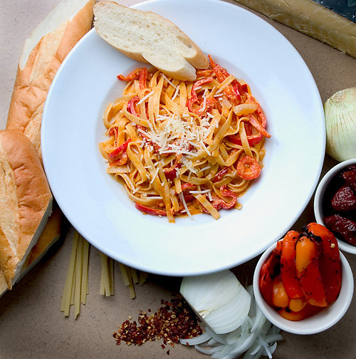
You can see how different the two shots look. One is very traditional, sort of a menu or recipe look to it. And the other has a more fresh, magazine or editorial feel to it. The heavy back light and angled horizon give it a bit of whimsy.
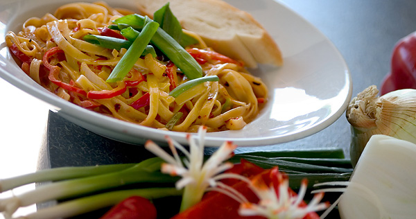
It is important that the food look appetizing at all times. Letting pasta sit for too long makes it look rubbery, and we were constantly rotating the veggies and other items into the fridge so they would not look old and spoiled. In the end a lot of food was prepared and we gave it to customers or ate it ourselves… not wanting to waste it.
I shot a few shots tethered to get the exposures correct and nail them down. After that initial testing, I went to shooting on the cards. I didn’t want the AD to start picking apart every shot and slowing us down. I knew we had what we needed and would of course ‘chimp’ it to make sure.
Shooting food is a lot of fun. It is demanding and can be crazy fast, but it can also be very rewarding when the images make the chef smile and people want to buy the product.
I hope you enjoyed this little tutorial. We are full of stuff for July so drop in again soon.



Hi,
you have no idea how this post is useful to me! I have a friend who is doing restaurant opening and I was thinking about doing these kinds of shots for her in the near future.
When doing some research I found out that a lot of product shooters use tilt-shift lenses and I am surprised to see how good you managed without one! Dont you think they are useful for that kind of stuff?
These shots are very inspiring and I think I will have to post an article on my blog about food shots too!
Hi and thanks for the kind words.
I use tilt/shift for some things. The client wanted the images shot nearly straight down and with that much power (lights) I had plenty of DOF with the wide angle lens. For the ‘natural’ shots, we wanted a very limited DOF so again, the TS wasn’t really needed. I think most of the cameras provide the color needed, but sometimes it may get lost in post. I use Adobe RGB for all final post, going to SRGB at the end and then tweaking it to get it as close to the Adobe RGB as I can. I also think that digital is quite flat, so I pop the contrast with both contrast masks and channels.
Hi,
While a tilt-shift lens is very handy, and can do some wonderful things, it isn’t demanded in this kind of work. As long as you are able to keep the perspective you want without it, then it is fine. I shoot these kinds of shots without it because they don’t need it. Had I been more oblique and really wanted more DOF then I may had tilted a bit, but again, only if I create the shot that needs the tilt.
You can do fine with your shots if you just make them attractive. Don’t let the lack of a specific tool stop you from doing the work.
Amazing, you are doing such a wonderful job on your articles and the site in general. Thanks Don for all the good info.
Alfred
hi this is sai regarding photography……………just i want some lighting tips and as well as some of photographs……….pls i am waiting for ur reply
Thanks for the Post. It is very useful, I wish I had found it before the food shoot I did.
I would appreciate some comments on the work I have done thus far.
All photos were shot with a D80, and an Impact 6-way reflector.
I setup by a large north facing window and shot in mid-late afternoon.
I have read/heard that strobes and food don\’t mix but this dispels that myth to me.
http://www.flickr.com/photos/matthewcarnes/
Thanks, Matthew
Hi Matthew,
I like your food work. If I had my way, a studio with both north and east windows would be my favorite. The East for the direct light and the North for the soft light. I do like adding a bit of snap to the soft north light.
Nicely done and thanks for the kind words.
–don
Question…
Is there a format and/or camera that will yield better results when working with food?
I noticed the great color in your images… What did you adjust in post or is this from the camera?
I am a Lightroom2 user and have played with the vibrance and saturation controls but as I resolve issues new ones popup.
I am in the market to upgrade from my mid-range pro-sumer to a maybe a D700 at the top end.
Any thoughts?
I really enjoyed reading your interesting yet very informative insight. In the book of life every page has two sides: we human beings fill the upper side with our plans, hopes and wishes, but providence writes on the other side, and what it ordains is seldom our goal. Thank you for sharing and I am looking forward to reading more of your very current blog postings!!! 😀 Shooter Game
Hey Don – I don’t know why I’ve never seen this post before – instant bookmark! Well done!
Hi, I have been reading some of your articles and I was wondering if you might me interested in being featured on our blog lasvegasphotographer.blogspot.com. We are a collaboration of photographers from all over the world that simply share their ideas and expertise with others. Our audience ranges from hobbyist to pro. I’d love to feature this article on our blog if you’re up for it! You can contact me by email. bryceandcindy@hotmail.com Thanks for your consideration.
Thanks for your contribution Don! We published your article today. ~Cindy Larkin