On the heels of my E-Book on Portraits, “The Heart of Portraiture”, I have a few other portraits to share. And I discuss why I like them. Article on the E-Book is here.
First some housekeeping:
GoingProNOW is our emerging commercial photographer seminar with Selina Maitreya, Jack Hollingsworth and me, and we are finalizing what we need to get the registration started. We have had a ton of interest, so we will open it to people who want to sign up soon. It is a different kind of seminar, and we focus on the commercial photographer, not the wedding or portrait industry. Direct to consumer is a different type of photography, and there are those who really know that area better.
Workshop News:
Openings remain in Atlanta and Columbus. Greenville is nearly full. Remember, we only take 12 people, so the size is small enough to get a lot out of the workshop. Columbus will be hosted by the great guys at MPEX and they will be announcing some incredible things shortly – and that will of course be here as well. New York and Baltimore are both filled up, and I will be spending the week back in that area shooting and writing so it will be a big week for me and for Lighting Essentials as I plan to blog each day beginning with the Friday before the NY workshop up to the Sunday of the Baltimore workshop.
I am going to do a workshop in Flagstaff, Arizona in July. The workshop will begin on Friday at around 1PM and finish on Sunday at sundown. Flagstaff is an incredible area, with amazing landscapes and backgrounds for portraiture. It will be a very special workshop, with a wide variety of photographic experience. From forest to stark desert, the area around Flagstaff will become our palette. More Workshop information here.
From the Web:
Seth Godin talks about the Micro Magazine and its importance to the upcoming changes to publishing. I believe the iPad is the breakthrough with many other devices on the horizon. This will be a very heady time for photographers and publishers and writers… for sure.
At APhotoEditor there was a wonderful post on “Treatments”. A Treatment is a document a photographer may submit to show the client what they have in mind. Lighting tests, wardrobe ideas and such. I haven’t used them in the past as a photographer, but I sure did in the agency days… providing the photographers and clients our treatment ideas. This is a fantastic way to differentiate yourself from other photographers, and this post shows you how. There is also a great interview with Keith Gentile, the owner of Agency Access. Agency Access is a list builder for commercial photographers, and this interview may really open your eyes to how part of the business may help you.
Bruce DeBoer has a great little article on a guy who rediscovered his art. Take a moment for a good read, and some inspiration.
Check in with Heather Morton and catch this great little post on “Contact 2010”.
And three photographers who I have been looking at a lot lately. Love this work.
Jason Bell
John Russo
Nicolle Clemetson
BTW – I wrote a rant for the guys at Tiffinbox that may cause me to get bodyguards, so look for it in the next few days.
Now on to a few portraits from the archives that I kinda like.
The first shot is Briana at a rest stop on I10 near the Sedona Exit, Arizona:
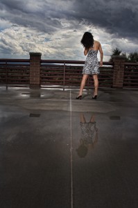
This shot has become one of may favorites, and it was shot a while ago. I have shots where Briana is looking at the camera, and I like those too. But this shot removes the ‘glamor’ from the shot and instead presents a person in the environment. And the gesture of the shoulders/hair tend to add some great dynamics to the shot. I don’t know what it would have looked like had she stood there casually looking toward the clouds, but I am very happy with this movement.
Lighting and Camera: Canon with Canon 20-35MML at 20MM. Two Canon flashes. One to camera right and one to camera left. Setting to bring ambient in foreground to close to that of the background. I wanted the clouds to be dominant, and the reflection was a wonderful find.
Now we have Connie, our makeup artist from Florida:
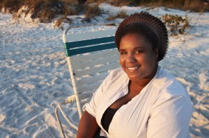
I loved her great smile and the fantastic way the light settled on her face. It was very late in the Florida evening and the light is coming from nearly the horizon toward her. It is a warm and soft light. I took a quick meter reading as I was heading toward where she was sitting and realized that the sun and the ambient were only about 1.5 stops different, so the shadows would not be too dark. At first she turned away, but I told her how great she looked in the light and she gave me this smile. I got two shots off before she turned away laughing.
I used my 20-35MML 2.8 at 4.5 to keep a little more focus on her face. The shutter speed was only 1/100 so I had to be a little careful with it. However, at a setting of 20MM, there would be a little room to play with for camera shake.
Next up is a shot of Christina in Miami, Arizona:
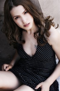
This was a shot I did on a shoot I wrote about called “Minimalism Shooting”. Christina and I went out with nary more than a fill card, a camera and a couple of lenses. I love natural light, and we were on a quest to make some images without a ton of setup time. It was also damn hot in Phoenix, so we headed to Miami, only a few miles up Highway 60, to get 15 degrees cooler.
This shot was done in a little doorway with totally natural light. Across the street was a very bright wall, and that added some wonderful main, and I used a fill card to camera left to fill in a bit on the shadow side of her face.
I used a Canon 50MM 1.4 lens at 2.8, at 1/250 second to get this nice DOF look, and the way the lens shapes her form. You can tell from these settings that there was a lot of light coming from that building.
And we end with Alexi in Las Vegas, Nevada:
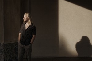
We were walking around a little cantina area in a shopping mall in Vegas when I saw this cool lighting thing happening on a terrace. I had Alexi walk into the light until I got the patch of light to reveal his face and the shadow to appear on the wall. Having him look off – toward the light – gives the image a bit of mystery. The framing gives it some dynamics. I had him lean into the light a bit to add more ‘movement’ to it.
Canon 20-35MM L 2.8 at f-8 – 1/250. I had it zoomed to about 28MM to get the framing I wanted. The light bouncing around in the little hallway gave me a bit of fill, but the drama of the dark was maintained because of the color of the walls. I exposed for the highlights on his face to keep the look more dramatic.
Thanks for coming along. I hope you download and enjoy the E-book. These images do not appear there, but there are 20 other images that are discussed in depth. Light, subject and gesture – the things I look for in a portrait.
You can stalk me on Twitter, follow along on the blog, or hang out at FaceBook if you like. See you soon with a blog on gear I like a lot.



Hi Don,
Very cool pics. Do you always have the video of Briana during a shooting with you?
Regards,
Samuel
Hi Sam,
Do I always have a video going with Briana shooting?
No.
Don, I’ve requested this before but could you repost the video on the “Lady in red on bridge” shot you did around 3 years ago. As many photos as I have taken and looked at over the past several years, that is one of my all time favorites! Your comments were that you beat the sun and that you had to be careful when booming the strobe out over the ravine. I would love to see the video but it was posted on the old site and the link no longer works.
Thanx! Bigbirddy