(This is part one of a continuing series on starting out in the world of commercial photography. I am a commercial photographer, not a wedding shooter, but most things would be similar in that genre as well. )
Even in these uncertain times, there are those intrepid souls who want to join the ranks of the professional. From baseball players to race car drivers, there are people working hard at their craft to get their work to the level that it will be their entrance into the ‘big time’ – or, hell, even the medium to small time… but that gives them a chance to go a bit farther if they can.
Recently, at the behest of one of my clients, I looked at four photographer’s books for an upcoming shoot. They were not prepared. Not for any kind of job. Now, the work wasn’t bad at all. But the presentation was awful for all of them. I called each and offered some free consulting if they were interested and most jumped at it. Good.
I posted this adventure at a Flickr Forum with the title “What is a Photographer” to see if we could spark some healthy discussion. We did. Lots of questions raised.
I decided to get to work on a set of posts that would help straighten out my thinking into something coherent on how I would go about getting started today. I did it my way back then. Made a lot of stupid mistakes, and I made a lot of really stupid mistakes. Oh, yeah, I also did some stuff right and that helped get me over the really stupid mistakes.
I think these posts will be long and still may not even brush the surface of what must be done to get ready. But they will get you thinking and planning what needs to be done. And some things will be so easy to say, but so damn difficult to execute. That is the nature of the beast, I guess. There are challenges at every turn, and people ready to sell you a shortcut around every corner. There are no shortcuts and challenges have to be met. Head-on sometimes, and other times you sneak around the back of them and cold-cock the sob’s. Ya just do.
Workshop Information:
Workshop this weekend (June 20, 21, 09) in Missoula, Montana. Not too many workshops come to that part of the world. Don’t miss this one. We have 2 openings left. Come on out and learn to light in a small class workshop atmosphere. Seriously.
Some good writings on other overall important parts of this business… and it is a business from Ken Rockwell.
Ken pulls no punches and this post is excellent. He also has this to say about what level a professional can achieve.
Education:
I am not big on photography schools, or university’s for photography. I don’t really want to debate that issue, so I am just telling you that a $65 – $100K or more investment in a photographic education at most of these institutions will leave you with a mountain of debt and in a daily competition to become an assistant with those who didn’t go to school and incur the debt. This is of course, a matter of personal decisions. If you choose to go to school, work your ass off. Do more, print more, shoot more and participate more than anyone else at your school. The top, I mean the VERY TOP, can move into first assistant positions at some of the larger photographic studios. If you aren’t doing something photographic, be sleeping. And do that as little as possible. Got it? Good.
We will not be dealing with the issues of being a business in this post either. That part you need to work and research on other blogs and online sources. Harrington’s is one of the best. And of course, David’s wonderful Strobist blog and his “Lighting 101” is a great spot to add to your photographic knowledge.
Well, let’s get on with this initial post on “Getting Out There” as a professional. You can create a PDF of this post online here.
You need a set of tools and knowledge that will help you initially in getting known, getting seen, being remembered and landing gigs. You will always need these things. “Identity” (business cards, leave behinds, business forms), a portfolio, a website, and some understanding of business basics. All of those are rolled together to start the creation of your Brand. And while I think that ‘Brand’ is a much overused word, it is important to make sure that you are remembered, and that you and your work are noticed. Who you are and what you do can blend seamlessly into “Brand You” and that can help you in your attempts to get known and get work. It’s important. Start now.
In my opinion, the tools should be ready to go BEFORE you quit your job, or go part-time, or get out of school or whatever your line of demarcation is. Brand will take a while.
When you have these in hand, you can begin doing the things you need to do to get work. Being unemployed and hot having any funds for a portfolio case is a very scary place to be. For those of you who are in that situation through no fault of your own, well… hard doesn’t mean impossible. You may have more of a challenge. That’s OK, the air at the top may actually smell a little sweeter. You CAN do this. Just shut your ears to all the naysayers and ‘bringers down’. Screw ’em. This is your time to do it, there is never a perfect time. Ever.
(My own story in a nutshell. I was an avid shooter on weekends and evenings and every moment I could squeeze in. When I left a paycheck behind, I was forced into finding my way. I did. And never had a business loan or borrowed from family (they didn’t have it anyway). My mom got me a Norman strobe for my birthday the first year out and everything after that was on me. My business financed my business. I am not bragging, just letting you know that I believe in bootstrapping and busting ass and getting to done. My perspective, as they say. Just do it, no whining allowed. Great years were fantastic. Bad years were terrifying. But all-in-all it has been one hell of a ride, and I wouldn’t have traded any of it… well, I I wouldn’t trade most of it. Heh.)
Opportunity is missed by most people because it is dressed in overalls and looks like work.
– Thomas Edison
Now let’s create a checklist for the basics to allow you to enter the world of commercial photography and “get out there.” (NOTE: This is about commercial photography and not necessarily the same things that a wedding / portrait – direct to consumer type shooter would have. I am not a direct to consumer photographer so I do not speak to that genre with other than the generalities that fit all photographers.)
My checklist in very short form:
PRESENTATION:
What does that mean? It means how you show your work. How you present yourself, your portfolio, your working space, your business forms and more. It is you. It is your work. There is no separation. You are your work and your work is you and the presentation is the culmination of the two.
Get a real Portfolio. Make it nice. Professional. It doesn’t have to be terribly expensive. It must be something that seems to be an extension of you.
For instance. Let’s say you are starting out in Architecture Photography. What kind of book could be an extension of that? Aluminum, or polished steel come to mind. So does a book in a case. Would a larger book (16×20) be a good size for showing what you do? Or would a small, compact book show the work off with a bit of style?
I don’t have the answer, but there is one for your work. Look around. Ask mentors. Get brochures and imagine your work in them. Do not buy on price alone. JUST DON’T DO IT. It is your portfolio and it must look fabulous. It is YOU. To spend $1600 on a wide angle lens and then look for a $20 solution for a portfolio just makes no sense. If you are serious about this, you have to be serious about the things that represent your work as well as the tools that create it.
What to Show:
What you do, simply put. If you are a people shooter, then the book should have some people shots that inspire and astound. Don’t split your book up into so many images of disparate things that you cannot have a cohesive presentation either. I would mix maybe two if I were to mix them. Still life and people can work. Architecture and lifestyle. Be careful. If you dilute the work too much, it can be disasterous. A really good book on creating a powerful portfolio is one by Selina Oppenheim. I love this book for its clarity and concise information on professional portfolios. More info below.
Portfolios come in many sizes and shapes. If you are an established brand, small, tiny, precious, over-sized, and gargantuan portfolios can be very cool. If you are starting out, as the readers here are, maybe we need to introduce ourselves first. Can an outrageous portfolio get you attention. Sure. But the risk that the attention may not be totally positive is simply too great. Keep it simple, keep it clean, and keep it professional.
Whether it is a horizontal book or a portrait book, there will be images that will not fit. A wide shot in a portrait book can be done only with either a spread (2 pages) or placing it horizontally on the page with space at top and bottom. You can choose to crop all of your images if you want, that is your call. But choose the book style and presentation most suited to your work and begin.
It is important to not have the book be turned to show horizontals and verticals in the same presentation. And the presentation should “flow” well from page to page. Here are some examples of page layout. These images are shown un-cropped, with borders all around them. The typical image size of 2:3 will not crop down to an 8.5 x 11 without losing some image. If planned for, that is what you do. However, many photographers like to present their work in an uncropped view.
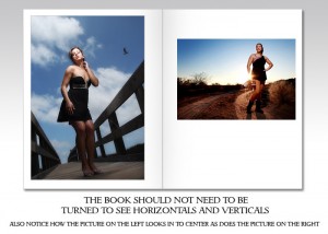
Page Design example 1. Vertical page book in spread form. Notice how the images are displayed so that the book does not have to be turned to show verticals and horizontals.
Notice how the image on the left side “leads” the viewer to the right. The gesture of the body and the lines lead us to the next page. On the next page, our subject looks back toward the left picture. It is subtle, but when possible keep this in mind. If the person on the right is looking off the page to the right, it can draw the attention and let the viewer turn the page without ever looking at the image on the left. Left side images need to be strong to capture the visitor’s attention. While all images must be strong, left-side images should be even stronger.
In the next example we have a ‘spread’ shot covering two pages. Notice how the gutter of the page goes right through the subject on this image. This may not be the best place for the subject to be.
There are some portfolio companies that eliminate the gutter, but still, it may still have some kind of line or separator there.
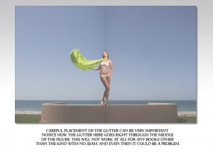
The gutter is the middle part of the page where they meet. On many books, this area is not even accessible.
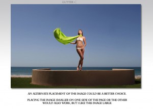
Here is an alternate way to show the image with the gutter down the side of the image. If you are using a deep gutter book like a screw-post method, even this space may not be enough.
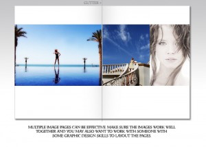
You may choose to show multiple images on a page. I do this frequently in my books. If you do, you must make sure the images look good together and the gesture of the image keeps people on the page. Multiple page layouts are different animals than single image pages… treat them accordingly. You may want to work with a graphic artist or a portfolio designer when doing this kind of page.
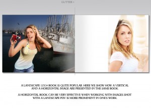
11x 14 portfolios are quite popular, as are some square sizes, 12x 12 and 16×16. Below is a landscape presentation in 11×14 size. You may also show the images “full frame” with borders if that is your choice. This design shows a full page left side landscape and a portrait on the right page with some white space separation.
What kind of portfolio should you get? Let’s take a look at some options.
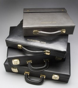
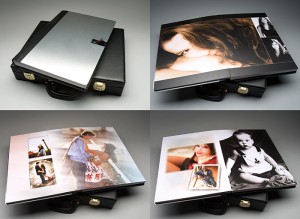
Here is a look at some of my books. From top to bottom: Brewer Cantelmo Box with two Bound Books, Brewer Cantelmo self-contained sleeve book in box, Square GraphiStudio Design Book in travel case and a 12×19 GraphiStudio Book in Travel Case.
I will talk about the companies I have worked with. There are others, but I can vouch for these companies.
Books, boxes and total presentation materials for photographers.
These are not cheap portfolios. The quality is high and the workmanship extraordinary.
Consider them one of the premier custom portfolio companies anywhere.
Brewer-Cantelmo makes your case by hand, just for you. Choose the grain and the leather and the size.
Here is my older Brewer-Cantelmo book. It contains two books with embossed name. Each had 15 sheets (30 images) and one was for still life the other for people. Also shown is the 8×8 inch square box that I used to show 4×5 transparencies mounted in cardboard panels. This was mostly used for Architecture back in the day. I no longer shoot architecture.
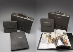
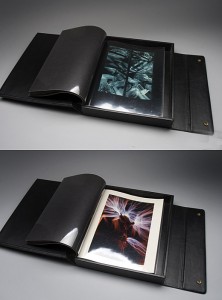
This is my old Brewer Cantelmo self contained sheet box. 11×14 verticals I chose to show only one image per spread. I am working some new images up that will be two images per spread.
Lost Luggage
Boxes, portfolios and presentation materials.
Lost Luggage’s Case Envy line is extraordinary as well. Modern, hip and stylish, the Lost Luggage portfolios can range from inexpensive to very expensive, and yet the quality never falters.
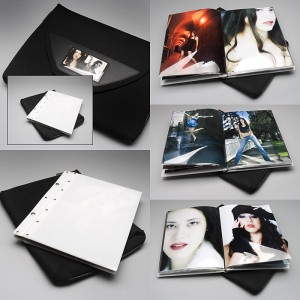
Here is my Lost Luggage 8.5×11 portrait book. (Not shown is my 14×11 landscape book in orange.) Notice the nylon case. It is kinda weathered looking… I like the patina of it. It has gone through a lot but it has kept my portfolio looking like new.
TIP:
You can see how the spreads lead the viewer back onto the page, not letting the eyes wander instantly to the right page and off without seeing the image on the left. Layout is important. Take your time and get it as right as you can. Then commit, show it and tweak after showings. It is far too easy to fall into the “tweak, tweak, tweak” syndrome where instead of getting to the next thing, we get stuck on the littlest things and blame that on our inability to move. I am not saying to show bad work. Don’t do that. But when you have the portfolio ready, then get out there… you should be shooting things all the time that will be added to your book.
You can get some nice deals on Lost Luggage from ArtSuppliesOnLine.com.
An 8.5×11 is under $100 shipped. Look at the nylon case they make for the book as well. It protects if from the elements and has a nice place to hold a few business cards and a leave behind.
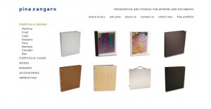
Pina Zingaro
Books, Presentations and Portfolios.
Well crafted, modern and quite popular, the Pina Zingaro portfolios are a great starting platform.
You can get some great deals and portfolios at PZDirect.
Prat books are inexpensive and available at most art supply stores. The self contained black book with the vinyl sleeves can be a nice intermediate solution.
Here is an online source. Consider these books as very much a starter book.
Tip:
Remember the sleeves. Get an extra set if you have the bucks… protects against not having a spare when one is damaged or scratched.
OPTION: Small bag or case to carry it in. Lots of models carry the lost luggage as a book, where photographers can have a sleeve or case for the book.
Prints
Your prints should be printed to the highest quality. Keep in mind that when showing images behind a glossy sleeve they can look a little different. Make a print and look at it behind the sleeve. I find that I prefer semi-gloss prints behind the sleeves over high gloss. Personal preference.
How many do you show? Lots of people say 15-20. I am in that camp. Leave me wanting to see some more… not so bored that I close the book before I get to the end of it. I would say 25 would be the limit for a contemporary portfolio aimed at commercial and editorial market.
Edit ruthlessly. Tirelessly. Get a mentor to help. Can’t find one, then put the top 50 of your shots in a Flickr group and ask someone to help you out. 20 really good shots says more good stuff about your photography than 20 good shots surrounded by 20 OK shots. And bad shots say that the good ones were lucky… not the other way around.
TIP:
One way to layout your book is to make 4×6 images at Costco or Sams Club and start laying out the images on the office floor. I will combine and mix and reshuffle them till I get a progression of images that tell my story. If you do this in an hour, you rushed it. If it is taking more than a couple of days, make a decision and get on with it. As important as it is, it cannot be rushed and it shouldn’t become an albatross around your neck.
Printed Books:
I love my GraphiStudio books. They were very expensive. They helped me seal the deal in a couple of cases. GraphiStudio is mostly a wedding book company, but I have used them for a couple of years for my more overall portfolios. My books ran $700 and $500 respectively.
Here is my large 12×19 book with a 1/4″ polished steel cover. It contains my portrait work in the front half and wedding work in the back. One of the problems with printed books. It is now not current as I no longer do wedding photography.
This is my 16″x16″ GraphiStudio book with graphic design work and photography. I use this for large client presentations where I am working on both design and photography. It is carried in its own travel case and weighs nearly 5 pounds. When I hand it to someone they know it is a substantial book.
Notice that these two GraphiStudio books have no ‘gutter’ in the middle. In addition, they lay flat on any surface. No binding or having to flatten the pages. Hand made, they are not inexpensive, but well worth it for a large presentation that won’t be changing all the time. I do one of these each year for my Design and Photography studio. Photography is much more loose so I use the above Lost Luggage books for that work.
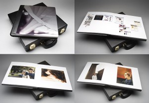
GraphiStudio makes some amazing books. Mine have 1/4 inch stainless steel covers and they weigh a ton.
A new and very exciting company doing books is Couture Books. You can get a beautiful book there for around $300. I particularly like their New York and Himalaya books.
A less expensive option: A Blurb book with hard cover. I have had great work done with the hard cover product. Soft cover has been a little dicey. I made a few LuLu books that turned out pretty well, but they were not “portfolios” but photo books. Watch out for those books with the holes cut out in the front. They may be good for some fun studio work or for home use, but not for portfolio work.
Oh, almost forgot Asuka Books. A sort of midground between Blurb and Couture. Asuka makes very nice books that can be used for portfolio presentations (around $100 or so).
If you know of one that I have missed, it may be because I have not worked with them and cannot vouch for the quality/price/value. These are the ones I know, and I have made books from all of them. I will not recommend ones I have not worked with, but that certainly doesn’t mean that there are not other high quality books out there.
Printing Your Prints:
Either make them yourself or get them printed somewhere like WHCC or MightyImaging or hire a local buddy who prints really well.
Book shouldn’t turn. If it is landscape, portraits are either 2 per page or one with wide borders. If it is a portrait book, landscapes go across with borders top and bottom. The book does not have to be twisted.
Size: 8.5 x 11 is fine. 14×11 may be a little better. 16×20… well, you are into the esoteric there… as well as 6×9 or smaller. Could be cool, depends on the work I suppose.
Prints can be produced on your inkjet if you have a good one. I print on Epson with High Quality Ilford Glossy or Semi-Glossy Paper. Many of the newer printers can make amazing prints.
Places to get your portfolio images printed.
Mighty Imaging is a lab in Scottsdale, AZ. They have a very high quality control system and they produce excellent work.
White House Custom Color has some very tasty pricing and excellent quality.
The online printing places can be pretty good if you have the right files. Check with your favorites.
Sam’s Club and Costco. The ones by me both do wonderful work if the profile you are working with is correct. Pricing is dirt cheap, but you may have to have the prints done a few times to get exactly what you want.
Business card.
You need a good business card. It is your calling card. They are not out of fashion at all. Resist the urge to go cheap on the business card. Resist having a clipart photographer on your card. Resist goofy fonts. Resist more than two font styles. Resist the urge to be ‘clever’? Please.
If you are going to go with images on your card, you must be very, very careful. The image you choose has to say what you do, without limiting you to that image. I once made the mistake of putting an image on my card that was very fashion oriented. It really made a bad impression at several corporate clients I was working with. I had a new one made as soon as I realized it was not helping me.
Do a trade with a designer. Cards with clipart of cameras, 5 different type styles, photographs of stuff the client may not be interested in, or bad design coupled with bad typography say a hell of a lot about your business. A good designer will not do those things. When you are not there it IS your business. It says taste level, experience, visual literacy, and a pride of ownership. Crappy ones say those things in reverse. They say those things loudly.
Want to see some amazing business cards to get inspiration? OK, here ya go.
Simple and Elegant Business Cards
Smashing Magazine
WebDesigner Depot
QuickSprout
First WebDesigner
LogoDesignerBlog
Here are some templates to start with if so inclined.
These are pretty cool, and very creative.
And lastly to keep it all digital… these are pretty cool as well.
A Leave Behind.
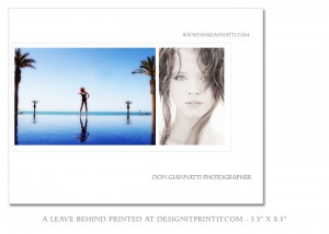
A postcard, or oversize card with a photograph or two. A one-sheet. Something to sit there while the pondering of the choice is made. OverNightPrints can hook you up as well as DesignitPrintit.com – you can order as few as 25 oversized cards with printing on both sides. Contact information should include website, phone and email. Add your twitter and facebook if you are so inclined. Getting people engaged with you and your work is the idea. I have even had some nice work done at Kinko’s. For a custom leave behind, that may be a great way to go.
Here is a recent leave behind I had printed in a run of 25 at www.designitprintit.com.
Make sure your leave behind has all contact information on it. In an envelope or not, it should be something they can refer to when thinking about making a decision. Models have comp cards, you have a leave behind. Print them up on and inkjet if you want. You won’t have that many to print.
Oh, and remember to send a thank you card after every appointment. Like clockwork. Do it. And separate yourself from the other 95% of shooters who don’t.
Identity Package.
As well as business cards, you should also have letterhead and billing materials ready to go. Be sure your billing materials are as attractive as possible. It is all part of your look. All part of your marketing. Having a great business card, portfolio and leave behind should not be mitigated by a badly designed delivery receipt or invoice.
Need some ideas on what paperwork you should have? Join ASMP or APA and get to know the different documents you need. May be a good place to find a mentor or two. I would say that a good id package should also contain a Jewel Case design and having a few pre-printed DVD’s and CD’s can make a nice presentation when dropping off work to an agency. Just imagine how a sharpy scribble on a CD would look next to your portfolio.
What you need:
- Invoice
- Delivery Memo
- Project Bid Form (Estimate and Job Description)
- Scope of Agreement: (What you are doing, when you are doing it, what are the projected delivery items, when it will be delivered and what happens next. This way we can use the next form when things start to build on our original job bid.)
- Change Order Form
- DVD / CD Labels (have 50 pre-printed or make sure you have a printer that can print on them)
- Jewel Box Design
- Thank You and Note Cards
Invoice: So you can get paid. Never wait more than 3 days before sending it out after completion of job and acceptance by client.
Delivery Memo: We deliver things… prints, files on CD or DVD’s, Hard Drives, Thumb Drives… Delivery Memo states what was delivered, Job it was for, who signed for it. (In case something goes wrong and it comes up missing.)
Project Bid Form: Putting the numbers to the test. Line Item things that will cost something. Or pay for it yourself (not recommended…)
Project Description: Similar to the worksheet above, but now in final form.
Scope of Agreement: What are you going to do. What you will deliver (10 shots, 25 shots, RAW files of shoot, P-shopped edits… whatever). To Whom. When. When payment is due. No surprises.
Change Order Form: “Since you are already here could you shoot the CEO’s office?” “Sure, let’s get this change of work order filled out. BTW, do you have to get approval on the additional cost?”
CD / DVD Labels: Design and have them printed on printable discs, or print yourself. Do not use peel and stick labels.
Jewel Box Labels or Cool Jewel Boxes: Self explanatory… what you deliver in could be seen more around the office than what you delivered… keep it sharp. Probably the best I know of are these guys. Not cheap, but definitely an investment in your image. Jewelboxing.
Thank You and Note Cards: After every appointment, send one by ancient, old people snail mail. An email is NOT a personal thank you even though you may do that as well as twitter, facebook, plaxo, friendfeed or whatever you use. Text is, welll… no text.
Score has some really good forms for your overall business.
FreshBooks. For those of us who want to cut down on paperwork and dealing with folders and such, may I recommend FreshBooks. It is an online management of your billing and bidding and all things business.
Business Awareness.
Join ASMP or APA if you have to. Find out what this stuff is worth. Even if you don’t get what it is worth, knowing what it is worth is very VERY important. Professional organizations can hook you up with a lot of the forms, bidding information, how-to’s and more of your industry. Quite often you will be able to meet a mentor or someone willing to help you in your endeavor.
That is important, because at some point, a prospective client may actually ask you for a bid. That is what it is all about, so what now?
What do I show?
Show work that is relevant to the client. If you have a portfolio that allows you to quickly change images, then you can rework your book specifically for the work that the client wants to see. Show them the work they want to hire you to do. Don’t show them stuff they are not interested in.
If it is a beauty shoot for a local hair salon, then headshots and beauty shots are good. Kids to adults. Playful and studio-serious. Men, women, kids are all good. No, they don’t have to be “hair” shots everyone, but people are at least a common denominator.
If it is architectural shots that the client is asking about, then the beauty, glamour and fashion shots may not be the ticket. Not at all. Show them your buildings and interiors and property and landscape design shots. Don’t have any? Well, you can handle that two ways. Face up and tell them that you have no shots but would like the opportunity to do one for them. Handle that any way you can if you know you can do it. If you know you can’t, then the other way is to simply say “thanks for the opportunity, but I am not shooting Architectural. I can refer you to a friend of mine that is awesome if you would like.”
Don’t take jobs you have no familiarity with. The bad Karma and negative feedback can cost you way more than you can possibly deal with starting out.
A hint: Nudes, glamour shots with girls in fishnets, pinups, kitty pictures, your car’s dented hood, random beach pictures, sky shots of awesome clouds, flower pictures, prom photos, porn, still life shots with no point, ‘art’ studies of overweight people eating at food fairs and anything you shot while inebriated should be stricken from your book. I have seen all of the above in books called in to do advertising work for medical technology clients. Really.
When asked for a bid, ask questions back. Find out everything that you could possibly need to know and ask.
Do not blurt out some number off the top of your head. And that is where it would have come from if you don’t have any clue to what the job actually entails. A day rate of $2000 may sound great but if you are not on the same page as the client and the models get billed to you… OOOPS.
Ask questions. Take notes. Bring a recorder if you don’t want to write. Be ready to find out all the details of a shot that you may have to deal with. Be as thorough as you need to be.
What about props?
Who will deliver the clothes?
Will the clothes be ready to wear or will a fitting be needed?
Stylist?
MUA?
Will they need an assistant?
Time Frame?
Location challenges?
Models?
Casting?
What about weather delays?
What about usage?
What about usage beyond what was discussed?
What about location fees or permits?
What about lunch for the crew? (which for 2 models, hair, mua and assistant could eat half the $200 fee.)
What about assistants?
What about overtime due to client being slow?
What about …
Ask what they are going to want the pictures to do? Incite a buying frenzy? Introduce a new product or service? Change the mind of people who thought they were something else? Find out what the motivation is and keep that in mind as you plan your shoot. Many times, the shoot is mostly planned for you by a marketing person or AD, but sometimes you can bring your ideas to the table.
Without asking a few, or many, questions, it is hard to know what to charge when you don’t know what is going to be happening at the shoot. Where does your scope start and end? Who is taking care of all the little things that may get in your way? Permissions to shoot – you or the client?
Asking questions also says you are interested in the client’s job, not just an opportunity to shoot pictures. I am more interested in people who are interested in me than in people who are interested in themselves… All of us are. Human nature. Becoming interested in the details also helps to remind the client of how much work is actually involved. It reveals the challenges that may prevent the work from being done to the highest level possible. And that helps them understand the fee. You do remember the fee, right? (I once read about a photographer who was so excited about his first big job that he forgot to even bill it. Heh… don’t do that.)
As to what to wear to the interview, well, I am from a different generation. Showing up in crappy jeans (instead of ‘designer’ jeans LOL) and a wrinkled old shirt won’t do it for me. A photographer can be a little offbeat – especially portrait and fashion shooters. Be respectful in your choice of what to wear, and be unique. Let them see something unique. You want to be remembered, right? Now dressing loony may not be the best thing, but having a ‘look’ is a good way to keep your name and image together. (Personal aside: my assistants don’t show up looking like they have been up all night and drinking heavily. No T-shirts with slogans and no holey, beat up tennis shoes. No, they don’t have to wear a suit – we do a lot of work that is work, but looking like a homeless person on a shoot is not happening with me either. (If you don’t know the name Anthony Edgeworth, look it up. Great true story about a guy getting started in late middle years. Heh.)
Website.
Well, we are working on a large post on websites, so we will be a little short here. If you are working to create a feeling of trust, you want that on your website in spades. Lots and lots of professionalism.
Now here’s the thing. I don’t think photographers should spend too much money on websites. When I see sites costing $5K or $8K, I just wonder at all the other places that that asset could have been placed. A website should show your work, a contact page and have some description of what you do.
Personal opinion is that I really think those sites with 5 or 10 categories look stilted or groveling. Like I can shoot everything and anything and pleeeeeese give me a job. A couple of dozen images or so could be enough. Resist the temptation to show every shot you ever did. Keep the editing as tight as your print book. Less is more. Only the best. Keep it exactly as you want it to look. No filler. Only the best images should be used for your portfolio.
Show a couple of categories if you want, like “people” – “not people” or “still life” – “environments” – “portraits” but having a category for everything and then only one or two shots in that category is just pathetic looking.
I will be discussing more about websites in a couple of weeks. In the meantime, you can download this wonderful document by Photoshelter for more information on the web, how people use it and what you can do to up your game there.
In closing on this rather long post… a little on Brand.
Don’t go cheap. Don’t break the bank, but don’t go cheap. It will be so difficult to build a ladder out of the hole you build if you go with a look that doesn’t help you. Be ruthless in protecting your brand… all of which is above. And a little more of you. Your brand is you. It is how you answer the phone. It is whether you return calls or not. It is how you deal with adversity. It is how you deliver your work and how you treat your assitants and whether you respect the people around you.
You. You are your brand. Not your logo. Not your portfolio… and not the pictures you take. It is all of that rolled into a person that either delivers or doesn’t. One bad client experience can lead to many more bad impressions than one good one. More people complain than ‘extol the virtues of’… so you have to work as hard as you can on the problem clients to make them happy.
It is your business. All of your work reflects YOU when YOU are not there.
Some reading on personal branding.
Tom Peters (Brand YOU evangelist.)
Brand You Tool Kit
Garr Reynolds
Seth Godin. If you aren’t reading Seth Godin every day, you are missing some incredible Brand and Marketing wisdom. Like this one on the day I post this.
As I said, we will have some more information coming on websites, blogs and social media marketing.
UPDATE: Milton Glaser, one of the foremost designers of our time, has this to say.
Thanks for coming by and visiting Lighting Essentials. Please tell your friends.



Great post! Your passion in passing your experience to others so that they will learn and waste no time simply beyond words.
Salute!
Sam
I’m printing this for later re-consumption!
I would only add to ALWAYS take a note pad and pen to a meeting – shows that you are interested in what the client has to say (vs a recorder).
Check out this video – presentation: “Luke Tuttle on your “digital footprint†and sandals at work”
http://vimeo.com/5075237
(Disclosure: Luke, the presenter, is my younger brother)
Some other things to remember (like what your facebook, twitter, myspace, etc has to say about you as a professional)
What a terrific post! Such valuable information and for free! As Sam said, your generosity in passing this information along is very much appreciated. Printing it out to read tonight.
Thank you for an awesome post! This is exactly what I needed right now.
Ben
Great post and I look forward to the other posts in this series. Your willingness to share and help us be more successful is very much appreciated.
Wow, I actually made through all that! 🙂
Thanks so much for putting it out there, Don–I recognise it’s a lot of work. Looking forward to more “info from the inside”.
Cheers,
–M.
I just ended up here from a Chase Jarvis Blog.
This is The Most Readable collection of information I have found yet!
Thank YOU!
Thank You, Scott
And thanks to all of my commenters above. I am glad you enjoyed it. I am busy working on a second post.
Don,
Great stuff. Thanks for taking time and dumping your experience and knowledge for us all to share. You’ve cut to the core of the basics required to get off the ground.
Tom
Tremendous post, Don. Thanks for giving me a nudge in the right direction!
Outstanding. The timing could not have been better. Thank you, sir.
Donation Made.
More to Come.
Brilliant Stuff!
Don – this is an unbelievable post! You have provided so much valuable information in one place. This is “reference material”…a chapter in a book…a lecture…and more!
As a businessman and hobbyist photographer, I cannot tell you how many photographers I have seen that do not understand the business side of photography…or the simple importance of a GOOD business card or website. It’s all about branding, branding, branding…and YOU are the brand!
Well done Don.
Don, this is an awesome article, I just read it again after digesting since yesterday. Definitely a must read for anyone even thinking of becoming a \"Professional Photographer\".
You sir, are a gentleman and a scholar.
🙂
Thanks a million, Don. 😉
Simply one of the best business related posts I’ve seen, giving the real heads-up scoop on the essentials for taking the jump from amateur to professional. Very Well Done.
Cheers,
Gary.
Don…
Thank you for sharing your knowledge in such a personable way. Your message makes so much sense. I appreciate your teaching and encouragement to those of us who are truely considering making this a career. Taking the time to share your experiences and knowledge is so valuable, it would take years and years to learn on our own what you have just said. I look forward to attending another workshop in the future.
Thanks again!
Daniel
Don,
Simply a great post, as so many above me have stated! Thank you, thank you, thank you. And the timing is PERFECT, almost like you’ve been reading some of OUR minds!
Can’t wait to attend a workshop and meet you in person.
Thanks, you just saved me $100k + at SVA here in NYC. I have only had my camera for a year and need to make, find, create whatever more time to shoot. Experience is the best teacher and I need to get in the classroom. Thank you for this post and please keep them coming.
Excellent post Don. This should be required reading for every photographer, professional novice or not. Things I thought I had a pretty good grasp on, I now understand a lot better. Many thanks.
Awesome post! I can’t wait to see the rest of the series.
Great Info 🙂
Hi, there are so many photography blogs/ websites (including mine) that it gets incredibly tough to sift through all of them, and figure out which are the ones that you actually need to follow. Yours, by far, is one of the most interesting and useful. I discovered your site sometime last year, and have religiously read all your posts since. Your passion for sharing your learnings and experiences is stunning, and humbling. Thanks for doing this.
Thanks Rishi.
you made my day, man.
This is a fantastic piece of writing, Don, and so very informative. As already noted above, THANK YOU for taking time to distill your incredible wealth of knowledge and experience into this article and share. My appreciation for your insights and wisdom only grows stronger. Looking forward to the rest of the series!
You are very generous with your information. Good stuff, too. Thank you.
WOW! This is THE BEST articles Ive ever come across!!! THANKS SOOO MUCH!
Photography school doesnt cover this one bit! Thanks again – this is fantastic advice! Been wanting to know all this for so long.
PLS do more articles like this – business topics.
Chally from South Africa
thank you for sharing this information about photography. Basically all people want to shoot . NO RULES, POINTERS or whatsoever. But thanks to you, everyone can become a professional photographer in their own way..
Great tips..