Just before Halloween (October 31, 2016) the assignment for the Project 52 students was to shoot to layout for this fictitious piece.
The magazine layout is a two page (spread, or “double truck”) and calls for the photographer to be very cognizant about what is on the right side of the image. The right side of the image will have copy set there, and it is important to keep that copy readable. The text is set as reversed (light text on a dark background) and was not to be changed.
This is a deceptively difficult assignment. Making sure the image captivates, fitting it into a layout, helping direct the viewer to the text are all decisions made BEFORE taking the shot. Planning the image is as important as executing the image.
This kind of exercise helps the photographer understand the image making process – whether for practical, commercial applications or simply to make a photograph that is deliberate.
There were many amazing shots. These are my favorite ‘scary thirteen’.
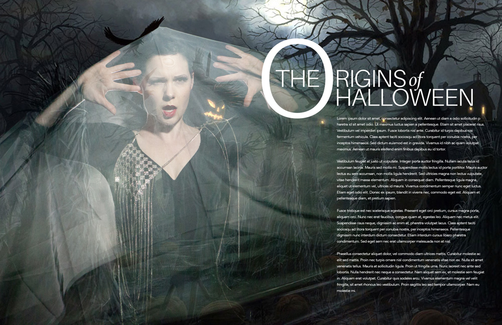
(Cover shot by Anne Stephenson.
Careful blending of a ghostly figure with a shot of an old, abandoned cemetery brings a cinematic feel to the image. Anne also used a color grade technique to look more like moonlight.)
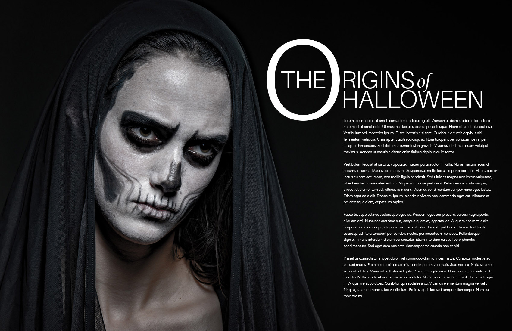
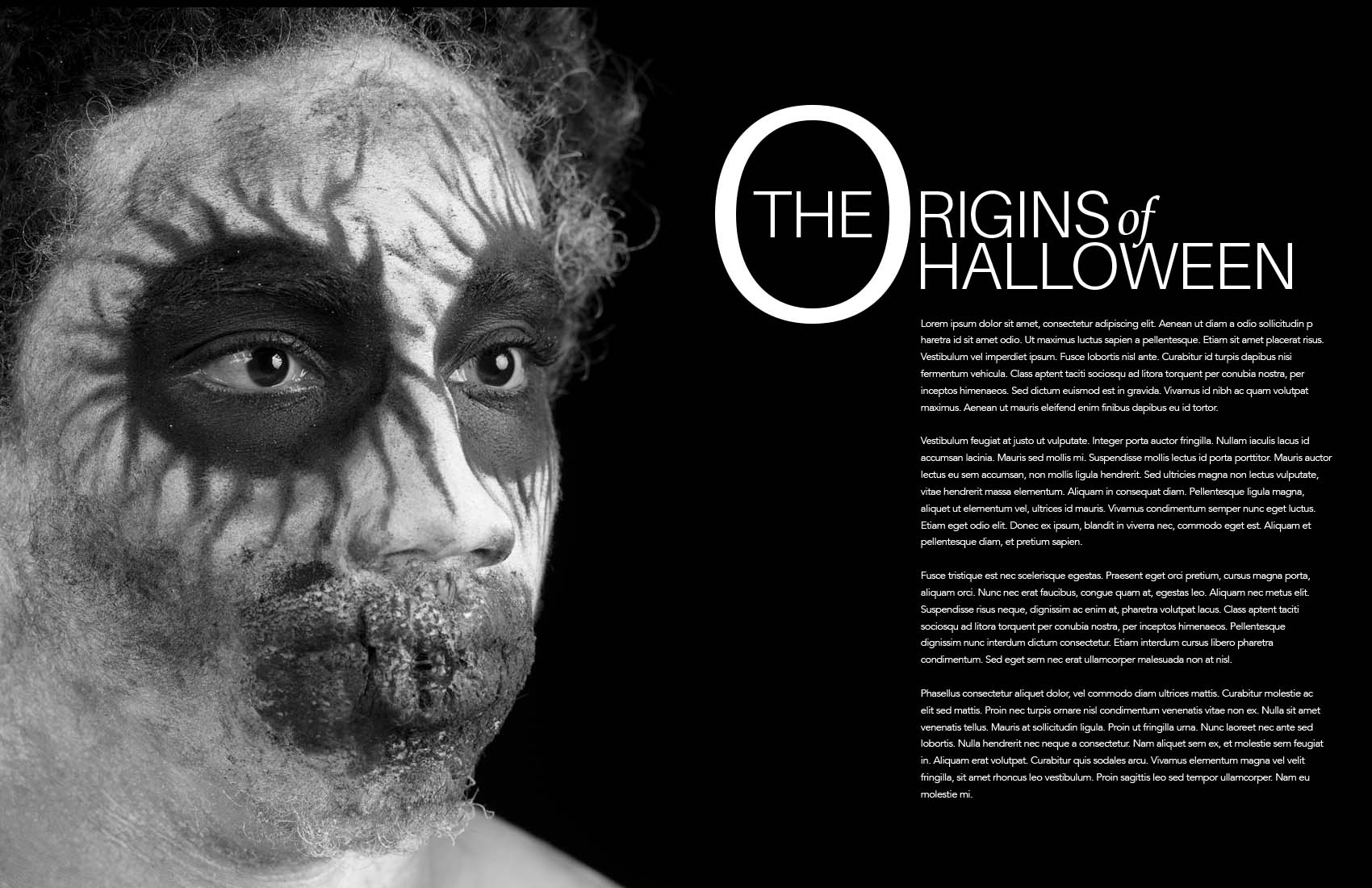
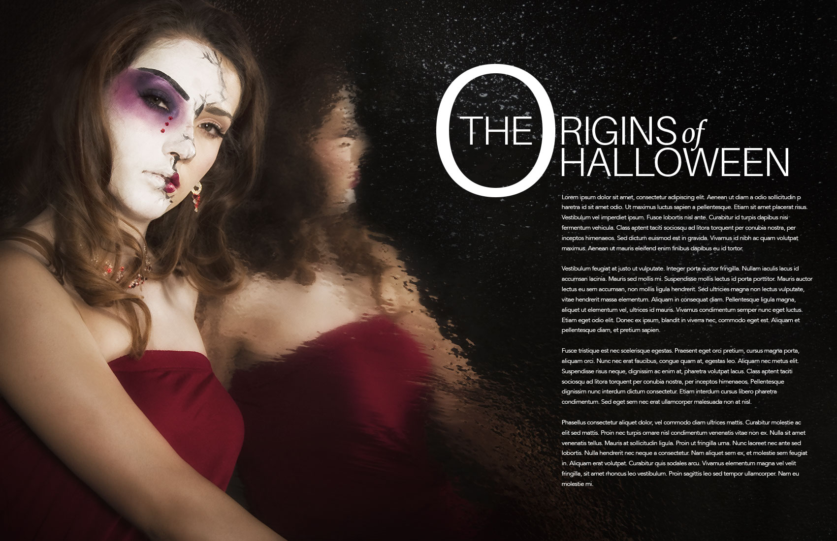
Photographer Dirk Brand used a model with the “day of the dead” makeup to give us a start. A single light source still keeps the tonality of the dark scarf, and the high contrast of the white-face makeup.
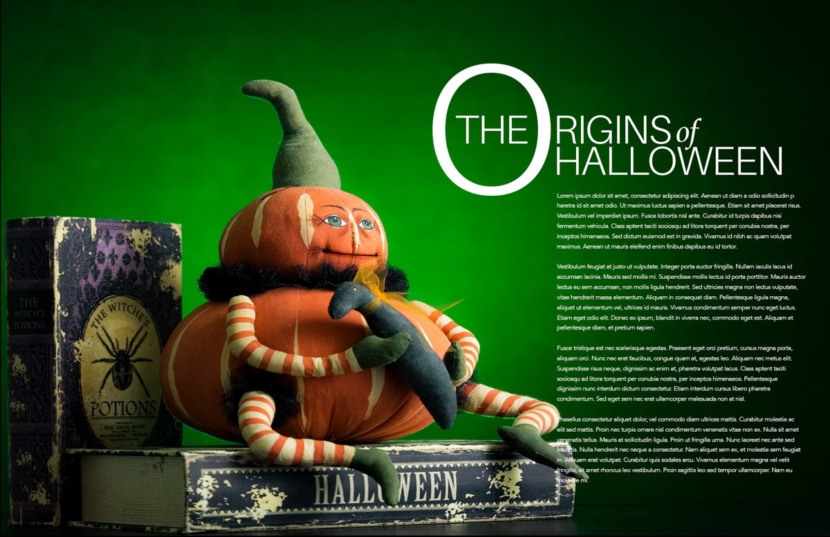
Photographer Frank Grygier brings his image as a still life of old toys. Well lit, well composed and definitely a bit whimsical, the image leads us to the text perfectly.
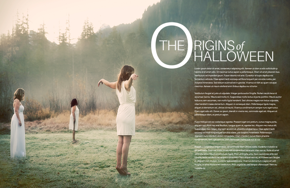
Photographer Melissa Wax transports us to a mythical land where druid like dancers seem to be calling forth a spirit. She had wonderful models to shoot on this very cold morning. The backlit fog and flare add to the mysterious mood, and the direction of the dancers lead our eyes to the text.
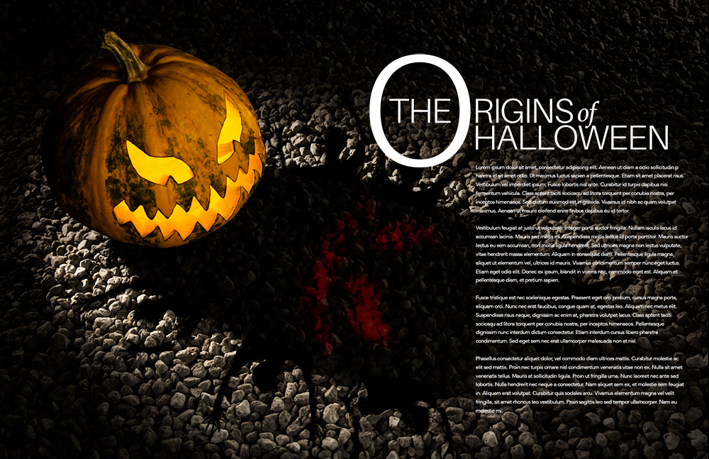
Photographer Nadine Eversley used light and Photoshop to create this interesting, graphically strong image. An iconic carved pumpkin, and beautiful leading lines take us right to the copy.
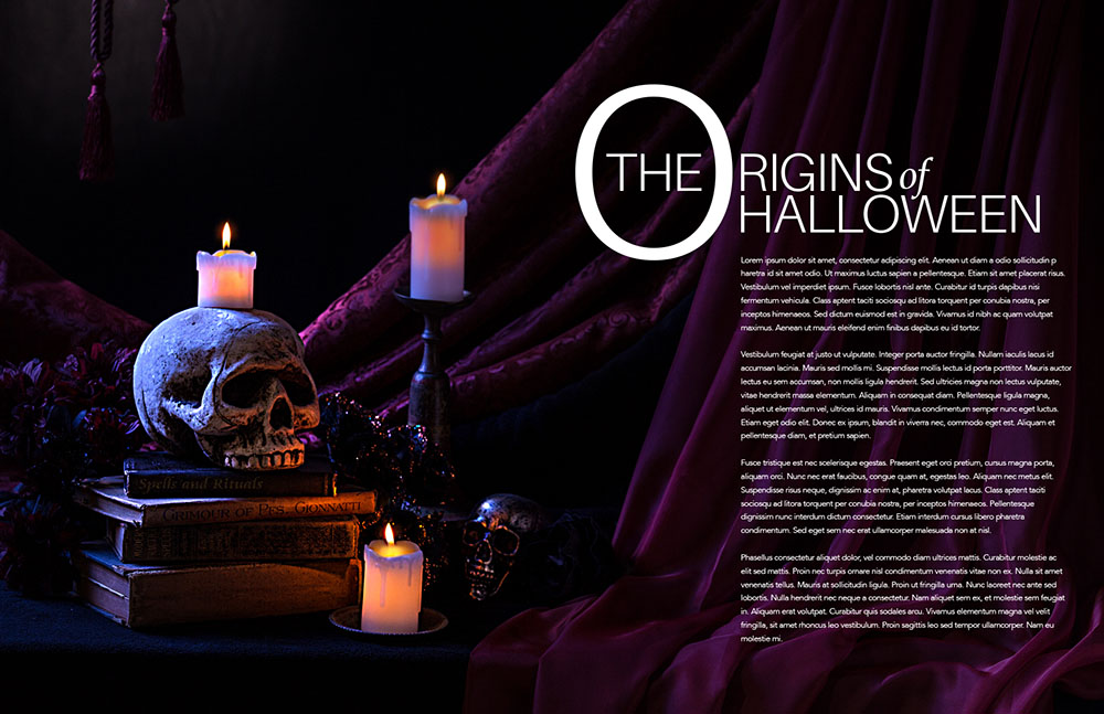
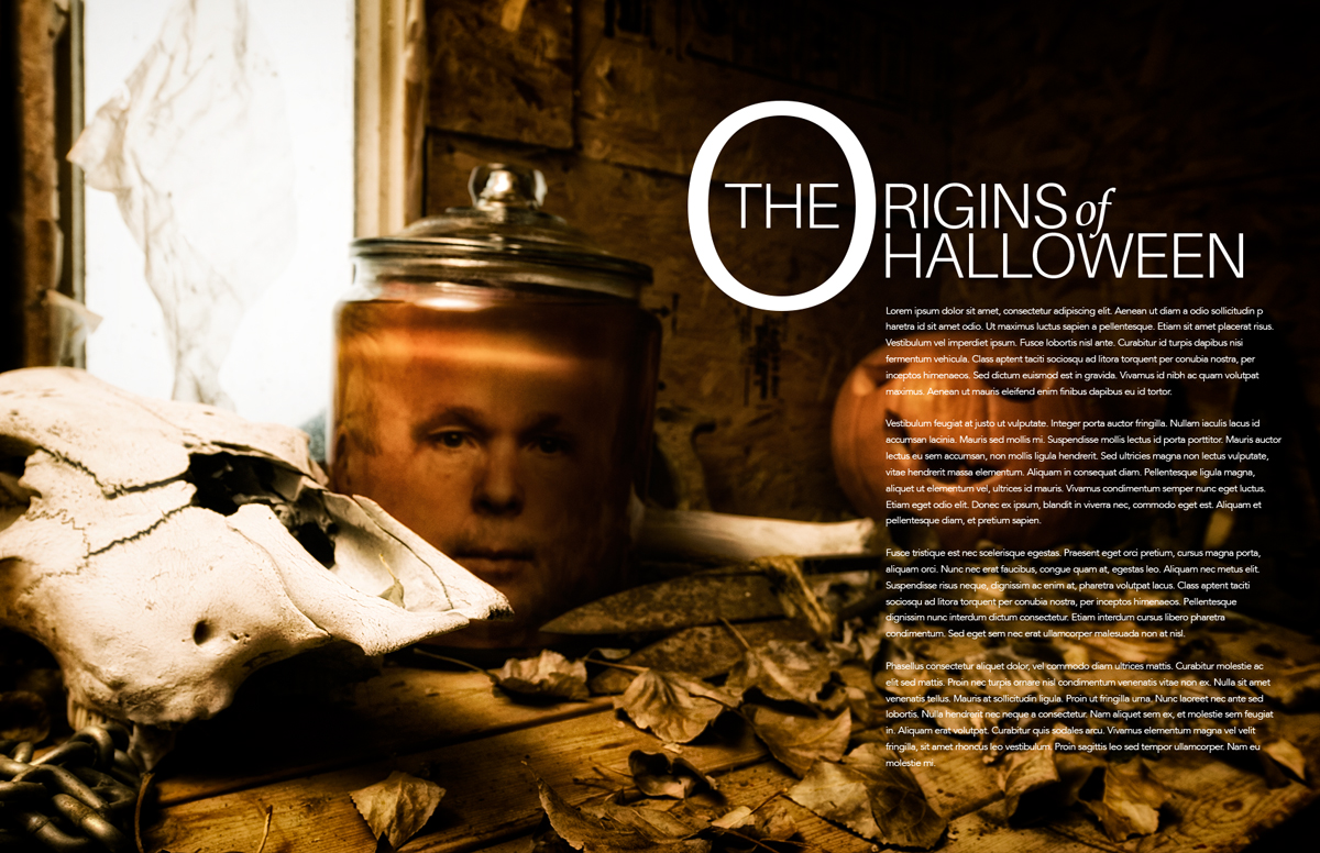
Photographer Neville Palmer presents a workbench from hell. From a potted head to a skull, to a mass of dead leaves, the still life is creepy and made it even more by the excellent use of lighting throughout the image. Note how well the copy reads over the background even though it may seem too busy at first glance.
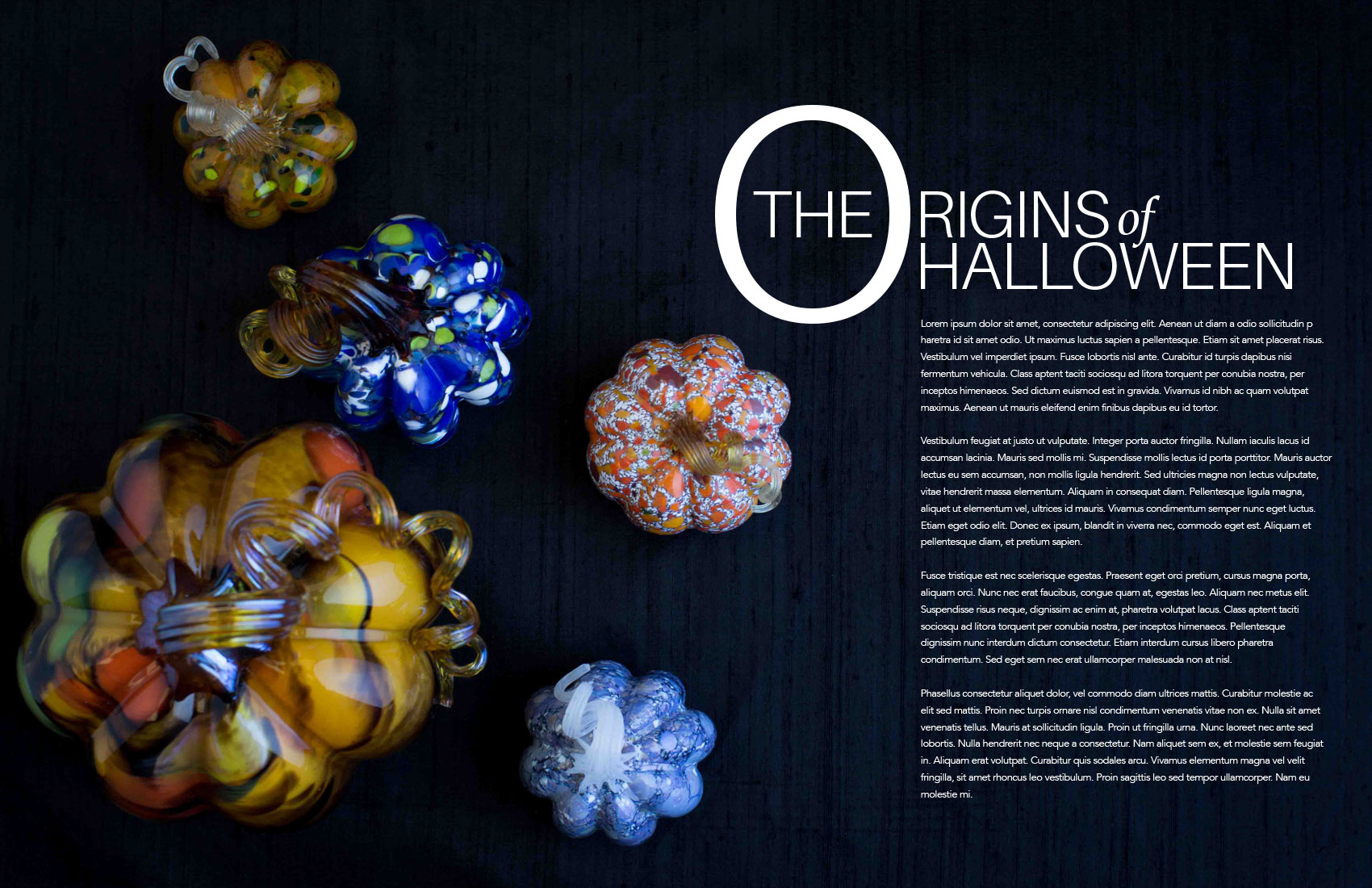
Photographer Iryna Ishcenko takes a still life approach with rare glass pumpkin ornaments. While not a traditional approach to ‘scary’ Halloween, it is a wonderful editorial approach to the product, or collectibles. This is the fun of photography – bringing in different approaches for our clients.
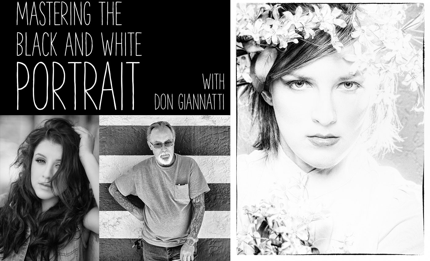
For the last time this year, I am running this very popular class on Black and White Portraiture. Lots of information on shooting people and converting the images to monochrome (black and white, sepia, toned etc…).
For the last time this year, I am running this very popular class on Black and White Portraiture. Lots of information on shooting people and converting the images to monochrome (black and white, sepia, toned etc…).

