I want to take a closer look at some of the portraits the students in the 8 Week Portrait Class are doing. Decontructing an image is a very valuable exercise and one that can garner much insight into the way the portrait was conceived and produced.
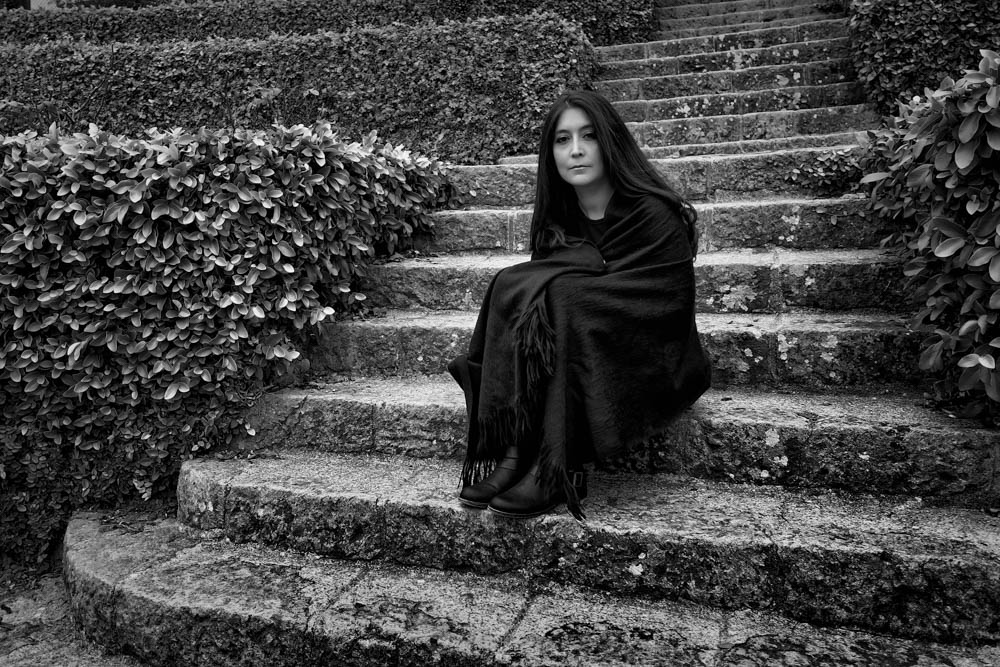
The image above, by Leonardo Ferri, is of a young woman at the rose gardens in Berkely, CA. Usually a place teeming with people and other photographers, and especially so, it was nearly deserted on this cold, overcast day.
Using the steps and the hedges as a grounding point for the image – a contextual pallete – he placed his subject in the middle of the steps and then moved a little to the side to bring the angles of the image slightly askew, and giving her a bit more of a dynamic position in the image.
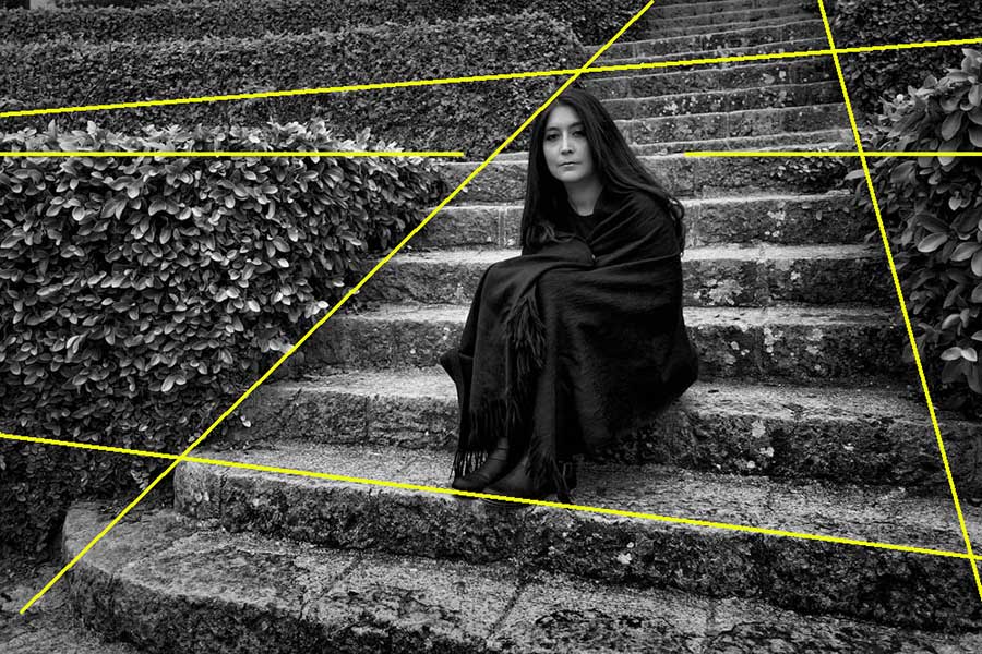
The placement of the subject is directed by the angles of the parts of the image. The placement of her face is in nearly a perfect spot.
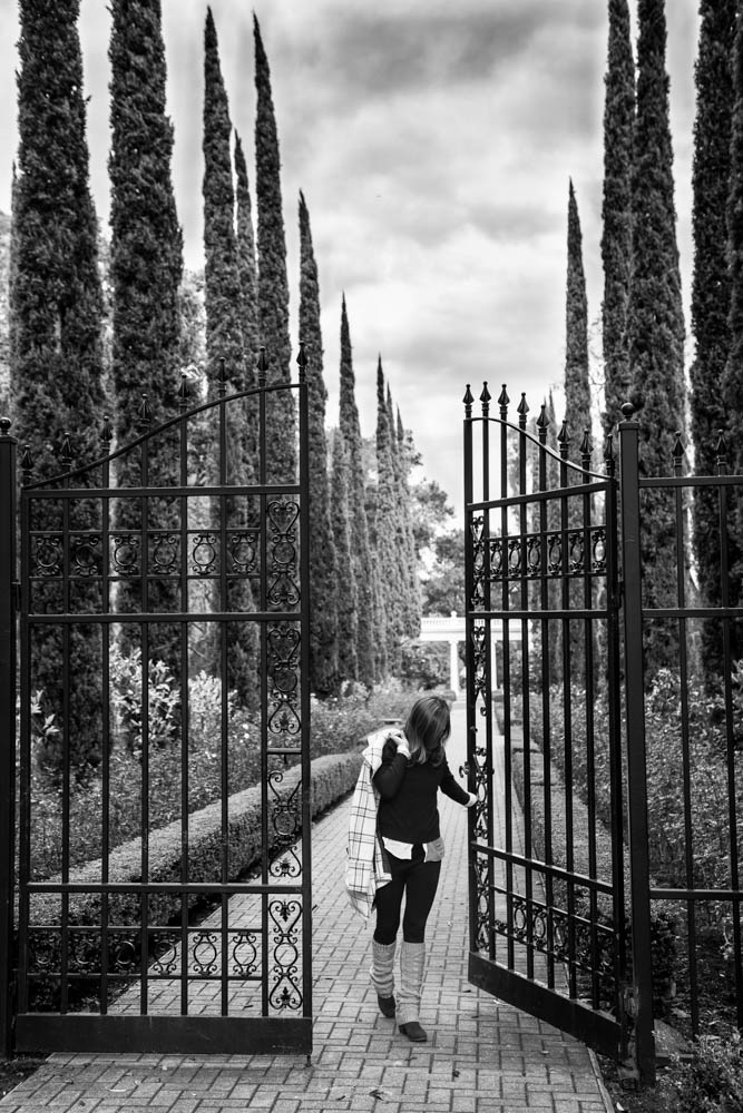
Photographer Iryna Ischenko used the tall gates and cypress trees to frame her subject. I personally like this photo for so many reasons. The leading lines of the brick roadway, the brooding sky and those lovely, tall cypress trees. The subject seems to be moving through the gate, and her gaze is down. All other elements are focused upward while she gazes down. I think this makes the portrait quite intimate and hints at a narrative unknown.
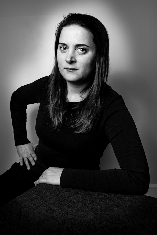
Photographer Gabriel Alvarez worked with his wide angle lens (part of the assignment) to create this powerful, yet understated portrait. Simple elements for the subject to lean on, and a single light from a speedlight was the effect he wanted to use. Gabriel told us he really struggled a bit with the wide angle lens and used a cropped area of the frame to keep the wide angle distortion from being too much for the image. Since our inspiration this week was the great Jean Loup Sieff, I think Gabriel did very well.
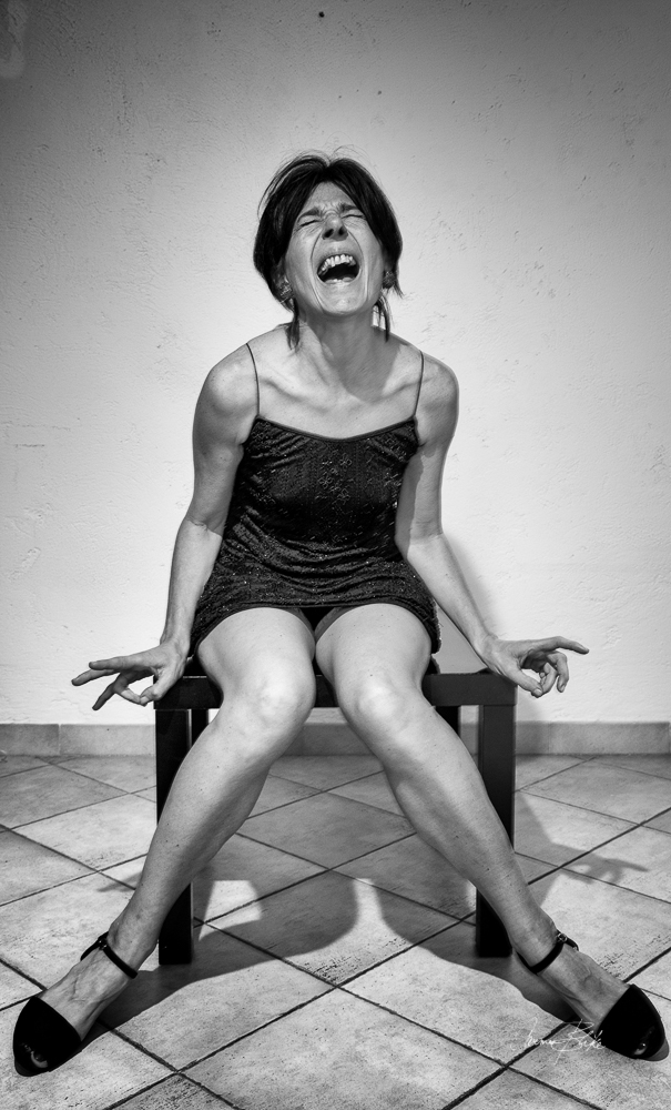
The expression is a moment caught in time and we are not privvy to what is happening. The wardrobe, a little black dress, adds to the minimalistic setting. Everything is black or white. Carmen Blike, the photographer, used the V shape of the stone work as a base for her composition, then used the subjects legs as an inverted “V” above them. The light is a single diffused speedlight above the subject and blended to be just a bit brighter than the ambient.
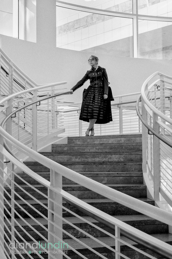
This image, by Diana Lundin uses the geometry of the setting to drive the eye toward her subject. It also seems to isolate her, while making her the obvious hero of the shot. All lines lead to the subject here, and instead of appearing overwhelmed by the huge architecture around her, the pose makes her seem confident and in total control of her environment.
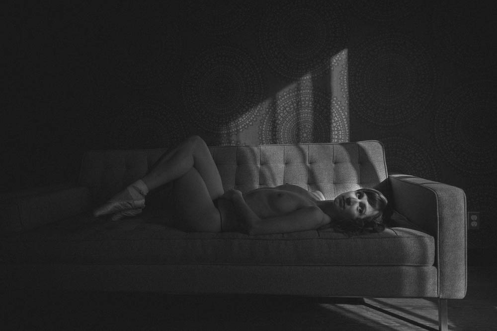
Linda Luu Kieff used a graphical shaft of light coming in from the window on right to highlight the face of this nude portrait. The angles of the light bring our eyes to the face and the textures of the environment help the subject stand out. The smooth skin of the subject is in full contrast to the dark, rough material of the lounge and the patterned background. Working in the dark tones like this can be very tricky, but Linda handled the exposure very well. The image has a feeling of film to me, although it was shot digitally.
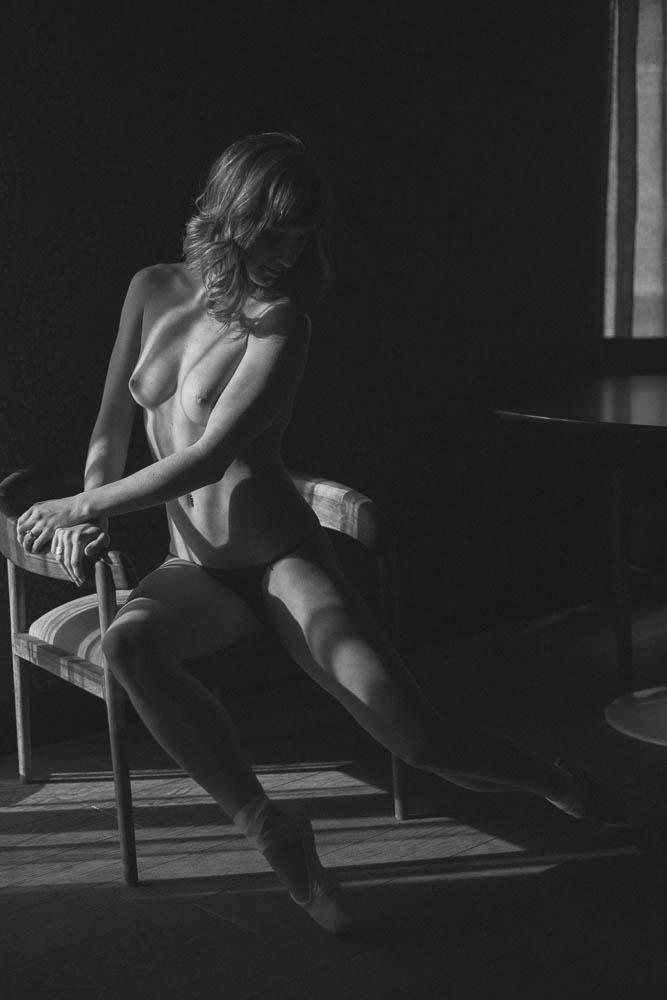
One more from the set by Linda Luu Kieff. This nude shows a different angle and how Kieff worked with the window light, and the bars/panes of the window to play the light across her subject. This play of light, and the anonymity of our subject prove to be a narrative that begs explanation. None is forthcoming. The gentle tones of the image are very film like, and keep the viewer intrigued by carefully retaining the shadow details to play off of the skin of the subject. Ballet shoes add to the story, although we don’t know why.
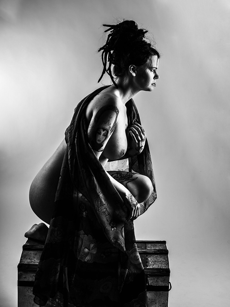
Annely Silferwax used two softboxes from either side for this nude portrait. Camera right is turned up a stop and a half over camera left, and provides the impetus for our subject to be looking off toward it. The dynamic position in the subject with the careful placement of the cloth makes this a very powerful image… one the subject seems ready to leap from. Annely used a very contrasty post-processing to be reminiscent of high-speed film when pushed. The subjects regal expression, and subtle dynamics provide a stunning image.
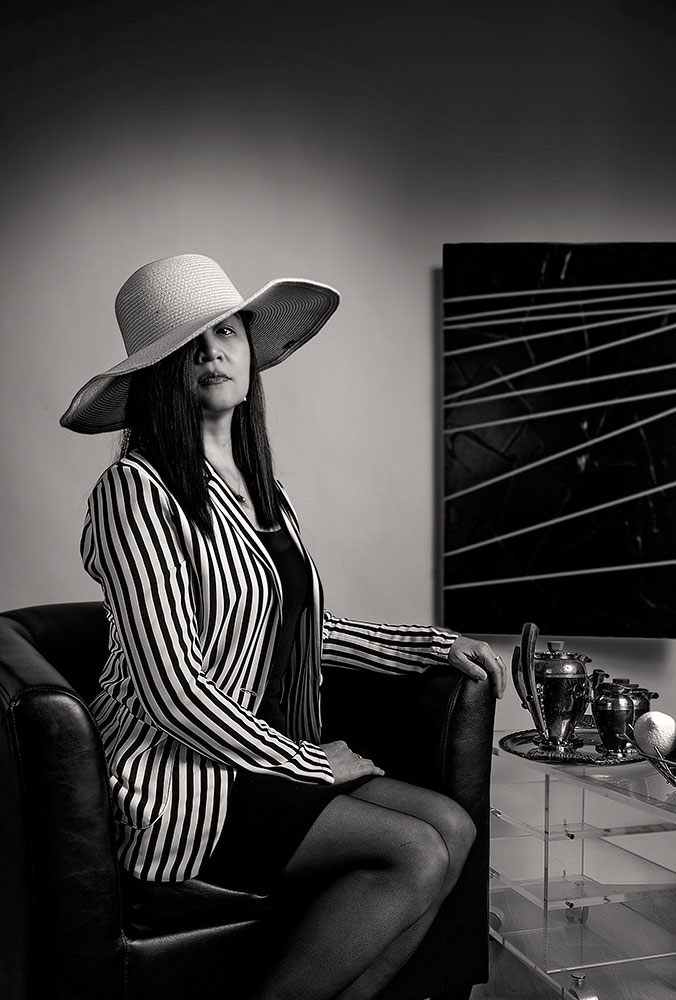
Photographer Frederic Reblewski used the stripes on the jacket as a compositional element. Notice the painting (hung on seamless paper) that mimics the lines and colors of the jacket. A large single light source gave him the look he was desiring, and a natural feel to the portrait.
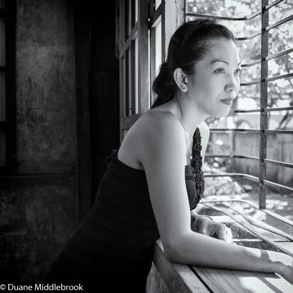
With the subject leaning way into the photograph, and into the light from the bay window, Photographer Duane Middlebrook used line and texture to set his subject off from the background. I love that bright outside contrasted with the dark patina of the inside walls. The pensive look of the subject makes the portrait more intimate and personal.
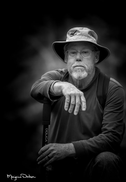
In the wilds of the mountains, and on an overcast day, photographer Marjorie Decker caught this portrait of a fellow hiker and companion at a moment of rest. The gentle light and shallow depth of field help the portrait keep a more personal feel.
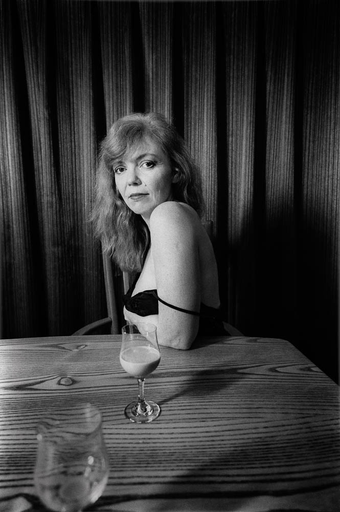
An intimate, spontaneous feel to this portrait is due to the careful use of props and background. A single speedlight is aimed from camera left, and it is flagged off to provide the raking light on the flowing background behind the subject. The simple wardrobe and sparse table setting give the image a bit of mystery. Photograph by Richard McDonald

