This past week we have been reviewing the CD cover assignment for the Project 52 2015 group. The assignment was for a cover and back image for a String Quartet performing Samuel Barber’s String Quartet Op 11.
The assignment specifically noted that the string quartet members may not be available for the shoot, so a creative solution must be found. (I don’t give assignments that are impossible… and finding a string quartet to photograph may not be totally impossible, but damn close for many of us.)
When shooting a CD cover there are three main ways of approaching the image.
For pop music it is usually going to be a photograph of the artist. Rare are the covers that do not have the artist shown. The cult of personality, and celebrity demands that we keep the faces of the performers in the fore. In many cases, the celebrity is more important than the music anyway. See the covers below for Faith Hill.

Another way is to show something that is reminiscent of the music, or an image that may be part of the title. Respighi’s “The Pines of Rome” cover could certainly have the pines of Rome featured:

And the third way is use art that is quite striking, but may not relate to the music but in the most obtuse of ways. This is usually done when there is no necessary correlation between the recorded music and a celebrity, or an album that is more about the music or genre of music than the actual performers.

Some labels like Windham Hill above was a full adopter of that approach to album design, and helped create the style as we know it today. Another company that also used art, although in many cases commissioned art, for their classical work was Nonesuch. Both of these legacies live in today’s music cover designs.

The CD cover is becoming less of a major label concern as streaming has taken its toll, but cover art will be around for a while longer and is very important for Indie bands and artists.
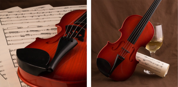
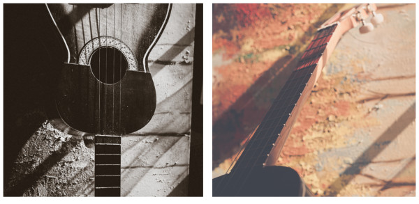
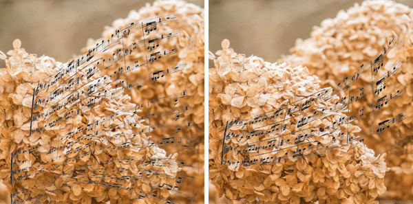
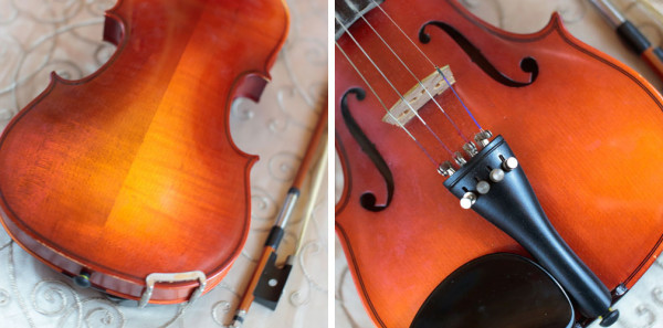
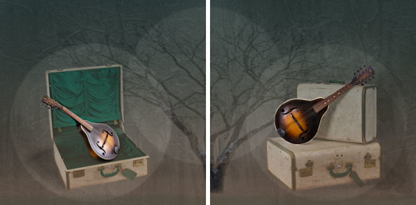
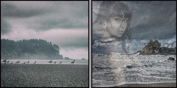
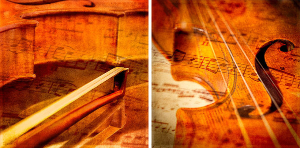
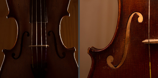
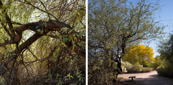
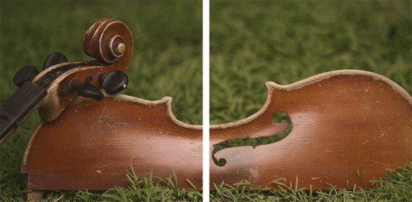
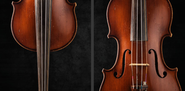
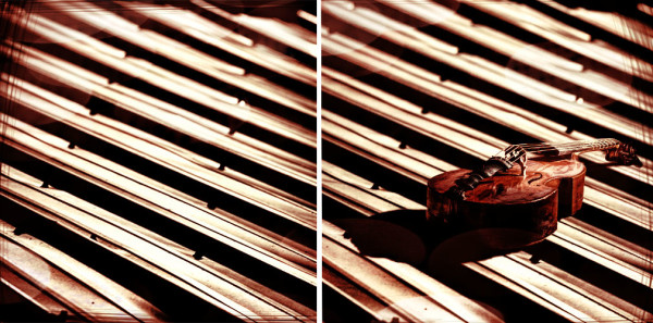
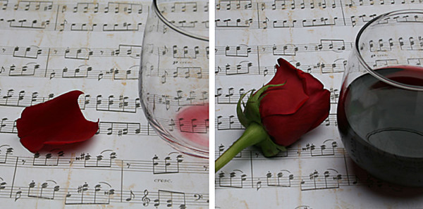
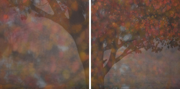
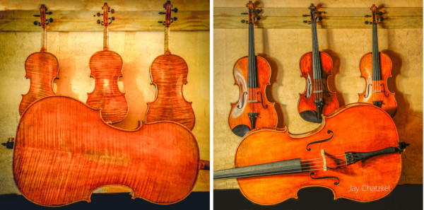
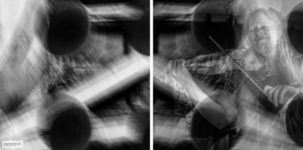
Here are a few of my favorites from the Assignment. Remember the cover is on the right side, back panel on left.
Continue on after the jump to see the class images.
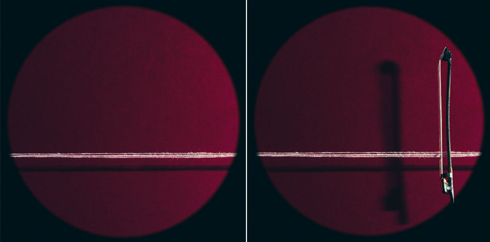
Photographer: Anna Gunn.
Pure simplicity in design and execution. The minimal approach is lit beautifully. The striking color and design catch your eye immediately.
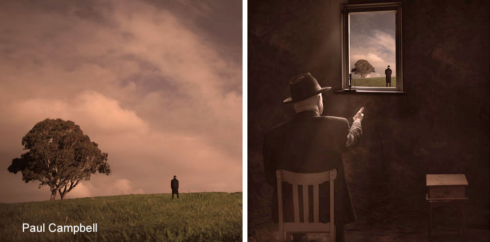
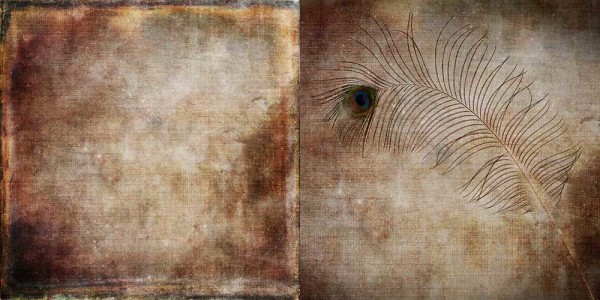
Photographer: Paul Campbell.
A story inside a story. Paul researched the biography of Samuel Barber, and wanted to infuse the cover art with a bit of mystique, as well as create an image that was at once striking and mystical.
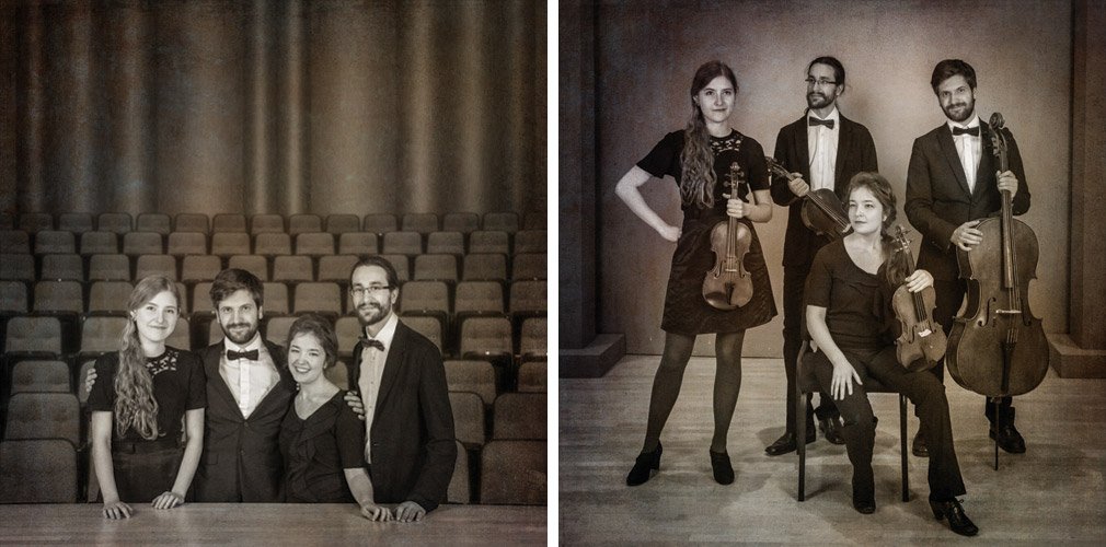
Photographer: Theresa Ste Marie
Theresa actually found a string quartet rehearsing and they agreed to pose for her. She will be gifting them this image for them to use for PR as they have nothing right now.
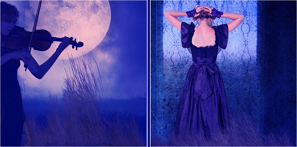
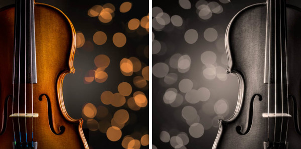
Photographer: James Kern
James approached the sensuality of the music and created his own world for us to see. The use of tone and icons make the image wonderful to look at. And it brings us a bit of emotional attachment as well.
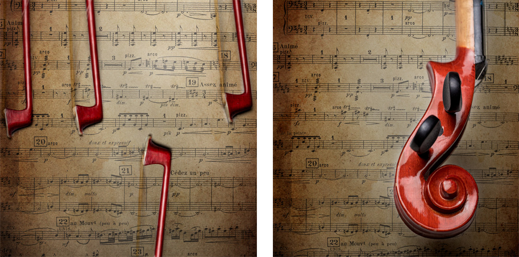
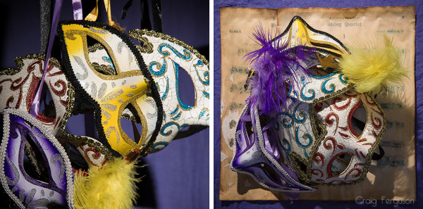
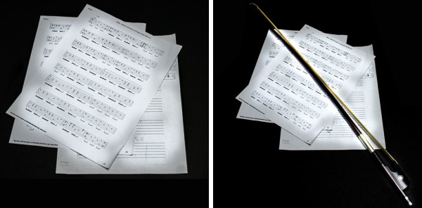
Photographer: Mike Moore
The use of an old score and exceptional lighting brought the quartet to life here. A clever use of the bows on the back side reminds us there are four musicians, while the single scroll on the cover indicates ‘strings’.

Photographer: Alex Baker
Finding the scroll in nature and then shooting it two different ways presents a truly creative approach to the cover. Shot from above and shot from below, the scroll takes on a different feeling, yet ties the two images together.
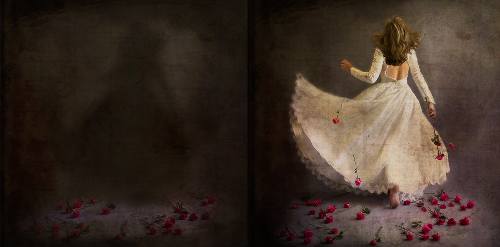
Photographer: Carla McMahon
Working to produce an image that would make the viewer stop, Carla infuses the duo with a mystical story. Who is she? Where is she going”? What is the significance of the roses? All meant to bring the romance and delicacy of Barber’s music to an image.
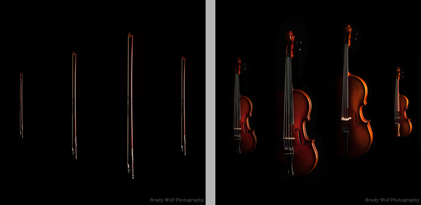
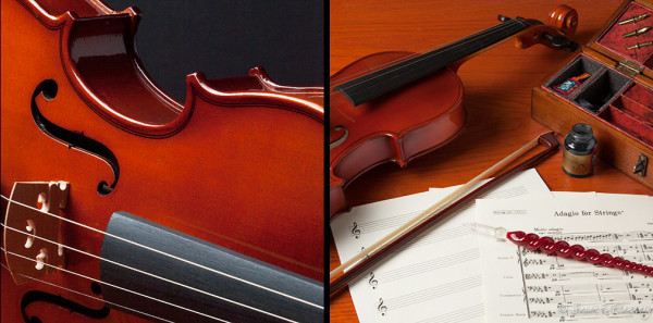
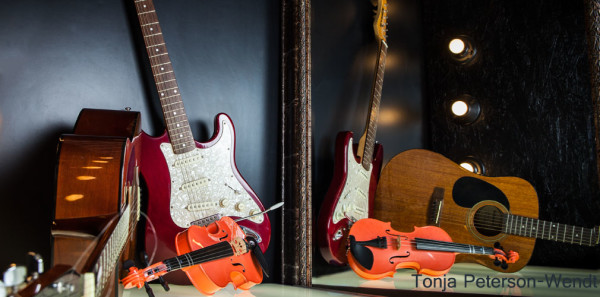
Photographer: Brady Wolf
Brady chose to shoot the instruments in luscious, shape defining light. The bows on the back are a sort of visual pun, but brings us an image that is both striking as revealing of the contents of the CD.
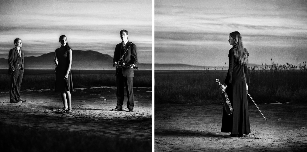
Photographer: Nicole Fernley
On the banks of the Great Salt Lake, on a very cold day, Nicole shot her quartet in a selective, serene way. Note the way she positioned the horizon to be continuous. Each of the people were shot individually.
The students were in a great creative form this week. Below is a gallery of those submissions.
I am so proud of all the Project 52 members. We are going on a holiday break soon, and their enthusiasm is simply overwhelming.
This is the kind of thing that lifts my spirits… to see the levels of creativity and effort that go into these shots makes me feel pretty good about the future of commercial photography.
NEW CLASSES ENROLLING
A reminder that we have the next 8 Week Portrait Class 102 enrolling as well as the 8 Week Still Life Class. Both start in January and we only have a few spots open on both. If you are interested in portraiture or still life photography, check them out. I think you will like them.

