Gary Crabbe is a full time landscape and environmental shooter living in Central California. Recently, one of his blogposts caught my attention as it is something I am wondering about as well.
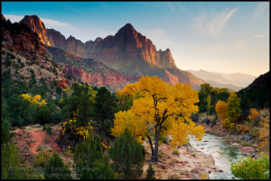
I just came back from Zion and Bryce Canyons and while there found myself staring at those “postcard, iconic” images of these places. My light was no where near as wonderful as some of the shots I had seen, but I nonetheless snapped off a few frames. I ‘got it’ – that shot of Inspiration Point, and the bridge over the river in Zion. Recognizable images, but not very spectacular.
Here is how Gary began his blog on the subject:
“This month I was fortunate to spend a week traveling through Death Valley as the guest of some friends who were leading a photo workshop. We arrived at Zabriskie Point on the first morning, which is one of Death Valley’s prime photographic postcard locations. Zabriskie Point is a true icon, in that it has become one of the ‘must-have’ shots for photographers traveling through the park. It was somewhat disheartening for our small group to crest the hill only to find a large workshop with two dozen other photographers lined up on the hill below and in front of the paved viewpoint. Their presence in front of everyone else made it difficult for anyone who arrived later, or those with mobility issues who were limited to shooting from the paved viewpoint to enjoy or photograph the scene with any sense of unobstructed natural beauty.
A friend remarked to me this week that nature and landscape photography has become like a competitive sport. I found that to be both an incredibly appropriate and sad assessment when discussing those many “must have” icon shots. Seeing this group, who set themselves up to arrive early and get the best location in front of everyone else, seemed to epitomize that competitive urge to ‘get the shot’.”
A very lively discussion follows, and I wanted to chat with Gary about his opinions on the desire for so many to get that “iconic” shot.
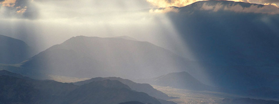
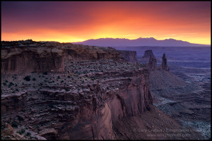
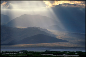
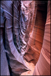
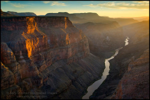
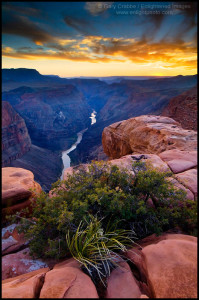
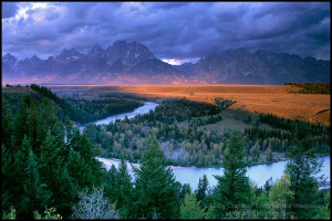
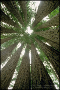
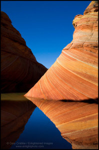
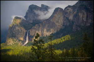
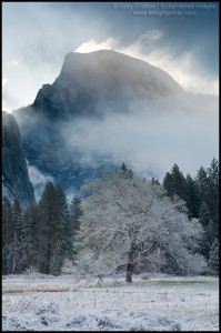
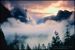
Here are a few of Gary’s images. See a lot more on his website.
(BTW – I designed Gary’s website and structural flow, and logo. Just wanted to brag a moment there… heh.)

