This weeks Tech Sheet features one of my favorite portrait techniques. In this shot I am using it as a bright, poppy front light with a very pronounced back “spray” light. It is an easy setup with lots of room for customization and personalization. It can be done with studio strobes as well as speedlights and would be appropriate in many settings.
.
Before we continue on, I want to remind everyone that next Monday, November 24th, we will start the listing of next years workshops. We will start in Phoenix in January, then off to the Bahamas, Sacramento, Detroit, Tampa, Denver, Dallas, New York and Washington DC. We have more dates to announce and we are always looking for hosts in cities we haven’t booked yet. If you are interested in hosting a workshop, let me know in the contact area of the site.
(BTW… I am thinking about doing some live broadcasts… say, every weekend do a free livecast of something or a shoot. Do you all think that would be a good thing or should I simply video it and post it. I like the vidcast thing because we can have a dialogue while it is happening. Thoughts?)
Now on to the portrait lighting Tech Sheet for November 21, 2009.
The key to this light is keeping the umbrella in close, in bounce position, to get plenty of natural wrap fill from the parabolic shape of the umbrella. Let’s take a closer look at how this light can be used without fill cards.
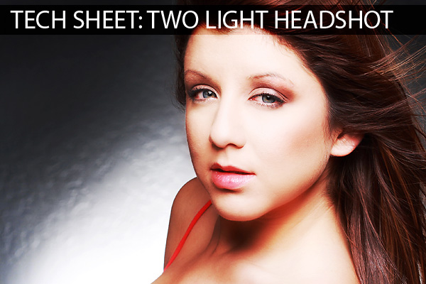
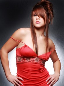
In this image we can see how well the light covers Briana and seems to wrap all around her even without a fill.
In the image above you can see how the light plays soft and yet with a pop that keeps the skin bright and clean. You can also notice how the closeness of the umbrella creates light that falls off quickly as it moves away from the source (ISL). The back shoulder is considerably darker than the front of the image because it is farther away from the light source. This also makes the image a little more dramatic.
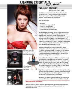
Let’s take a look at the tech sheet:
To download it and print it, use your right mouse button and “Save Link As”.
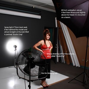
The size of the umbrella in this shot can make all the difference in how the skin looks and how poppy the light can get. I am using a 60 inch umbrella at 4 feet. In this shot I am using 400 WS heads… one in the umbrella and one on the backlight stand. The reflector that is in the umbrella allows for maximum coverage of the umbrella and that translates into a very even and ‘clean’ light onto the model’s face.
This image shows the model in position, 8 feet from the wall behind her. The spray light is plainly visible from this angle and you can see how close it is to the wall. This closeness chokes the light off and forces it to quickly dissipate as it leaves the close area of the reflector. Placing this light at the same angle as the camera will put the circle of light in the middle of your image. You must also be careful in that it gets placed in a spot that is not seen by the camera. Your model will probably be able to hide the strobe head behind her.
Let’s take a look at what it looks like from camera angle:
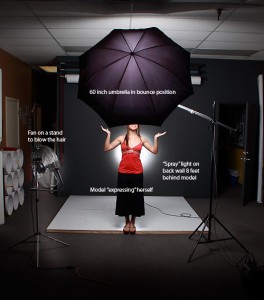
Notice the careful placement of the umbrella so it is in the center between the camera and the backlight.
Keeping the main light on the vertical axis of the camera means that there is very little shadow provided and also that the light wraps evenly around the model. The spray light in the back can be centered or placed where ever in the background the photographer wants by moving shooting position slightly to each side. Too much movement could reveal the light, so be careful.
Here is an alternate shot:
When taking the reading with a flash meter I place the meter against the wall at the spot right above the models shoulder. I make the choices at that point on how bright or dark I want the spray to be and adjust from there. For a subtle look have it match and for drama make it one over the main. If you are chimping, make sure that the light isn’t too flat.
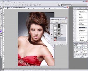
Let’s look at the Photoshop work for this image now. After the normal skin retouching and basic editing the image is ready for the final tweaking. Here is where it gets pretty interesting. After the normal processes which can be a local skin repair or as elaborate as recalling several layers, we have an image that looks pretty good, but we can make it look better.
I rarely process an image these days without using Tony Kuyper’s amazing Luminance Masks. They are available here and Tony asks for a donation to keep him working on them. Please let him know you were recommended by Lighting Essentials.
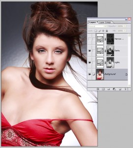
Here is the image with the basic masks turned off:

Not bad, but a little flat to my taste. I add a layer mask action of “light” and create a gentle “S” curve… very gentle… on the curves adjustment layer that the action. Small adjustments are the best so be judicious in their use. With this mask only the light pixels are chosen, added to the curves adjustment and then can be made to be lighter or darker without touching the pixels that are not in the lightest categories. In other words, we can start to add contrast without affecting the other parts of the image.
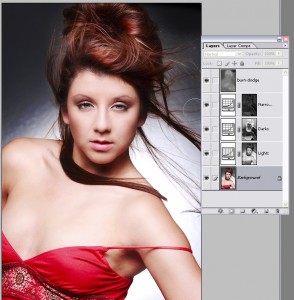
Now we will add the ‘dark’ mask with the action. This chooses the dark pixels and I make a gently curved ‘S’ on the channel layer. Again small movements can be a large change so watch your image very carefully and don’t go overboard with the changes.
Below is the group shot with this medium layer mask turned on. This layer has a little bigger movement allowed because , but still watch that image critically to see the final adjustment layer doesn’t make changes that are inappropriate. I do the medium masks last.
At the end I add a layer of 50% gray, blend mode to either soft light or overlay and set my brush opacity to around 8%. Using white I gently add to the highlights and with black I can add to the darker tones. This is a very small move, so be gentle with what you do.
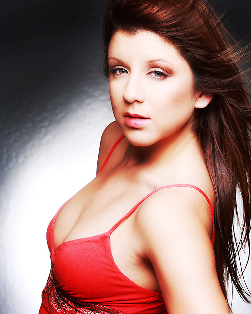
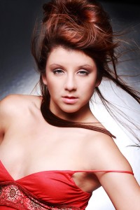
Here is the final image with the tweaks in place:
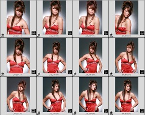
For fun I am including this small section of images in a “contact sheet” form so you can see the work that Briana did on this shoot. These are unedited and right out of the camera in sequence. Notice how she works toward the camera in each image… from keeping an ‘open’ chest to focusing the eyes right into the lens.
Assignment:
1. Using a similar setup do an environmental portrait of someone in a situation where the backlight is not on a wall.
2. Find a very dramatic top for your model and go wild with the makeup. Add a shiny board under her chest for a very dramatic bright light.
3. Try to make the spray light very soft and almost imperceptible. You may have to add a little diffusion to a very low powered strobe to keep it down in the lower register, but give it a go.
Thanks for visiting Lighting Essentials. Let us know what you think of these tech sheets.




Holy crap Don!!! What an article.. wow! Where to start? lol
First I love the idea of a live webcast kind of deal, that would be amazing!!!
Second, I love the tech sheets. I keep printing them out.. 🙂
Thirdly, this article is superb!! Not only do you show how you light these amazing shots, but you show the post processing as well. I learned a LOT from this one article.. wow!
Thank you Don!!!
Great tech-sheet, I’m also collecting them. The text for the inset images are a bit small, but we can always check the site for a more readable view, anyway. If you ever decide to come up with a book or e-book, I’ll be in line to buy it. 😀
I also like how you explained why a fill wasn’t necessary. It’s giving me new lighting ideas to experiment with. Will also check out the filters you suggested. Thank you very much!
I”ve just found your site last week and am just starting to ‘get into’ lit shots (few inexpensive strobes, stands, etc.). Your info is GREAT and is really inspirational to those of us just starting out… While I’m sure my first shots won’t be anything to write about, maybe I’ll surprise myself… I look forward to your future sheets and even hope to attend a future session or even host one!!!
Don,
I’ve tried out and I’m still experimenting with Luminance Masks – thanks for the link to Tony. Any change of you doing a blog on how best to apply such masks to portraiture – it difficult to see which ones you’ve selected for this Tech Sheet?
Your blog is fantastic and a gold mine of information. I’m very lucky to have learned so much from you. Keep up the excellent work and hope to take one of your course one day.