Recently I had the pleasure of working with Coni of Glacier Design and her client, Alicia on a big catalog project. It was to be a couple of dozen shots. Most are what I would call a “drop and pop,” or simple product shot. Well, of course nothing is as simple as one thinks it will be. And that challenge is met so much easier when there is some planning and preparation in effect. And that Alicia and Coni had in spades.
We knew it would be a hectic couple of days and we were pushing against a printing deadline. Alicia came with an SUV full of boxes and bag and props. We set up a few tables in on area of the studio and then placed the items in a shoot order. Coni had set a shot list so nothing would be misses so we organized the product in a fashion that would allow us to get and stage the products in some sort of order.
The product is potpourri, scent bottles, gift boxes and reeds. Most of this is pretty simple, but some of the boxes had a cellophane type material over them and that created a bit of a heartburn when trying to kill the reflection, or at least smooth it out a bit, while still maintaining light to the front of the box.
Before we take a look at this shoot, I want to welcome a new sponsor to the LE Site and the Workshops. SmugMug Pro is now a sponsor of the workshops and every attendee will get a one year membership in the SmugMug Pro account. This allows hi res images, hi def video and includes a shopping cart for selling the images you shoot. I am so pleased with their support and even more excited about seeing all the attendees getting a well designed web page with a shopping cart. And we also want to shout out to my other sponsors, BorrowLenses. com and Mighty Imaging. Thanks guys.
Also to remind everyone that the Kansas City workshop is full as is the Dallas and Washington DC workshops. I am hoping to see some of you in Mexico. At this point we only have three openings for Mexico. And don’t worry about the news, we are heading to Rocky Point and it is pretty calm there. Missoula Montana will be a lot of fun and we are thinking about adding a day to that for those who want to miss a day of work and shoot environmental portraits with me.
Let’s get on to the catalog shoot.
We started out with a shoot list and a ton of product. Some of the images needed to be shot on white seamless and some with a more ‘set’ look to them. We chose to shoot the white background stuff first. And there was a reason for that. The drop and pop stuff had to match existing work, so I looked at the catalog they had shot previously and decided on the lighting that would match.
It was also imperative that the light not change drastically between images. These were inserts, headers and full page shots. They should match for this area of the catalog, so we wanted to create something that would be easy to switch between the drop and pops and the still life work.
I took a strip light and placed it over the set and slightly behind the product shoot area. Slightly… like a few inches. I tilted it a bit forward so we could get just a little bit of light to fill the cards in that I knew I would need. This kind of work demands a lot of fill cards.
I also wanted to have a little ‘pop’ from the rear so I added a grid-spot on a medium Norman reflector. I took it behind the set just a little bit and aimed it at the center point of the product. I set this backlight to be 1/2 stop brighter than the main light. This would give me an ‘edge’ to the shots without adding too much of a ‘rim’ look.
Here is the set I used for these shots:
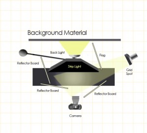
This is the shot diagram for the still life shoots. The drop and pop are minus the background light. The light facing back was to create a little drama behind the shots and not have the background be so ‘flat’.
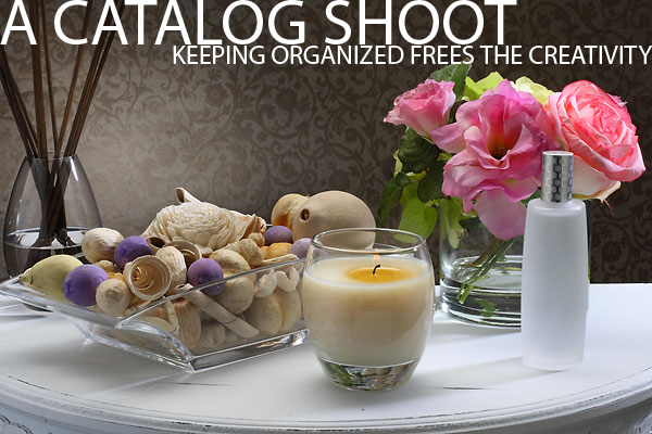
Our first shot is one we will look at is a potpourri shot. The background was one that Alicia wanted to have a natural, tropical look. While she built it, I worked on the exposure and fill card variations for the glass. Alicia then carefully built the potpourri to make it show as effectively as possible and I did a few last tests. We then added the glass items and checked to see that there wasn’t any strange reflections that would give us trouble later. Lastly we added the candle. Alicia lit the candle only as we were ready to shoot it.

I should note that for these kind of shots, I usually use a tethered approach, shooting straight into the computer. This lets me tweak the looks and also lets me share with the art director and client the EXACT the shot as it comes out of the camera.
The shot below shows how the background has a nice clean look to it because of the small backlight. The gradient actually brings the eye back to the product itself. In this specific shot I moved the backlight to be a little off center so it wouldn’t have that ‘studio product’ look to it. There are cards in front and to the camera left side keeping the fill in check and when you look at the potpourri, you will see a nice highlight on the edges from the backlight Grid-spot.

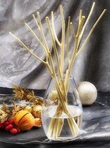
The image below shows the way glassware holds up with the lighting. The backlight gives a sparkle to it, and the subtle backlight from the grid-spot on the reeds shows how nice a little extra touch to the lighting can render the image. There is a sense of shape to the reeds and and the liquid looks almost sensual. The fill cards surrounding the set keep the shadows at bay and also add a bit of highlight themselves.
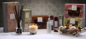
This final shot above shows the boxes and the items for a long thin shot at the top of a catalog page. There are carefully placed cards all around the set to provide a nice smooth transition from the lighted sides to the shadow sides. As well, they provide a smooth surface to be reflected back from the product. This pops the color on the boxes as well as keeping the gold printing nice and shiny.
These shots are always a little tricky so be so very careful in the placement of the items. The angle of the boxes have to seem natural, but still show the items as they are meant to be seen. The labels must be straight, the edges of the boxes cannot be damaged, and if they don’t fit exactly tight, use double edged tape to keep them tightly fitted closed.
We lit the candle at the end of the setup phase and I used a long, 2 second exposure to get the candle to look lit. Once the item was focused, we killed the lights, tripped the shutter and waited for the shutter to close before I turned the modeling lights back on. We had to make sure that the candle wasn’t blowing all over the place and we also needed to make sure that the pool of wax wasn’t too much.
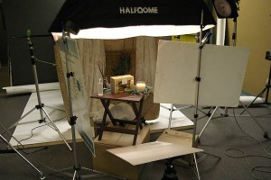
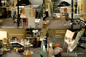
Here are two set shots to show the lighting in the real world, so to speak.
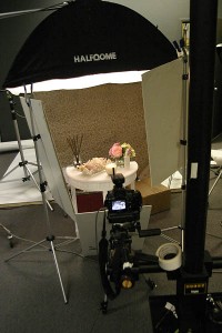
For fun, I will share this fun image I posted on Flickr. You can get an idea of the controlled chaos that happens when there are so many ‘moving parts.’ You can see the camera stand I use and the tethered computer and lighting.
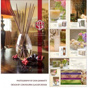
EDIT: Here is a graphic with some pages showing the use of the pics I did.
An apology to those who follow this blog. We have been crazy busy lately and doing some reconfiguring after losing the laptop a few weeks ago. And even though everything was indeed backed up, there are still a lot of business things that were an added challenge due to the loss.
But let me tell you that we have a lot of good things coming up.
I promise.

