Here we are for our second Tech Sheet of the year. How to create a natural light look to a photograph when there is little to no ambient light to be had. We will be using a couple of speedlights for this Tech Sheet.
It has been a wild first couple of weeks for me, and I don’t mind telling you all that it has been exciting. Clients who had ‘gone dark’ came out with plans for work for this quarter, LE is doing well and the workshops are getting more attention.
I have been furiously working on materials for the workshop, and developing some other interesting things for LE… and on top of that, I have assignments and editing to do.
Hey, I ain’t complaining.
I hope you have checked out the workshop page for our itinerary for the first couple of months. And we are adding some more in the coming days. As always, we are looking for hosts in the areas where we have scheduled workshops as well as entertaining ideas you all may have about the workshop coming to your little part of the world. We need 10-12 attendees and we are ready to roll.
NOTE: I was asked about some Photoshop techniques and have added that to the bottom of this post.
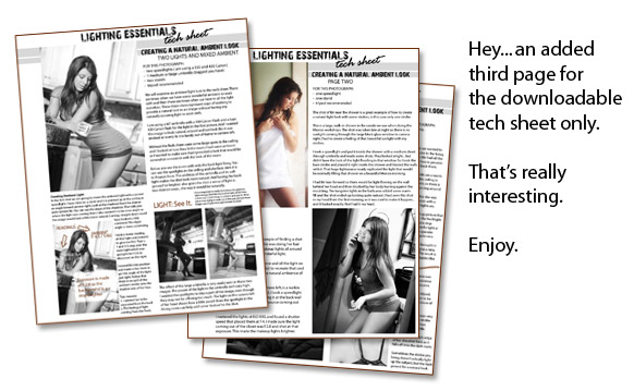
Be sure to check out all the tech sheets we have done by clicking on the Tech Sheet Category above. Now, on to creating a natural ambient looking light when there is none. (And, look… the downloadable Tech Sheet has a third page bonus feature… that’ pretty cool, eh?)
FOR THIS PHOTOGRAPH:
– two speedlights ( am using a 550 and 430 Canon)
– 1 medium or large umbrella (biggest you have)
– two stands
– tripod recommended
We will examine an ambient light look in this tech sheet. There are times when we have some wonderful ambient to work with and then there are times when we have to all the light ourselves. These three shots represent ways of working to provide a natural look to an image without having any naturally occurring light to work with.
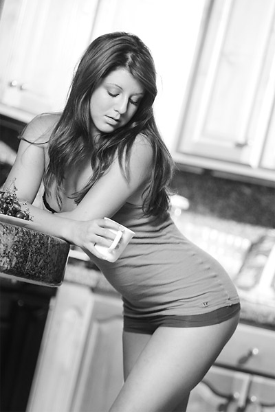
I am using a 60†umbrella with a 550 Canon Flash and a bare 430 Canon flash for the light in the first picture. And I wanted the image to look natural, relaxed and not look like it was strobed or overly lit. It is barely out of frame to camera left.
Without the flash, there were some large spots in the ceiling and I looked at how they lit the room. I had some ambient so I wanted to make sure that I provided a look that would be somewhat consistent with the look of the room.
Creating ‘Ambient’ Light
In the first shot we are going to create the ambient light with a second speedlight. I have mine on a stand and it is pointed up at the ceiling at an angle toward camera right. Look at the shadows from the drawer pulls behind Bri. You can see the angle of the shadows. That tells you where the light was coming from. I also wanted it to be at an angle so the image would look a little more natural. Coming straight down could have looked a little contrived. The slight angle is more convincing.
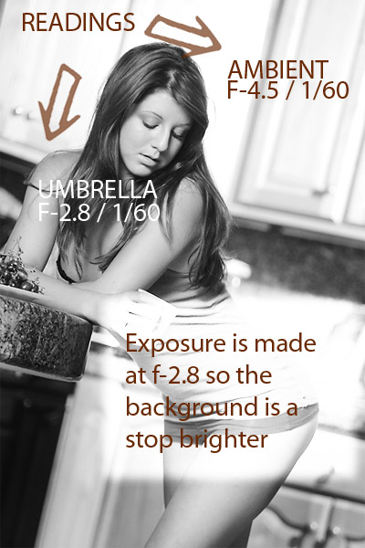
I took a meter reading of that light and dialed it to give me f4.5. That is 1 and 1/3 stop over the main light which was going to be f-2.8.
I moved Bri into position and made a few shots to get the angle of the light just right. Notice that there is no spill of the ambient strobe onto the shadow side of her face.
Two reasons:
1. I wanted her to be separated from the back
2. The feeling of light coming from the front.
Here is a diagram of the light and how I pre-visualized it.
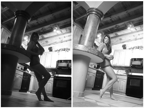
Below you see the room with only the back light firing. You can see the spotlights in the ceiling and also how dark it is to Briana’s front. The addition of the umbrella and its soft light makes the shot look more natural. And having the background be brighter also gives the shot a sense of light in two distinct areas… the way it would be naturally.
Above:
The effect of the large umbrella is very easily seen in these two images. The power of the light in the umbrella isn’t very high. I wanted the spotlights to stay a part of the image, even though they may not be offering too much. The light on the camera left of her head shows how a little punch from the spotlight in the dining room can help add some ‘texture’ to the shot.
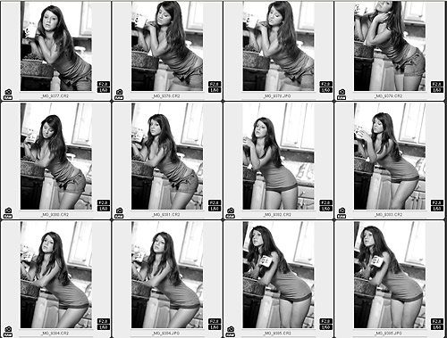
A small contact sheet section of this shoot:
FOR THIS PHOTOGRAPH:
– one speedlight
– one stand
– tripod recommended
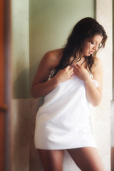
The shot of Bri near the shower is a great example of how to create a natural light look with some strobes, in this case only one strobe.
This is a large, walk-in shower in the condo we use when doing the Mexico workshops. The shot was taken late at night so there is no sunlight coming through the large block glass window to camera right. I had to create a feeling of that beautiful sunlight with my strobes.
I took a speedlight and put it inside the shower with a medium shoot through umbrella and made some shots. They looked alright… but didn’t have the look of the light flooding in that window. So I took the bare strobe and placed it right inside the shower and blasted the walls with it. That huge lightsource nearly replicated the light that would be normally filling that shower on a beautiful Mexico morning.
I had Bri lean forward so there would be light flowing on the wall behind her head and then blocked by her body leaning against the moulding. The tungsten lights in the bath area added some warm fill and the shot ended up looking quite natural. I had seen this shot in my head from the first morning, so it was cool to make it happen… and it looked exactly like I had it my head.
FOR THIS PHOTOGRAPH:
– one speedlight
– one stand
– tripod recommended
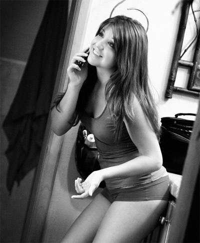
Bri on the phone is a great example of finding a shot on the spur of the moment. She was doing her hair in the mirror there and the makeup lights all around the mirror were creating a wonderful light.
She turned her back to the mirror and all the light on her face went away. But I wanted to recreate that cool look of the mirror lights and the natural ambiance of the dressing room.
Directly in front of Briana, to camera left, is a walkin closet. It is painted white. Perfect. I took a speedlight and placed it in the closet. Aiming it at the back wall provided a very large, soft light source coming out the double doors of the closet.
I metered the lights at ISO 800, and found a shutter speed that placed them at f-4. I made sure the light coming out of the closet was f 2.8 and shot at that exposure. This made the makeup lights brighter. And that gave the shot a sense of reality. If the light in front had been brighter, then it would not have made sense and it would have looked ‘lit’… which is what I wasn’t looking for.
EDIT:
I was asked about some Photoshop work on the images. I will explain below.
First off, I use Tony Kuyper’s excellent Luminosity Masks religiously. Love them. Get them, tip him well. There is a hell of a lot of work in them… and they will make your work stand out.
Here is the image on left as it came out of the camera RAW – no manipulation.
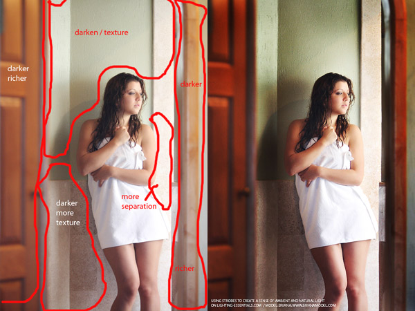
First, you can see my markup… simple, just a reminder of the thoughts I have as editing.
Here is what I did.
- Checked the levels pallet and moved a little darker.
- Retouched any skin anomalies.
- Smoothed skin by making a new layer, blending it with Softlight, backing opacity off to 30% and adding Gaussian Blur at 10
- Added a layer of 50% gray and used soft brush at 10% to gently paint in shadow and highlights: black for shadow and white for highlights.
- Copied that layer to a new layer and changed blend mode to Overlay. Adjusted opacity to what I liked.
- Applied TK’s “Light” mask and adjusted a slight ‘S’ Curve effectively raising the contrast in the lighter areas without modifying the shadows.
- Applied TK’s “Dark” mask and adjusted a tighter ‘S’ creating contrast in the shadows. This helped bring the texture out of the wall and stone.
- Applied TK’s “Narrow MidTone” mask and raised the midtones across middle and light nodes. This made the image more ‘airy’ in the middle tones.
- Applied sharpening to blue channel and overall at 200 / .3 / 4
And closed the image. This hardly took more than a few minutes, but the result is what I was looking for… a contrast that looks real, with tones and color that are rich as well
Join us after the weekend for a special post on Light Meters.



Thanks a million Don. You’re always cool.
Thanks for the brilliant tech-sheets and all the tips and advice. Thanks for sharing your knowledge. Much appreciated.
Thanks for sharing, keep up the good work!
Amazing pictures
Thanks a lot for sharing Don, very useful for the amateur like me.
Great explanation and, of course, love the shots. As always, love to see Bri in your shots.
The one part I don\’t follow is why sharpen only the blue channel?
thanks,
-S.
Great writeup, loved seeing several different setups. Thanks for taking the time.
Great article and thanks for sharing the Photoshop process
Excellent tutorial Don, thanks for the tech sheets.
In answer to Scott’s question, and without seeing the original files, my guess is that Don sharpened the blue channel as that was the channel that held the best edge detail. By sharpening that channel only, Don could bring back some of the edge detail that was lost after using the gaussian blur tool.
If I’m wrong I’m sure Don will correct this statement.
Hi,
Yes, I missed Allan’s question. The blue channel gave me excellent edge detail that I could sharpen just a little more for a better effect.