One of the ways to separate the subject from the background is to use a spray light. The light creates a ‘halo’ of light to dark behind the subject and helps make a flat background more dynamic. It is a fairly simple technique with a lot of variations possible.
We can do this with all kinds of lights, from speedlights to normal reflectors and beauty dishes. Each can add its own look to the spray, and make it work within the framework of your image.
Before we get to this technique, I would like to let you know we are adding Montana to our workshop schedule this summer. If you are a photographer in Montana / Wyoming area, be watching the site for our Montana workshop date. UPDATE: Montana is June 20 and 21, 2009. Signup is active on the schedule page.
We are also having a pair of advanced workshops in Phoenix in February and March. We will only be taking photographers who are already familiar with lighting tools, but need to step out and get some real experience with models and shoot situations. Limited to only 3 photographers per day, the workshop is fully focused on shooting. We have models for the day, and will be working in studio and on location. Portfolio / Web Site review will be required. See the Learn to Light site for more information on January 26, 2009.
Now… on to some simple ways to create a spray light and a gradient background for your work.
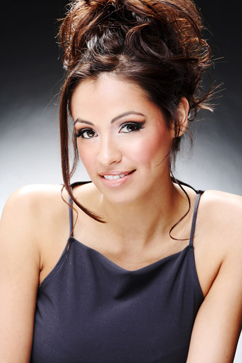
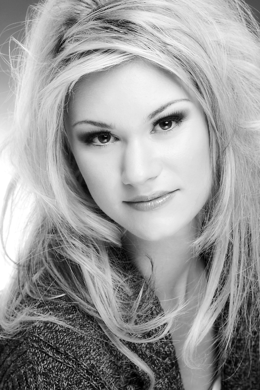
The portrait of Vanessa shows how the background works to create a light-to-dark base for the face and shoulders. The background is behind her about 10 feet. This helps create a dynamic background for the portrait to sit above. The look is far different than a flat background… and keeps the eyes right on our subject.
Keeping the wall 10 feet or so behind her helps blur it from limited DOF. I am shooting here at about f8 at 1/60 at ISO 100. With an 80-200MM L at this distance, the background drops out pretty fast. I am out to about 160-170mm with the lens, so it is quite a telephoto.
Adding a hair light gives a nice shoulder accent. For this shot there is a silver/white ‘Zebra’ over the top of her and slightly back. It creates a nice little accent that is still there even against the bright background gradient. You should really watch this area, because if it the background is too bright, it can kill the separation between the highlight on the shoulder and the spray light.
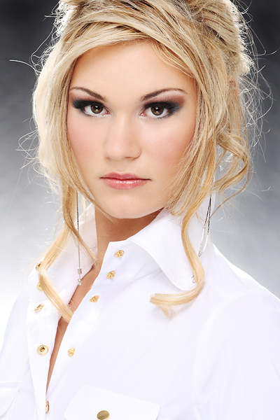
Marissa is wearing a white shirt in this shot, and it separates fine from the backlight.
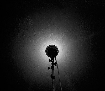
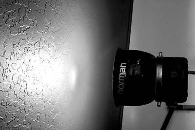
The closer the light, the tighter the spread of light. This shot shows the background light at 6″ from the wall.
This close up shows how close the light is actually to the wall. Just about 6″. I think being very careful with the heat is a great idea.
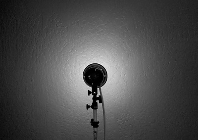
Now we pull the light back about 2″ to 8″ from the wall. Notice the wider spray, and slightly less contrast from center to edge.
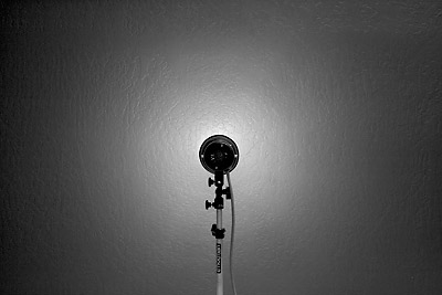
Now to 12″ from the wall or background. The light is now very widely spread and there is a soft gradient from center to edge.
The color for the background here is “Thunder Gray.” You can get that color in seamless, and we have our back studio wall painted that color. This technique works best on the grays and darker colors.
One more shot of Marissa here:
This last shot shows how subtle the look can be. We have a hair light on Marissa, and the spray light is adding a dynamic look behind her. The hair seems to be lit, and yet in the corner we can see some dark background to let the blonde stand out.
I like the spray light look. It can be done with far more subtlety than these as well. Photographers like Platon, who shoot a lot of editorial portraiture, depend on variations of this kind of light to provide subtle definition to their subjects.
Try using a Gary Fong diffuser for some softness, or add a few layers of gel for a color. I find that spray lights work well on dark to medium gray backgrounds. Colored seamless, old canvas, walls and wallpaper can also be used to advantage.
If you try this, post a shot or two to the Flickr Lighting Essentials pool and tag it: le_spray_light. I would love to see how some of you take this idea and change it up.

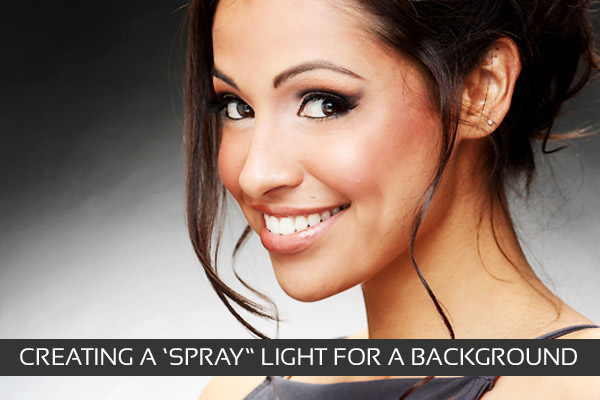



Nice article but I really dont like the blasted faces effect, were the face its almost completely blown out.
Montana date? Say no more…It makes us Albertan photographers very excited for more details.
Montana, you say? That’s quite close! I’m looking forward to more details 🙂
I love this lighting style, thanks for sharing the tips. I discovered it by accident lighting a black background last year, but your technique is a little more consistent than mine was!
What color was the background in this photo?
Kind regards
DJ
The color for this shot is Thunder Gray. It is the same wall that I am using for the tutorial shots.
Thanks for dropping by.
Great lighting tutorial!!! Thanks.
jeffegg2 on flickr…
Nice tutorial. I just post id on bokehnews, go bok-it !
http://bokehnews.com/story.php?title=creating-a-simple-spray-light-for-backgrounds
it’s nice article with some excellent tips!!the color for the shot is nice…..great lighting tutorial!!!
hi i want know that we can make good photograph without any photo finishing software…..
thanks
well written post
Just came across this post now, and was just wondering where you got the Thunder Gray paint that you used to paint your studio wall. I ended up having Home Depot slowly mix black into white paint to come up with a colorless gray. He looked at me like a kook at first.
I simply took a piece of thunder gray paper and they matched it with a little scanning thing. Whatever works. I was very pleased.
This worked well with a flat finished gray wall I had in my house. Very cool studio look
I really needed this article. There is a lot of information online about how to light a subject but very little about how to light you background. I believe that lighting the background is just as important and a photograph isn’t complete until the background is lite correctly. Thanks!